Welcome back to Cover Snark!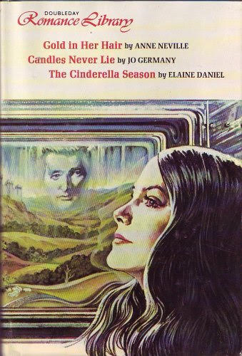
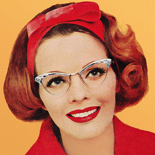
From HeatherS: I want to know why Ted Cruz’s spectral head is creeping on this lady. Nightmare fuel.
Sarah: Oh, that’s VERY Creepy. Also, the titles are terrific.
Amanda: Oh yeah, that’s Ted Cruz.
Sarah: You and Heather agree, indeed it is.
Elyse: JUSTICE FOR SNOWFLAKE.
Sneezy: *aggressive cat hiss*

From Rosemary: Is that a skylight?
Sarah: Is that AI or just hellabad attempts at photoshop? Their hands, her arm, the borders – all weird.
Tara: I need a sign that says “Stop putting light text over light cover imagery.”
Sarah: Will the sign have light text over light cover imagery? Seems fitting.
Tara: Maybe, but not that yellow.
Sarah: I suppose you’re right.
Sneezy: I agree, I can’t tell if it’s AI or just poorly done. I hate everything about the fonts too. It looks like a middle school powerpoint assignment.
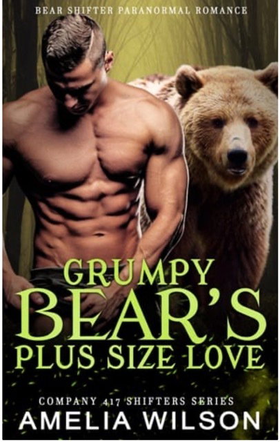
From Sara: Sometimes I just wanna yell “Stop staring at your peen, there’s a huge f-off bear behind you!!”
And…is there an actual love interest or his junk the titular “Plus Size Love”?
Sarah: Perhaps it suddenly is and that is why he is fascinated and alarmed?
Do you think he calls his ween “Buddy?”
Sneezy: “Heeey Buddy? How’s it going down there? I have to put on pants now, okay? Oh- don’t be mad, baby! I have to wear pants! It’s not because I’m ashamed of you! Wait, no, don’t- OW!”
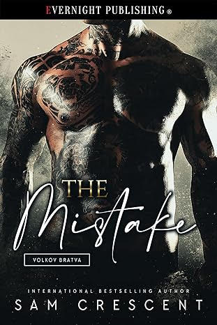
From Melodie: Was the mistake standing too close to the grill when he lit it? He looks very crispy.
Amanda: This is how I prefer my toasted marshmallows.
Sarah: I too have made this mistake on not re-applying sunscreen. It’s a painful mistake but I’ve never fucked it up that badly. My goodness. He needs an ICU immediately.
Sneezy: Whichever it is, it probably required an awe inspiring amount of incompetence and/or a series of statistically improbable events.
Elyse: He’s gonna need a cream for that.

The Ted Cruz and the crispy crunchy Mistake covers are both horrifying in their own way. What in the holy hell were those designers thinking.
I would like to second Tara’s request for that sign about light text and light backgrounds. It should just read, “It is called CONTRAST, friends!”
I’m not sure which is worse, Ted Cruz floating in the window (or is it an oven? Kinda looks like an oven window?) or that hideous green dress.
And I think The Mistake was made while changing the oil in his car.
@EC Spurlock: I know, right? Looks like she’s wrapped up in lettuce leaves. I assumed the window was on a train (or maybe a plane), but it could be an oven. TC is half-baked anyway, so would make sense.
Brixon: His face looks like a photo but hers looks like a painting? Is it a cross-medium romance?
For more vintage cover LOLs, I highly recommend Paperback Paradise on Instagram.
How can the guy on that one from Vernight Publishing (oh, wait, there is a faint E there) be so covered in charred skin and still manage to have a nipple staring at me?
Can’t unsee Cruz, but why is her silhouette reflected in the oven window’s landscape?
Wedding dress dyed green, ballroom with a modern skylight?, tile floor? weird shadow between them?, such a mishmash of a cover.
Those bear shifter covers all look the same.
Charred. No thank you.
I always get sucked down a rabbit hole with these – once I stop laughing. The “Volkov Bratva” on charred guy’s cover made me suspect that it was part of a series – and it is! The covers all feature intensely black body art – maybe all the guys had the same artist? But this is the only one that made me think maybe a visit to the ER was in order.
Unless Grumpy Bear’s genitals grow out of the crest of his right hip bone, instead of the usual location, I suspect he is just turning his pants pocket inside out in search of change, or breath mints.
Is the same bear on all the covers? Does the bear get royalties?
If Brixon is supposed to by historical, Lady Cabbage is using way too much hair product (although she also appears to be a mannequin, so perhaps that’s just how her hair is manufactured). The guy also looks too 20th/21st century.
Mistake: parts of him look crispy, and parts look like he’s been stenciling himself with motor oil. Neither strikes me as appealing.
His mistake was agreeing to captain the Exxon Valdez. I’m afraid no amount of Dawn is going to wash that off.
Came across one today which made me think Cover Snark. Catherine: A Time For Love. I think she does have the correct number of limbs, but it took me a minute to be sure.
My vote on The Brixton Agreement is photoshop; AI tends to be overly smooth rather than pieced together like that
Whoops, accidental italics continual & “Brixon,” not “Brixton”
@merle the bear has bad breath!
The titles ARE fabulous for the first book. I want to read those!
I even don’t hate the cover — it’s a great idea, just badly executed. They should have left the “man on her mind” guy off the train window, it would’ve been better. But I absolve them of Ted Cruz — this was published in 1977, he was 7 then.
I keep homing in on what looks like an extra capital A in the middle of The Mistake>/i>: The MisAake.
I disagree. That’s not Ted Cruz. It’s John DeLancie as Q, peaking in on one of Captain Picard’s ancestors.