It’s our first Cover Awe in January! This is where we discuss beautiful covers we’ve seen and open up discussions on elements we like versus what doesn’t really work for us on book covers.

Amanda: I need to go a major career change so I can become the NHL commissioner and change the rules of hockey to allow for shirtless skating.
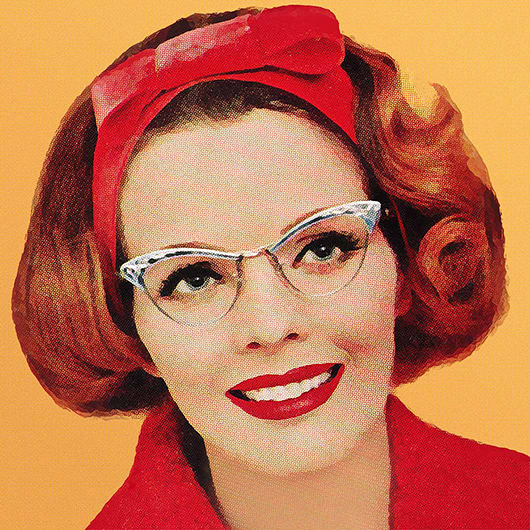
Elyse: Well hello, sir.
Sarah: Those blades are awful sharp. Says the mom.
Amanda: Well…the important bits are covered.
Sarah: I suppose you’re right. Nipples are probably not vital.
CarrieS: I just think he looks cold. But I like the use of red and gray.

Amanda: I love all the nuances of this cover. The barbed wire that look like stripes. The hair covering the face.
Sarah: I love that the illustration is both vulnerable and powerful.
CarrieS: You had me at “Resist.”

Amanda: Very relevant to our “silly” podcast episode where I professed my love for men in eyepatches. Probably because of all of my early anime watching.
What’s he keeping under that patch? A girl’s gotta know!
Sarah: I hope the crow is a talking crow. Unless that’s a raven?
CarrieS: Not my fave but I do like the bird.

Elyse: I am really drawn to warm colors especially pinks, purples and gold. So this caught my eye immediately.
Amanda: I agree that it feels very warm and cozy.
Sarah: I’m terrible, but alas this does nothing for me. I’m sorry!
CarrieS: The colors made me actually gasp.

Ah, men with eyepatches! I can date this weakness of mine to “Another World” in the early 1980s, & the character Patch. (Clever naming, I know, but whatever, I was young.) Having worn post-surgery eyepatches 3 times now (number 4 coming up soon), I can attest that they are annoying, but still sexy.
A shirtless male torso on the cover will always get me to “look inside” ( I have lots of theories about romance novels and “visual vocabularies”—but mostly it’s because the guys are smoking). How I miss the Harlequin Blaze line—the Dare line isn’t even close.
I like the colors on the Robyn De Hart cover (although that author’s name sounds like the aural equivalent of photoshopped), but the dress is absolutely not a Regency style (although the title indicates that the book is) and the top looks too loose.
Whoa, Dark Heart grew up brooding (Care Bears II: A New Generation).
How would you voice-cast the bird? Rowan Atkinson or Gilbert Gottfried aren’t quite right…
Unfortunately, the fuschia flood dress reminds me of a rhyme I read in a guide to fashions of the past. Paraphrasing, ‘what use to me is my country seat, when I can’t sit down?’
(The issue was underwriting/loops or sth, not reams of fabric, though.)
@DiscoDollyDeb: I just binged a bunch of Mary Balogh, Eloisa James, and Jo Beverly and now I really wish for a Regency cover that involves panniers.
I am not feeling the Robyn Dehart cover. It simply wouldn’t jump out at me as something to make me pause.
Also, is it supposed to be a Regency romance? I fully admit I know nothing about the fashion of the times so maybe the dress is date appropriate, but would they wear a sleeveless dress like that? Not even a cap sleeve? She looks like she is heading to the Oscars or the Golden Globes.
@ Deianira – Patch! *Swoon* I loved him so much.
INTERNMENT? Wow. All the yeses.
Thirding that Patch crush.
@Zyva, definitely Cate Blanchett for the bird voice. That man needs a Raven of substance.
Patch and Kayla were my Luke and Laura GOAT soap couple. But they were on Days of Our Lives not Another World. I loved both soaps growing up but was obsessed with Days because of Patch and Kayla.
My crush on Patch is probably why I think Chris Hemsworth’s Thor was much sexier with the eye patch and was sad when he got rid of it so fast.
Haha thanks, @Marci, a fellow Days watcher, I think they just declined to renew his contract (quelle horreur). But I do recall he played one of the Cassadine sons on General Hospital, too, yes?
@Carol. Yes he was on General Hospital. Without the eyepatch sadly. And so was the actress who played Kayla, but in a completely opposite “bad girl” role. They were coupled up on GH too for awhile and I love their chemistry together. My friends all loved Young and Restless but I was always a Days, and then GH, fangirl.
@Marci: Yes, you’re right – “Days” not “World”; they were the soaps playing on the student center TV at Auburn. Clearly I had a senior moment there. Or was just distracted by eyepatch lust!
Is it just me but eyepatch guy looks a lot like Spike from Buffy. Just dye the hair to blonde – you know I’m right.
The first thing i thought when I saw thr 1st one was Sharks. San Jose Sharks. 2nd thought was “Dude needs a helmet.” Didn’t do much for me because he’s obviously not a goalie.
Sharks. San Jose Sharks.
Anyone else hear that in a James Bond voice? “I play for the Sharks. The San Jose Sharks.”
Quick dash to Amazon tells me Teal Guy plays for Portland. (Er … Portland doesn’t have an NHL team, does it? I haven’t seen much hockey since my son went off to college, lo these many years ago.)
I’m Australian and ice hockey is not a thing here, so I’m confused by the first cover. Is that man wearing padded shorts and the biggest shin pads in the world, or is he wearing half an Iron Man suit?
Eye patch guy looks pissed because the damn bird that took out his eye is sitting on his shoulder and he can’t see it to catch it because it’s on his blind side.
The pink dress cover is screaming Modern Princess to me. Possibly not what they were going for.
heh, oh good, i’m not the only one who saw those hockey socks and thought San Jose Sharks. though that’s definitely not the Shark Tank with 3 tiers of seating! 😉
Hockey man with the deep-V pants is giving satyr vibes, into it
@BellainAus – he’s wearing the lower half of his uniform and “forgot” all the padding that goes on top. Yes, the shorts are padded, and there are shin and knee pads under the striped hockey socks (but they don’t have feet, so really they’re legwarmers!). Normally he would also be wearing a big chest/shoulder pad rig, as well as elbow pads, all under a big hockey sweater – still called a sweater, even if they haven’t been knitted in many a year! Plus a helmet.
And count me as another who saw the color scheme and thought Sharks!
For comparison:
https://www.google.com/amp/s/www.mercurynews.com/2019/01/08/erik-karlsson-enters-rare-territory-as-sharks-top-oilers/amp/
Definitely a Sharks theme going on! Also, forgive me if this is been posted ad nauseam but will there ever be affiliate links to the books in cover awe? Asking for a friend…
@Ellie: If you shop at Amazon, the covers are already linked! All you have to do is click on them. Though if you shop elsewhere, it’s possible we can include them some other way.