Welcome back to Cover Awe! This is where we discuss coves that we like or think are interesting.
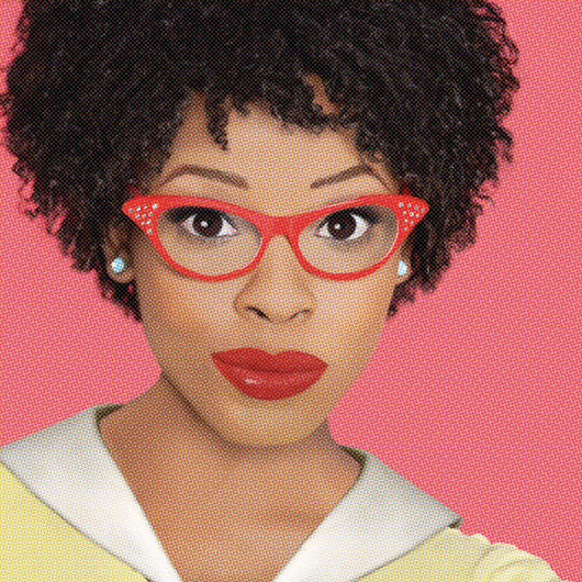
Sarah: I think this cover is so cute.
The color scheme really works for me. I know from Lara’s review that the vibes of the cover do not match the story, but I still love the artwork.
Amanda: It’s a very romantic color palette.
Sneezy: I agree! I really enjoy this illustrative style!
Cover art by Austin Drake of Bottle Cap Creative
Sarah: Taking the “comic” cover literally.
I’m not sure how I feel about this cover, but I am intrigued by designers trying something very new, and very vintage at the same time.
Amanda: I really like these covers, probably because they are so distinct but also give a nod to classic clinches.
Sneezy: Awww, the vintage comic style is so cute! I like what the artist did with their lines!
Cover design and photography by Juliana Kolesova
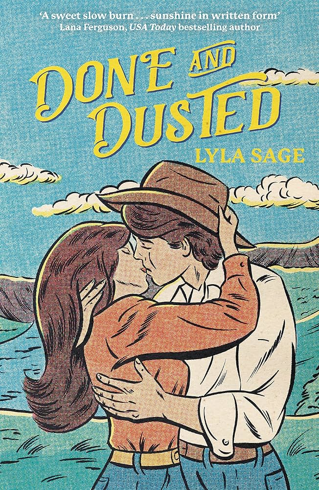
Amanda: I really like the warm colors of this one and the inclusion of movement/wind
Sarah: I have ponytail questions (as in, no ponytail I have ever worn has stood off my head like that. Is there a pipe cleaner in there?) but I agree. The colors are gorgeous.
Sneezy: I really enjoy the splash of water accentuating the movement in the cover and extending the flow of the text. Love a good swoosh!

My question on the last one is: why do we want to know what Jake gyllenhal looks like with a blond ponytail? Even if it’s a passing resemblance, I cannot unsee it as my brain began spooling out “you used to be a little kid with glasses in a town-sized bed”
Ok. The first cover intrigued me enough to look up the book and for me the blurb doesn’t square up with the vibes the cover is giving off!! Still like the cover just that… it seems off from the blurb!
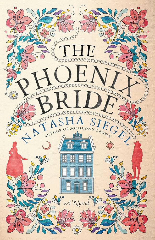
The cover for THE PHOENIX BRIDE reminds me of a sampler. I would stitch that.
Sarah re pony tails, I could get my hair to do that if I scraped the top really tightly into the tail, and used a fat scrunchie. I couldn’t do it with the front of my hair looking that loose.
I love the way the first one looks as if the top left corner was left in the sun and has faded compared to the other corners.
I like the Done and Dusted cover except that it looks to me as if they are somehow stood on the sea, which leads me to worry for their safety.
Oh I forgot to mention that pony tails like that have to be treated as a potential danger to the eye sight of anyone who gets close to you, if you turn your head at any speed they swing out and, I am told, really hurt if they catch someone in the eye.
May I share my cover awe? Even If We’re Broken by A.M. Weald – I saw the cover, read the blurb and immediately bought it. And it didn’t disappoint!
My problem with the Lyla Sage covers is that they read as sapphic to me? The SWIFT AND SADDLED one does too! And then I think, where is the butch femme cowgirl romance you seem to have promised?
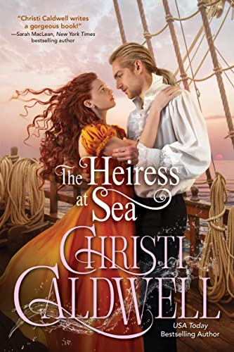
On THE HEIRESS AT SEA his collar may be propping up his ponytail.
I like the PHOENIX ROAD cover and agree with Sarah about the cowboy one and Amanda about HEIRESS.
I like that most of these have kept the titles clear of the pictures. HEIRESS’s overlap gets a pass because it’s kind of traditional, but it could stand to fatten up its text a bit and probably arrange it better in relation to the picture.
Breen’s cover is AI. Kind of a slap in the face to the other cover designers to highlight it alongside them.
@Jay: We do our best not to feature AI covers in our posts and have removed the image. We appreciate you letting us know!