
Let’s look at some cool covers, shall we?
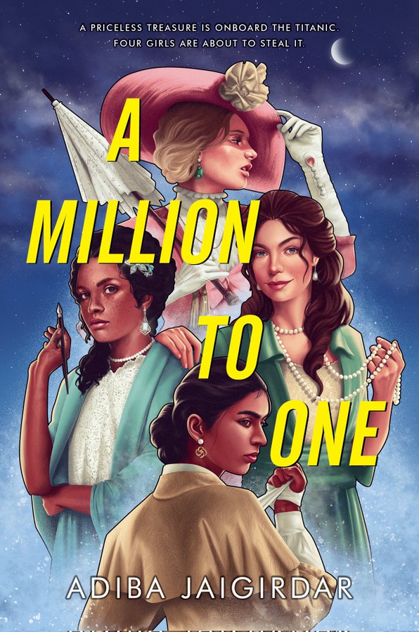
Cover illustration by Jack Hughes
Amanda: Lesbian heisting!!
Sarah: I love the nod to Titanic in her hat and parasol!
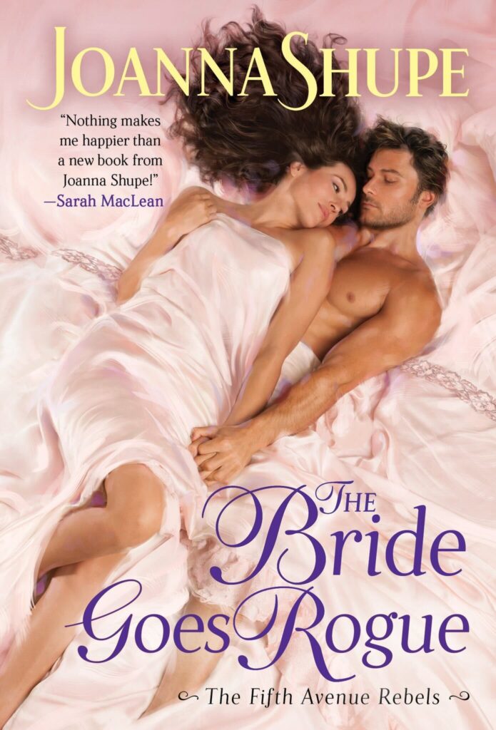
Cover illustration by Anna Kmet
Amanda: I actually think this cover is really sweet.
I want to hold hands in a big bed!
Carrie: The handholding is a sweet touch.
Claudia I like it too, and it reminds me of a similar Tessa Dare cover — I think A Week to be Wicked.
Elyse: I just requested this one and I want it so bad. I’m in a mood since I started watching The Gilded Age.
Cover illustration by Erick Davila
Cover design by Diahann Sturge
Elyse: Yes please!
Amanda: The deep reds are so striking and really make this stand out. Also, I need all the makeup details!
Sarah: I received a print ARC of this, and when I opened the envelope I said, out loud, ‘Oh, WOW.’ In person, this cover glows, I swear.

Cover designed by Will Staehle
Amanda: Loving all the use of negative space in the design!!
Sarah: MIDSOLAR MURDERS I see what you did there. And this is extremely interesting design and illustration. I’m so impressed.

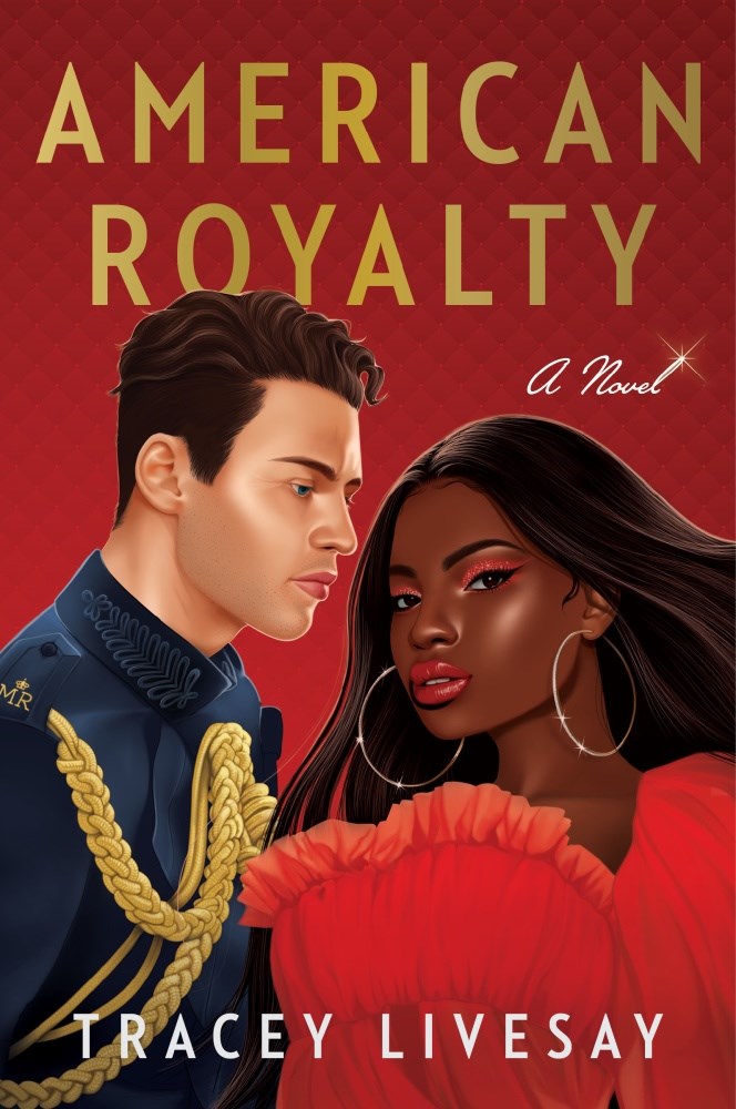
Interesting. I find the cover of American Royalty incredibly off-puttingly uncanny valley, although I do like the color scheme. I definitely didn’t let that influence me tho because I have totally absolutely learned to stop judging books by covers… I really don’t like royalty romances, or celebrity ones, it’s not that I can’t even look at it I swear.
The guy on American Royalty looks so much like Rami Malek to me. It’s all I think of every time I see it.
Re American Royalty: I love the colours, and the woman is absolutely stunning. The man, however, doesn’t appear to actually be looking at the woman herself; he looks extremely stiff, and has the slightly stooped look of a person peeking to read over someone’s shoulder, a habit that I find so terribly annoying that it always invites immediate reprisals. Given my [lack of] height, reprisals usually mean an elbow in the gut, and this dude had my elbow twitching.
I am so looking forward to Station Eternity. It’s an sf meets cozy mystery, where the lead character gets so tired of murders happening around her (and being the one to solve them) that she flees to alien space, except…
And Mur was pretty darn giddy when she got the cover art.
When Disney’s Snow White was released, no one noticed that every character–except the prince–was drawn with great detail. The prince, who didn’t even have a chin, was nearly amorphous because he didn’t matter in that version of the story. From Sleeping Beauty on, artists paid attention to male characters, making them more defined and adding a personality.
This is what the cover of AMERICAN ROYALTY says: the young woman is completely stunning and draws our eyes immediately; he does not, except for looking like he’s searching for something in her hair. Hopefully the text shows him in a better light.
@Lianne: Same here.
Ditto the uncanny valley look of American Royalty. It also looks like their clothes are too big for them (that ruffle hitting her face, his braid looking more like a rope) unless it’s supposed to be a perspective thing? And what is the time period for this book? It’s hard to tell by the clothes. The colors are gorgeous and the woman is just lovely, but everything else seems kind of — off, somehow.
Not only do I love the cover of American Royalty, the story is incredible. The cover fits the story to a T. Or shall I say Cardi B.
Joanna Shupe’s Book is a KEEPER! THIS STORY WAS SO GOOD ON SO MANY LEVELS,and they were this book cover and MORE. This whole series is a must buy for me. Cannot wait until she tells Nellie’s Story.