
Cover Awe is back today! This is where we discuss covers that have recently caught our eyes, though we might not always agree.

Amanda: Well that is stunning. It reminds me a lot of those 3D paper crafts people do.
Sarah: Oh, gosh. The paper cut look is gorgeous. Vicky Scott does similar work – she did illustrations for SBTB, too and I love them. What a fantastic cover.
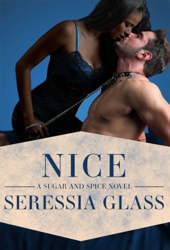
Elyse: I love this cover. First of all: blue. So much blue. Second: sub hero. Third: it’s erotic romance but it conveys intimacy.
Amanda: Yeah, I like how it makes it clear that HEY SUB HERO OVER HERE. And Seressia Glass writes characters you don’t necessarily see a lot of. I think she had an age difference pairing with an older heroine before too.
Sarah: I like the simplicity of the composition, and I really like the position of their bodies indicating intimacy and trust, and eagerness.

Elyse: I really like this cover. Sometimes it’s nice to have a cover without a couple (or hero) on it.
Amanda: I can always appreciate a cover that makes me hungry, though I do wish that were a real cookie recipe.
Sarah: This doesn’t do it for me, alas. I can see the heart and the smiley face and the image construction, but as a cover, eh? (I’m sorry!)

Amanda: I hope this is shiny and glittery in person!
RHG: Ooooooo!
Sarah: I don’t want to blink and interrupt all the visual discoveries hidden in this cover. Wow.
Elyse: I don’t even know what this book is about, but I just bought it.

I too like papercraft covers. I had to look up the artist for this one (Seedlings Design Studio) because I love it so much.
https://www.amazon.com/gp/aw/d/B07B6HGQY2/
Crimson Bound. Have you SEEN that cover? https://www.amazon.com/Crimson-Bound-Rosamund-Hodge-ebook/dp/B00MMENBPS/ref=sr_1_1?ie=UTF8&qid=1525693020&sr=8-1&keywords=crimson+bound
@Lora: Another book of hers has that spiral staircase winding through a rose, which is also striking.
LOVE the Seressia Glass cover! Where did you find it? I can’t find info about this book anywhere.
@Frida: I don’t think any links are up yet since it’s due out later in the summer!
I loved Seressia Glass’s Spice so I’m glad to hear there will be more in the series!
I don’t think I’ve ever concluded I had to read a book from one of these posts before, but count me in on the ‘must read that Seressia Glass’ club. SUB HERO.
I just want to wipe up the work surface in the Hungry for Love cover.
But I love all the other ones! Ok, I also really like the idea of the Hungry for Love cover, it’s just too messy.
Some weeks ago I asked my library to order “The Surface Breaks” but I was told I had to wait for a U.S. publication to get released. The cover alone sold me!
I also have a mighty need for that Seressia Glass book and I wish I could preorder it somewhere. Sub heroes are the rarest catnip.
Re #1: Didn’t even know I wanted a heroine version of “Creatures in the beard”.
Re last: A gargoyle shifter romance?
I like all the covers – especially the Seressia Glass, what lovely clear design. But I at first I thought the reddish stuff sprinkled around “Hungry for Love” was blood. I guess it’s really fine chocolate chunks and shavings? Looks like blood with my middle-aged eyes on my screen. But that contrast sort of makes it more compelling.