Cover Awe is back! This is where we talk about covers that we find striking or covers that catch our eye more than most. Obviously, our tastes are completely subjective, but we hope you like the discussion!

Sarah: Does that look familiar? It reminds me of – oh! Good job, my brain:
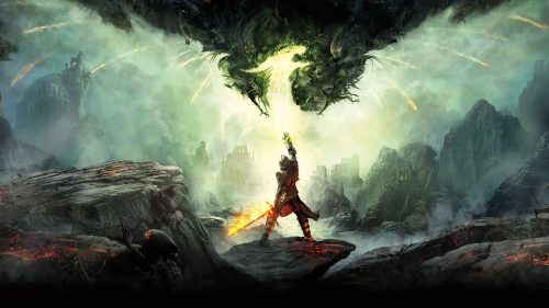
Amanda: That’s probably why I like it so much. Also when the heck are we going to get Dragon Age 4 news?!
Plus, I love a cover that isn’t afraid of negative space.
Sarah: I’m with you. Whatever the hell is happening in that book, I want to know all about it. Now.
CarrieS: I love an undaunted woman.
Elyse: I love the landscape hidden in the dragon’s wings.

Amanda: There’s something at the lattice-work (is that lattice?) and the shadows it’s casting that I really enjoy.
Sarah: If I’m remembering correctly, it’s called mashribiya and is common on second story windows.
Ok, well, I got the pronunciation right, and I almost spelled it right, too. It’s mashrabiya. AGAIN MY BRAIN, a fair job you have done.
Anyway, it’s a traditional element of Arabic architecture and it’s gorgeous. So that person is on a higher floor, most likely, and is in the private part of a home or building, on the inside. Given that it’s a mystery, I’m now extremely curious about what’s going on inside that book, too. Hey, cover art, nice work!
CarrieS: Love the geometry and shading ando the soft colors juxtaposed with the black lines.
Elyse: I am clearly a fan of lavender since it features heavily into my Cover Awe submissions. Also when I had a tonsillectomy in my 20’s and they gave me liquid Roxicet, super high Elyse went online shopping and apparently decided that the two best colors for me were lavender and tangerine. Fortunately super high Elyse also bought clothes that were returnable.

Amanda: I’m really loving this cover.
It’s different from a lot of historical romance covers we see, with the clinches and half-undoned dresses.
Elyse: That’s a hat!
CarrieS: It’s too much pink for me, but I agree that that is definitely a hat and the woman is wearing the exact facial expression one should have while wearing a hat like that. Also, she’s not super skinny, yay!
Sarah: Alas, this cover is not for me. I don’t like photography covers for historicals, and it’s a quirk entirely located in the stubborn part of my brain. I do agree that the pose is very alluring, though.

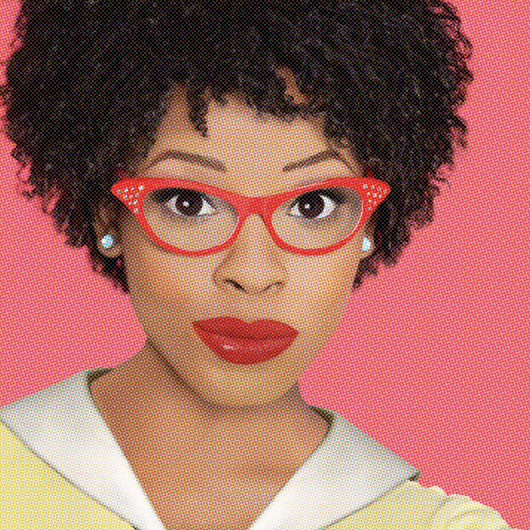
Amanda: The facial expression, the daggers, the splatter! Yes!
Sarah: I love that when this cover was revealed, the reaction was pretty much the sound of a thousand or more jaws dropping in awe at the same time. It’s fantastic.
CarrieS: bright colors, negative space, the sense of being dropped into the action, makes me want to find out what this book is about!
Elyse: I love the little paint spattering element to the side. Also she looks like she’s gonna stab the fuck outta someone and I am here for that.

OH MY GOD, thank you for pinpointing why that Tess of the Road cover looked so familiar! Every time I saw it, I just kind of squinted at it for a bit and could not figure out why my brain was getting excited.
@Kathy: Can you please identify that second image?
@Hazel: It’s cover art from Dragon Age: Inquisition.
I feel like the Jane Goodger cover straddles that “I like it” “I don’t like it” divide. It’s hard to explain.
It makes me think of Victoria Magazine, Laura Ashley,just general 80s love for Victoriana, and Jane Seymour ;-). But I kind of remember those things with fond nostalgia?
It feels like my mom would have this book on her bookshelf twenty years ago and I might pick it up and skim through it on a rainy day.
@ Jill Q. – I agree. The cover also politely whispers “sweet romance you would love to read with a cup of tea by your side.”
@LauraL: I get that vibe too, but what really makes me laugh is that there was one Goodreads review that talked about how crass and explicit the sex was.
@Ren: Thanks very much. I’ll look that up.
One thing I love about the Tess of the Road cover is that she’s standing tall but not making a threatening gesture toward the dragon. It’s an intriguing setup.
My fave covers is the Tess of the Road one. I have no idea what the book is about, but that striking cover art is killa.
My least favorite is, unfortunately, A Blade So Black. I love the female character (her pose and expression are quite badass). However, I find the whole ace shape + roses + splatter paint way too distracting. 🙁
I love all these covers. The cover for Tess of the Road is SO gorgeous. I wasn’t crazy about the book, but the cover is to die for.
The lattice on the cover of The Widows of Malabar Hill is probably a reference to the lattice that separates the men from the veiled women (the widows) in the house on Malabar Hill. The women observe purdah, so have their own section of the house, unreachable by men (except for their husband).
The book has a wealth of historical information, and is told from the pov of the first female solicitor in Bombay, around 1911(ish).
Correction, the story takes place in the 20s, with flash backs to earlier times.
RE The Widows of Malabar Hill
Sorry, the hat does nothing for me, especially since hats of that period (assuming Edwardian) were millinery on steroids! (Think “My Fair Lady”, “Titanic”). With this hat, you just see some satiny lining and a bit of fluff. It also doesn’t seem to be sitting on her head her well (early fascinator?). I also didn’t care for the smokey eye makeup.
Also, I love the Tess of the Road cover!
I like all these very different covers, but Tess wins because dragon.
Add me to the “Tess of the Road cover is gorgeous” camp. 😀 Imma go look up that book RIGHT NOW.
@Jill Q.: Yes! 1980s, Jane Seymour, Somewhere in Time is where my brain goes with that cover. Or a Merchant-Ivory production.
That Hat!!! Total cover snark moment! Why in the hell is she smirking at the lining of her hat???? What is the pink smoke? Why is she larded with make-up? I know I am, what do we say on here? yucking someone’s yum, but whoah baby, this looks like a 1980s cosplay romance! I am so fascinated I may buy it. I do love the Sweet Tea Southern belle romances.
That last one is channelling Marvin Gaye, but probably that is intentional. (Benefit of doubt to make up for bitchy comments above.)
I’m all about the Tess of the Road cover. There is just so much yes there to enjoy.
The fact that homegirl is rocking a fro AND knives on that cover, means that I need to find out more about it!
But notice how she’s carrying an era-appropriate briefcase? That implies she has either recently been, or is about to go, outside. This in turn sets up a contrast between the architecture, which is firmly Inside vs. Outside (i.e. Women vs. Men), and this individual woman’s real life. Tantalizing!
The boring-old-poop part of my brain says: Short gloves go with long sleeves, and vice versa. The smiling lady needs to go back in the house and cover her elbows.
Love the A Blade So Black cover. I have no control so I found an excerpt online and preordered it. Future me will think I’m awesome even if current me is annoyed with my impulse issues. I’m a sucker for Alice in Wonderland.
Love the Tess of the Road cover – would definitely pick this up – and am also very intrigued by A Blade So Black (probably because she reminds me of Buffy’s Nikki Wood, a bit-part character to whom I wished they’d given more time).
I’m also up for a good YA Alice in Wonderland reworking. I’m trying to read ‘Alice in Zombieland’ but struggling to like the protagonist (who complains early on that as she has big blue eyes, wavy white-blond hair and ‘legs that stretched on for miles’, boys just never show an interest in her. Mm. Yes. Tall leggy blue-eyed blondes frequently struggle that way.
The pink hat confection is lovely, but should they have put it on a lady with orange hair?
Is _Tess of the Road_ a riff on the ya classic _Adam of the Road_? Classy cover, either way!
The _Blade So Black_ cover is exciting–not only clothed and in a competent pose, but with fun splatter.