
Welcome back to Cover Snark!
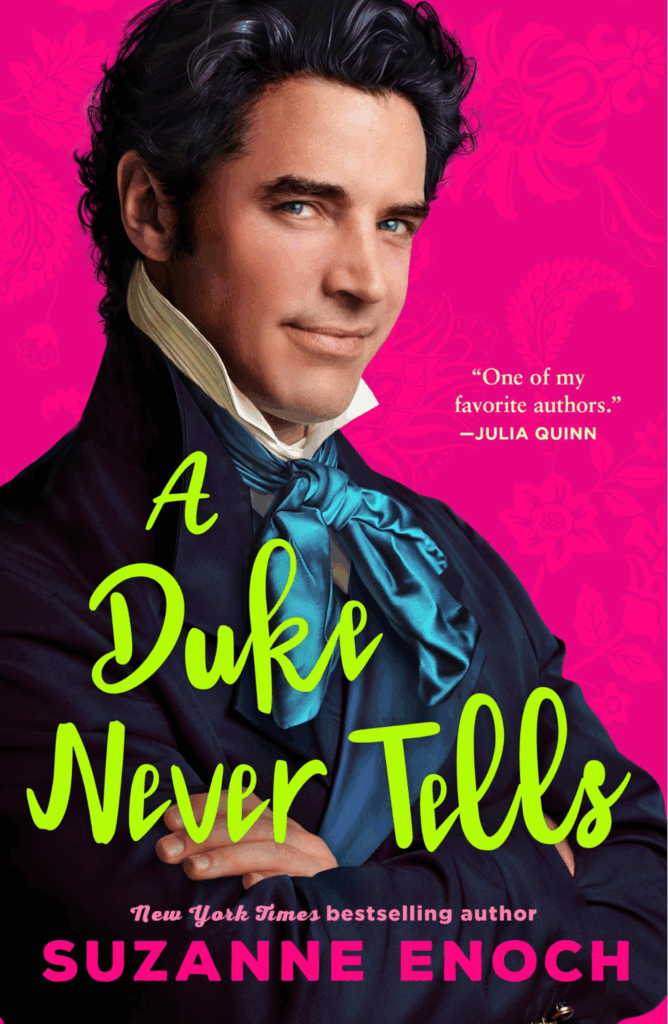
Sarah: What the hell.
Kiki: No, thank you.
I don’t want it.
Sarah: Who is designing these covers. Like what the ever loving crap
Are they trying to be like Indies? Single dude on the cover? They’ve got it all wrong. He needs to be bald, grimy, dehydrated, and looking at his junk.
Elyse: Is that a Jonas brother?
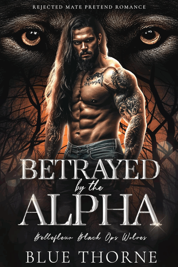
From Karen: His left forearm is really creepy. It looks to me as if he has a growth of some kind that he really should have looked at. The tattoo (is that feathers?) seems to emphasize the lumpiness. I can’t not notice it though I wish I could.
Sarah: Definitely has some swelling that should be looked at. That is what I look like after any encounter with greenhead flies.
Elyse: That tattoo is for sure infected.
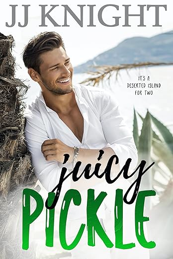
Amanda: It’s part of the “Top 100 bestselling Pickleverse”
Sarah: This is a weird timeline.
Elyse: So it’s him and the pickle on a deserted island?
Claudia: Pass!
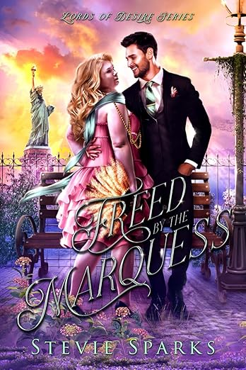
Kiki: Hey, here’s a question: why doesn’t this woman have eyes?
Also is that man Bryan from Rachel Lindsay’s season of the bachelor?
Also why does it, ya know, look like that?
Sarah: What is happening? Some kind of pollen apocalypse? How bad would your allergies be if you were in this picture, Amanda?
Amanda: Very bad.
Claudia: I fear that the feather fan is also bad news!
Elyse: This feels like an image where you’re supposed to find hidden objects in the picture.

I really thought it said Treed by the Marquess.
The Alpha’s headlights are on. Why is it that a cover model’s entire moob can be in shadow, but yet the nip catches the light? Do they coat them in fluorescent paint? Does the cover designer make a conscious decision to touch them up? Inquiring minds and all that…..
And what kind of self-respecting badass black ops team calls themselves Bellefleur?
I think the JUICY PICKLE guy and the FREED guy are one and the same. I don’t know who he is, but he was on every other romance cover about ten years ago. It’s the immortal life of the stock photo cover model.
As for Bellefleur Black Ops, that entire cover looks like it was coughed up by poorly trained AI. A “Pretend Romance”? Obviously doesn’t know the fine nuances of difference between “pretend” and “fake”.
In the Treed by the Marquess cover, how bow-legged is the marquess? He kind of looks like he’s sitting on the bench, if you look at just the legs, but as soon as you reach the hand in the pocket (it is not the best sign if your date has one hand around you, and the other in his pocket: hot dating tip), it’s clear that he must be standing. Bow-legged. In front of a bench with arms that seem designed to resemble carriage wheels. While in the background, Lady Liberty sets the clouds on fire (to drive away the purple infection?).
“Juicy Pickle” is either the worst or best name for a romance novel.
I don’t understand what’s wrong with the first one? I don’t love it, but also I don’t hate it? I mean hot pink and neon green are certainly choices for what is maybe a historical. But am I missing something obvious?
I couldn’t even look at the black ops one for more than a few seconds, it just gave me a full body no.
Freed (Treed) by the Marquess, Thanks @Amy! now that you pointed out his legs it’s all I can see. Also, I can almost see what they were trying to go for, but somehow it just all failed miserably. The lighting on her is just too harsh, and doesn’t make sense for what appears to be maybe sunset. His lighting looks like film studio and also doesn’t make sense for sunset. Her scarf is flowing in the breeze, but their hair is not moving at all, that is some 1980’s high strength hair spray. I think it’s the strong sense of nothing feels like it’s actually from the same setting? I’m struggling to put my finger on it exactly. The bench is too close to the lamp post, where are all these flowers and grasses actually coming from? Why does he look like James Holden’s long lost cousin?
Wait, what’s wrong with the Enoch? Not particularly to my taste but definitely cashing in on the Bridgerton phenomenon (I thought it was clearly Benedict.)
TREED BY THE MARQUESS is just confusing me—why is the Statue of Liberty in there? Is that his hand? her hand? If it’s his hand, it’s too far away from his body? If it’s hers, where is his? And what is wrong with her fingers…? So many questions.
In Treed by the Marquess, there is something seriously wrong with her left elbow.
I don’t hate anything in the Enoch cover except for the title font and color. His outfit is over the top but in a probably-historically-accurate kind of way, and the look in his eyes tells me he’s about to have some fun and he’s inviting me to come along. I’m in.
Some of you don’t watch Bridgerton, and it shows.
A Jonas Brother. My god.
Only thing wrong with that cover is the bright pink background. It’s hideously out of place. And bright. So so bright.
The Enoch cover screams early 00s with the color combo, font, all of it. My first thought was they selected a model who slightly resembles the actor cast as Benedict Bridgerton. Which, given his season is coming up….
A Duke Never Tells: Yee haw, it’s the Four Fonts Prize … in fact let’s call it five, because any font that’s that wildly anachronistic must count double. And speaking of stylistic anachronism, that color scheme, oh that color scheme.
Betrayed by the Alpha: Why is he wearing his love interest’s flowing tresses–and why only on one side of his head? Did she get to keep the other half? And puppy-dog eyes don’t really belong on the same cover with the word “Alpha”, do they.
Juicy Pickle: Y’know, I have to give the cover designer a bit of a bonus for “deserted island”. The standard locution “desert island” gives a very wrong mental picture.
Freed by the Marquess: Whisky Tango Foxtrot, and that’s all I can say.
@ Sara: Certain things always take me straight to “a frivolous shade of pink”, like the heroine’s favorite pelisse in Sanditon.
Personally, I don’t think the “Juicy Pickle” cover is that bad. Whether it`s a good title is debatable, but the only thing I would change about the cover itself is to remove that dried palm leaf/twig/whatever to his right, as it comes from nowwhere and is visually distracting. What I do like is the way the loop of the j in juicy goes arond the I in Pickle – a bit suggestive, methinks, but fitting for a romance novel. Haven’t decided yet whether it would have been better or at least more consistent to let the loop of the y go around the L in the same way.
As to the “Freed by the Marquess” cover: I wonder if the image is AI-generated. I used to play around with a free AI image generator app (I have since learned why the use of these apps is problematic and stopped using it, and I’ve never shared the pictures I generated or used them commercially, so please don’t yell at me), and the pictures I generated often gave the same impression of looking ok at first glance while still feeling slightly off somehow, and revealing serious flaws in perspective, object placement or similar on closer inspection. Also, the app never managed to get hands right, so the creepy hand on her back (as FashionablyEvil said, whats wrong with the fingers?) might be am indicator for an AI-generated (and not sufficiently edited) image.
Forget the cover, I want to know how and why the Marquess chased her up a tree? (And also what era is this supposed to be, as it’s quite the historical mix in terms of clothing and architecture?)
At least the Duke and Mr Pickle seem to be having a lot of fun.
The Marquess looks like 80’s Cyndi Lauper had an allergic reaction to some strawberries.
A DUKE NEVER TELLS: He selected hot pink wallpaper to force people to look only at him (because the rest of the room hurts too much to look at). (I’m not anti–hot-pink, but only the strongest of souls can casually gaze on a whole room of it.)
BETRAYED BY THE ALPHA: The tattoo artist did their best to transcribe the slurred phrase the Alpha drunkenly instructed them to inscribe over his heart. But when he saw the result the next day, the Alpha felt betrayed…by himself! Between that and the infected one on his arm, he hopes he can be luckier in love than he is in tattoos.
JUICY PICKLE: She just wanted to see the world on a budget. It’s bad enough the wealthy magnate caught her stowing away on his freighter, but now the ship has sunk and she’s stuck on a deserted island with him and countless crates of pickles! He’s handsome and seems pretty chill — but can love flourish on a diet of only pickles and whatever they can catch? Will they catch…feelings?
FREED/TREED BY THE MARQUESS gives me postapocalyptic vibes. The lamppost is overgrown, plants are growing out of the pavement, the ground is covered in some purple substance, and the NYC skyline has been replaced by fiery clouds. The marquess purposes to sweep her away to his “freehold” in the base of the Statue of Liberty; he does not realize she is a vampire emboldened by the constant, eerie cloud cover.
A Duke Never Tells… how long it took for his overpaid hairdresser to achieve that “perfect rumpled look,” or what nasty chemicals have been used to hold it in place for the entire photoshoot.
The Alpha was betrayed by overinflating his left bicep — he’d have trouble touching his opposite shoulder, left alone the same one. I suspect they hid the little valve in the tattoos.
Pickled what? Pickled Vienna sausages?
How can one get treed by the marquess if there’s no tree in sight on the cover?
The Juicy Pickle cover doesn’t seem too bad? The j looping around the I is a very deft touch.
What’s wrong with the first cover??
“Rejected Mate Pretend Romance” sounds like a really fancy way to say “stalker” to me. The glowing eyes make the point even creepier. I’m with @Lisa F; I like “Juicy Pickle” as a title. Perhaps not for a contemporary, though, since “a pickle” is an outdated idiom. It gives me Laurel & Hardy vibes.
So many things are wrong with “Freed/Treed by the Marquis”, but her lack of facial expression is particularly bothering me.
“Betrayed…”– Are the tattoos on his right forearm glowing, or is that magma oozing out of cracks in his skin?
Dukes never smile. They’re always broody. 😉
Alpha is just creepy.
Pickle has too nice of a shirt to be on a deserted island.
Freed/Treed looks like DWTS gone wrong.