Welcome back to Cover Awe!
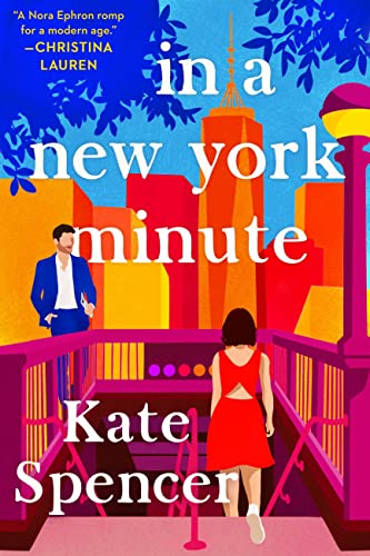
Cover illustration by Caitlin Sacks
Amanda: In a New York Minute got a cover redesign and I really like it
Sarah: Gorgeous colors!

Cover illustration by Leni Kauffman
Amanda: Love the hand holding while he draws
Elyse: Her hair and dress!
Sneezy: It looks so cozy and lovely!!
Sarah: This is a beautiful and very cozy image and I love it the more I look at it.
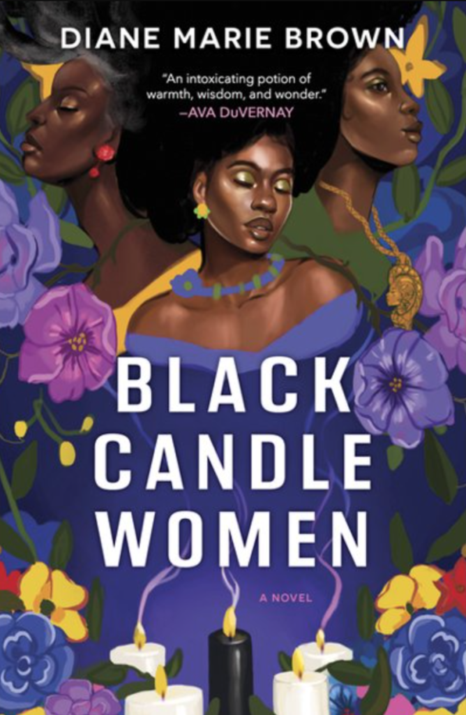
Amanda: I had to hunt for a version that doesn’t have that stupid “Read with Jenna” sticker because boy does that ruin this cover.
Sarah: Amanda! A border of stuff!
Love it. Especially the way their faces are highlighted.
Sneezy: I LOOOOOOVE how expressive and full of personality each face is!!!! It’s giving me the feeling that I’m seeing real people in a real moment, and I feel like the painterly style of the art adds to that.

Cover illustration by Camilla Gray
Carrie: This looks so colorful and fun and I love everything about it!
Elyse: I love his glasses.
Sarah: The color palette here is a whole entire vibe and a half, and really communicates a wild, colorful, over the top story.
Also her knife is bad ass.
Sneezy: I love the palette too!!!! Something about how bold and contrasting the colours are, plus the style of how the characters are drawn reminds me of Sixteen, the cartoon. *nostalgic Canadian sigh*

Happy sighs about all of these.
These kind of covers are the reason I can’t enter bookshops.
Deep and vibrant colours make me happy. I’d be drawn to these right away in a bookstore. Gorgeous covers.
Re: not wanting the “read with Jenna” sticker. I saw a company on insta a while back that makes stickers that match a book’s background image designed to go over those book club stickers!
Love the New York Minute cover redesign, but I ready that one a while ago and literally can’t remember a thing about it.
These are all so levely.
*lovely
Ooh, on the Black Candle Women, I spy some silver hair! That’s so rare on a book cover, and on top of all the lovely lush colors adds its own bit of elegance. Love it.
I love the colours, but the In A New York Minute cover makes the hair on the back of my neck stand up. Fully-clothed but slightly disheveled and possibly drunk male leering at scantily-clad female, who seems to be flinching away whilst stepping down into a grave-shaped subway stairwell populated with shadowy figures? Take the pretty colours away and it could illustrate a penny dreadful!
I understand sweetfa’s sentiment but don’t see that at all in the new cover of the Spencer book. He may be disheveled, but that’s the Brooklyn millennial male look for you (or, the variant, the Manhattan finance guy on his way home at the end of the workday). And she’s just trying to get down the stairs to the subway without tripping. I think this is a case of YMMV, with different readers seeing different things.
Not only are they all gorgeous, but each has a strong sense of place and hints at the mood of the story and even gives some idea of the plot!