Let’s look at some pretty covers, shall we?
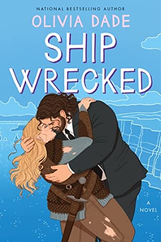
Cover design by Diahann Sturge
Shana: Oooh. Their outfits make me very curious about the story, and I love both the icebergs and the swooniness of it all.
Sneezy: It looks SO swoony!!!!
Sarah: I love how the references are obvious and familiar, and the people themselves make it new and different.
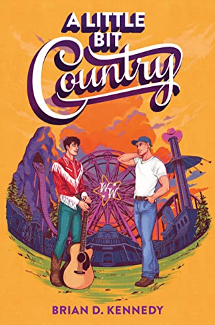
Amanda: This was mentioned in our comments by Penny!
Sarah: This illustrator is so talented. I keep finding little things to look closely at: the little heart card above their heads! The tiny door!
Shana: There’s so much movement! And I’m obsessed with her hair.
Sneezy: Gorgeous colours and clever use of the colour of light! I love the tone the illustrator managed to create here!
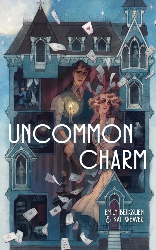
Cover designed by Stephanie Yang
Amanda: I love how pissed they all look
Tara: They are not here for anyone’s shit. I love it.
Amanda: “Uh…you interrupted our séance, you dipshit.”
Tara: I imagine they’d get along with the girls from Squad by Maggie Tokuda-Hall ( A | BN | K ).
Sarah: I definitely cannot sit with them and that’s okay.
Sneezy: Another cover with gorgeous use of colours and the colour of light! If I ever become an auntie, I hope my nibblings have friends just like them!
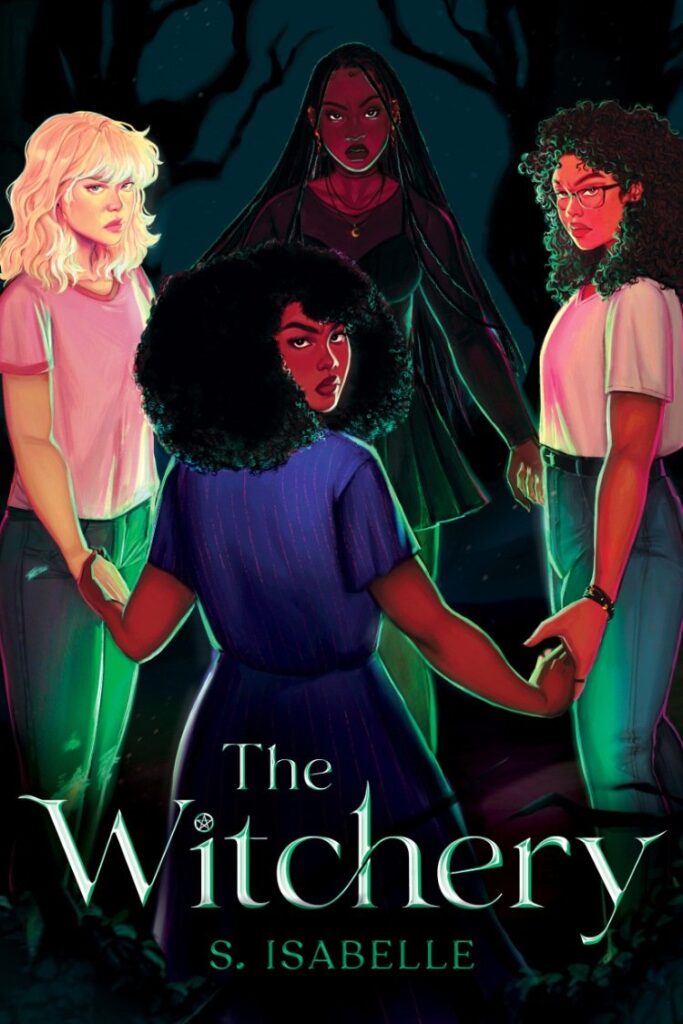
Cover illustration by Betsy Cola
Amanda: Definitely love all the detail and the sort of fish eye lens perspective.
Sarah: The colors and style remind me of older YA paperbacks from the 80s and I love it.
Shana: This makes me want to read the book, so mission accomplished!
Sneezy: The colours and perspective give the feeling of slight unreality and them being in their own world. I adore how romantic that feels!

Glad to see effort being put into covers again. Beats the usual wilting flower on a dark background covers we’ve had for like forever (thanks fifty shades!)
Please don’t stop the snark though!
I’m long over the heaving bosom covers. These are terrific . The effort by the artists is appreciated.
My favourite covers are on two non romance novels. I love the minimalist covers of Hench and Circe. Those two really appeal to me.
Has anyone read Uncommon Charm? I’ve had it on my TBR for ages but Amazon only has it for sale as a print book. I also don’t see a way to recommend the ebook for purchase at my library. Those authors are new to me but the book sounds and looks amazing!
Wait, does the Olivia Dade have a big hero?! I got so tired of big-girl romances where the hero has a honed six-pack.
the e-book is available through Neon Hemlock directly– if for some reason that doesn’t work for you, email me at emily.a.bergslien AT gmail and I’ll send you your format of choice. We will make it available via AMZ; I’ll bug the editor about that soon.
(anyone who wants a print copy: if you get it at Next Chapter Booksellers I draw a little spider in sparkly purple ink on the title page. listen. maybe this is an enticement for you)
Always glad to see Marlowe’s cover appreciated. Kat and I had a lot of latitude with who and what we wanted for the cover and they NAILED IT. I adore their work– please see also their cover for Ava Reid’s Juniper and Thorn!
@Tam, yes he is!
@Everyone… Consulting your creativity for a term (maybe there already is one?) for the illustrated covers that get so much understandable hate. I think I have never seen a photograph cover as good as the best illustrated ones, like these. But the trend that’s unpleasant is blah, generic, sketchy covers with a couple of little human figures on ’em, stiff poses and pastel colors, the stuff that insults the author when the publisher puts in minimum effort to say “this is a romcom everyone, what more do you want?” We need a term for THAT sort of illustrated cover so we don’t slander the good ones by just saying “illustrated.”
oh i’m a dink that’s meant to be a reply to tina re: uncommon charm. whatevys. hi all + thanks
@Vasha: I was calling them “clipart covers,” but The Youths apparently lack the necessary computer history for that to rouse the appropriate internal scream.
@ Emily Thank you for the information! It is a fabulous cover.
Charmed by the cover, charmed by the description of the story/characters, and charmed by the opportunity to get a sparkly purple spider (and I don’t even like spiders) so just bought Uncommon Charms through Next Chapter Booksellers. Now I eagerly await its arrival in the mail.
I loved Go, Went, Gone so also bought Jenny Erpenbeck’s memoir, but that’s a different genre entirely.
OMG I actually loved UNCOMMON CHARM as much as I loved the cover! It was fun and gothic and kinda surreal and I finished it in one sitting. Recommend! Also love Marlowe Lune’s patreon postcards, but I had to discontinue as I started grad school which is ridiculously expensive. I plan to re-up in a few years when I’m done with my grad program! But just FYI Marlowe’s postcards come with a wax seal that just gets me-I loved it for the few months I had it!
The cover of “Ship Wrecked” is the reason I pre-ordered the book without having read the previous two installments (and then ordering those too so I’ll have a matching set).