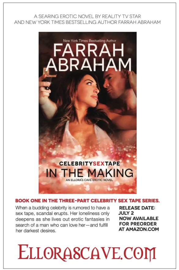
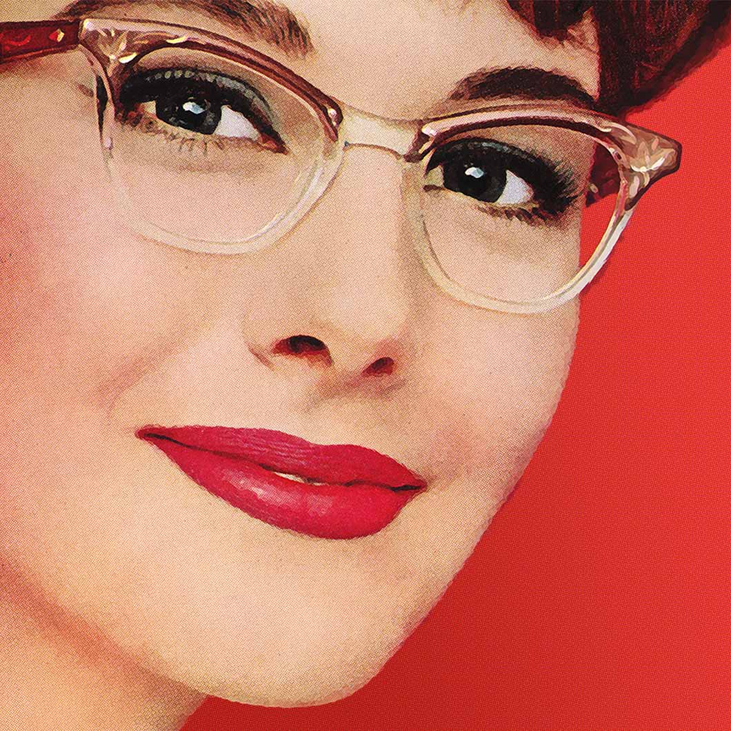
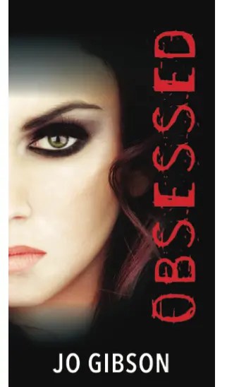
 In this week’s podcast episode, we’re looking at the advertisements and features inside the June 2014 issue of Romantic Times, aka RT Book Reviews.
We’ve got So Many Small Presses that no longer exist, plus some really, really weird feet.
Yup, feet!
You can also find all the RTRW content at our category page for Romantic Times Rewind.
And, most importantly, if you want to listen and follow along with this entry, we have more detail in the audio, but you can click play and listen and read and absorb all the visual goodness:
Let’s start with the cover:

Amanda and I had some questions about the physics? of this part of the image:

There had to have been something she was sitting on. Otherwise it doesn’t make sense.
And we won’t get started on the guy’s feet.

Or foot. I know it’s probably the distortion of the Photoshop and also the “water” but…ok, those are some long, long feet.
Is it the strength of his FEET that is holding him in this position? Like an L-bracket holding an Ikea bookshelf to the wall?
So many questions.
There was a full page of Top Picks in this issue, which I liked a lot:

The Editor’s Letter is once again a truly glorious treat:

I can’t fault the logic: if you live to 120 you will indeed have more time to read. No lies detected there.
That said, real butter has always been back. It never left. It’s like sexy. It neither left, nor came back. Butter and sexy are ever-present.
The ads for the RT Dallas 2015 Conference were very fun – this was Amanda’s first RT and it was an experience.

You MUST fill out a separate form for each proposal and do NOT submit the same workshop.
We chatted a lot about swag that we’d received at RT, and I mention this specifically:

Easily the greatest piece of author swag I have ever received. Farrah Rochon is a genius. I use it constantly.
I have a great deal of envy for this person’s smokey-eye.
I’d look absurd, and this person looks fabulous!
We also loved this letter from Snowhugs about the accessibility of the digital version of RT!

And the TWEET BEAT. Just reprinting tweets. We love it.

We found this full page ad delightful and also baffling.
What’s with the little white lines around each element? Weird, right?
But we both remembered Rebel Belle by Rachel Hawkins, and Anna and the French Kiss by Stephanie Perkins!
In late breaking news for the RT in New Orleans which was happening in May, the following authors had been added:

We talked a lot about the RT Book Reviews winners, and there are so many awards. SO MANY.
And the ads reminded Amanda of year book parent ads:

Wanda Brunstetter received a career achievement award, and in her full page ad, it says:

A tip of the hat to the copywriter because I’m still thinking about that first sentence.
We spent some time talking about Susan Mallery’s Fool’s Gold series, which does indeed have its own town website. If I’m remembering correctly, it was one of the first of its kind.
The one-page feature on Deeanne Gist’s Fair Play has an OUTSTANDING opening paragraph:

A massive round of applause to writer Tricia Carr for this profile. Well done!
I read Sparrow Hill Road by Seanan McGuire after the last round of RT Rewind, and I think this month’s selection should be Fair Play.
Amanda had a LOT to say about this cover placement for Huckleberry Summer and Simply Sinful:

And this model has the old Justin Bieber haircut!

Solved HaBO!!

A Silhouette from 1988 – and while I didn’t catch the title while we were recording, I have read this book and IT IS WORTH FINDING oh my goodness. Fever by Elizabeth Lowell is terrific. The new cover is very silly, however.
2014 marked the founding of 1001 Dark Nights, which is still going strong and one of our dedicated advertisers:

We also noticed this book on a full-page AllRomance eBooks ad:

SHINY!
If either of us had this cover quote, we would be putting that quote EV.ER.Y.WHERE.

Amanda calls the pose on the cover of A Promise of More an extra-large ‘Leave room for Jesus.’

We also discuss an ad for a digital press, now defunct, called Turquoise Morning that was (a) hosted on Blogger according to Absolute Write, and (b) Loooooooooooved some Scriptina.

So much Scriptina. So many questionable photo choices given the title. So much, so many. Such a time 2014 was.
The use of black and white ads was increased in this issue, which is kind of interesting, because the covers sort of blend:

I mean, look. Some of the covers are barely readable?

I thought we’d gotten away with Zero Scriptina, but nope, there are two Scriptina covers – No, three.
I mean, is it really a romance if you don’t use Scriptina?
Amanda is baffled by this one:

What does that MEAN?
Then there’s this truly incredible bit of text:

Come for the kerning errors, stay for the gender essentialism!
We talked a lot about Full Steam Ahead n the last episode, and we have a lot to say about the ad featuring the cover, too.
She does look a little like Frances McDormand, right? (I can’t embed a picture because most celeb photos are copyright to the photographer and it’s hard to tell which are usable in this context.)
Look at the smirk on that guy’s face. Obsessed with boilers indeed.
And yes, I would indeed wear every part of this outfit:

You would indeed spot me in the Aldi’s check out in that suit. Also, extremely high grade side eye happening there, too.
This one is questionable:

Sky Pilgrim!
I think this cover quote is going to battle the Dolly Parton cover quote for supreme cover quote because they’re both terrific.
![The ad for Fair Play by Deeanne Gist features a woman in a 1890s gown on a swing in front of a ferris wheel in the distance, and the quote is from Deanna Raybourn, and reads, [I] laughed so hard at their first full scene together I cried my mascara off.](https://i0.wp.com/smartbitchestrashybooks.com/WP/wp-content/uploads/2023/11/Screenshot-2023-10-17-at-4.05.23-PM-e1699305779260.png?resize=595%2C373&ssl=1)
And then, it’s time to discuss this airplane.
That plane is positioned in such a way that might possibly be suggestive, or perhaps outright phallic.
It’s coming out of his crotch pretty much. A tip of the hat to the designer. The plane has liftoff.
This cover from an ad from Marie Harte and Sourcebooks features a cover image that is really, really weird in the paperback format:
But the full image, which is visible on the audiobook cover, is not at all distracting:
Cropping, much like kerning, matters!
Neither of us were impressed with these covers:

but this author photo gave us SO MUCH JOY.
This ad from LooseId was more confusing than last time:

…as was this cover, from the top section!

Hay seems itchy, but the naked dude has given us some queries to ask.
And then…a full page EC ad.

That ship is AFTER YOU! RUN!

That hat is something, though.
Sage Publishing has an almost nipple cover, top left:

And then, there’s the Armageddon Mates:

Those look like images of someone trying to sleep with a back injury.
Amanda caught this ad – I missed this entirely!

The classifieds were Expensive! And you could get books on CD!

I haven’t heard back from the person selling all issues from 10 years ago. Oh, well.
And I misread this back cover ad:

I read the tagline as “A memoir more exciting than pizza.” Is there a memoir or any book more exciting than pizza? Probably not.


That LKH author photo has been the one I’ve pointed to whenever discussion turns to bad author photos. I can’t believe nobody told her how cheesy and desperate it looks. Also (more) evidence that Anita is a total Mary Sue for LKH.
Thanks for sharing all those pictures, Sarah. It’s fun to see specifically what you are talking about.