Come look at some awe-inspiring covers with us!
Carrie: Holy shit
Amanda: There are so many tiny details like the freckles
Tara: Yeah, that is gorgeous. I even like the shifting colours in the title.
Sarah: That is a wow cover. I said, out loud, “Wow.”
Amanda: I feel like this one is straight out of a Black Mirror episode and I am very much sold!
Sarah: covers have so much work to do at a glance and this one explains so much, it makes that work look effortless. And it’s really not.

Cover design by Diahann Sturge
Amanda: Best one in the series so far, IMO.
Tara: Oh yes, I agree. I was already excited for this book, but now I’m way more excited.
Sneezy: Cat. I see a cat.
Claudia: I’m loving all the covers with the blue/green/teal and orange/red combos.
Lara: I love it!
Amanda: I think when it comes to illustrated romance covers, I really love the ones that are detailed, where I can see distinct facial features and backgrounds and it creates a mood or sense of place. As opposed to just bright background and two faces or bodies.
Sarah: I love the plant details, and the texture of everything. Such a talented artist!

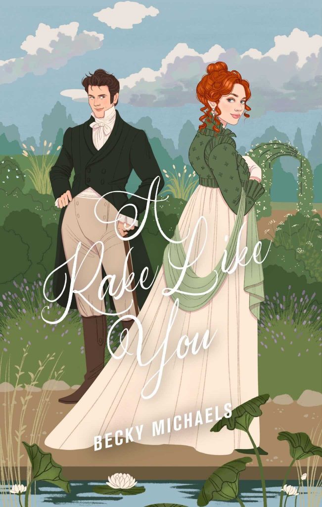
A Rake Like You might be one of the best illustrated covers I’ve seen! I definitely think it’s the best on a historical, because of the background details and facial expressions. Book 1 in the series is equally lovely and clever.
The only thing I don’t like about A Rake Like You is the color of the lettering. Not enough contrast. I don’t want to work to read the title, it ought to pop. It would have been lovely in a complementary shade of green.
I love the Bellefleur cover because of the two women leaning against each other. That says affection to me and trust, unlike clinch covers where one character is strangling the other. And while their arms are crossed, the attraction is certainly there.
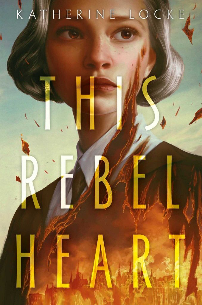
THIS REBEL HEART is simply perfect.
A Rake Like You simply blows me away. You seldom see a “cartoon” cover on a historical, and this is so well done, with all the detail both in the characters and in the background, it gives it the feel of a drawing or watercolor from the period. You can tell the art director respected that artwork too, since they didn’t cover anything up with bold fonts or a big title; only just enough to give you the info you need.
This Rebel Heart is set during and about the 1956 Hungarian Revolution??? Fucking. Sold. *adds to GR TBR list* That cover is amazing too.
‘Count Your Lucky Stars’ and ‘A Rake Like You’ is a tale of two illustrated covers, imo.
The former fits squarely in the field of the covers that are saturating the market, imo. It is on the higher end of nice because at least there is some definition to the art and they don’t look all blobby. But still it would not standout in a crowded field. My eye would still pass over it.
The latter, otoh, is very well done. It looks like the cover of a very high end graphic novel. It absolutely arrests my eye. The only thing that doesn’t quite work is the font. But the artwork is lovely.
The illustrated covers are so beautiful.
One pet peeve is people referring to illustrated covers as cartoons or comics. They aren’t.
See now this is why I love illustrated covers! Atmosphere, design, color palette, in short stylization — anything imagination can conjure for a suggestive hint at the contents of the book, enticingly pretty or enticingly sinister. But we’ve been just flooded with heart-sinkingly awful illustrated covers that are nothing but a stiff sketch, or look like a beginning comic-strip artist’s attempt at humor. I wouldn’t blame illustrated covers in principle for publishers’ unwillingness to put money and care into them, any more than photographic covers in principle can be blamed for all the bland or hideous examples of them.
@denise: good point. Cover art isn’t comics, what’s more comics aren’t necessarily comical, and aren’t necessarily trivial. Romances with illustrated covers are placed in the crosshairs of all sorts of contempt! Mis-marketed as “rom-coms,” disdained as feminine fluff, disdained as simple-minded comics…