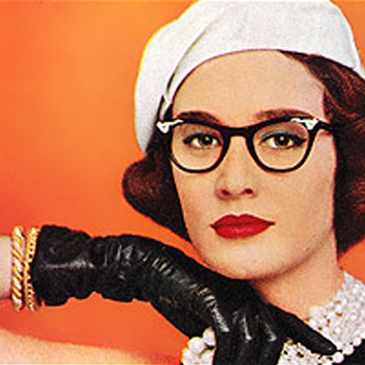
 Awhile back, I received the following email about a cover snark from 2010 titled Vintage Covers are Ready for their Close Ups:
Subject: The power of sexxy thumb-on-the-chin revealed….
Hi Sarah!
Came across your blog and had to laugh.
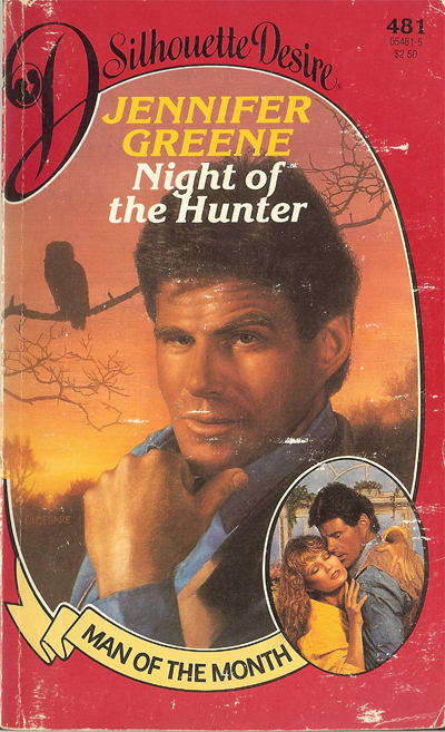
I'm the cover artist for Night of the Hunter, AKA “channeling-the-Hoff-with-the-sexy-thumb-on-the-chin” come hither look.
The comments are hilarious, and although I wasn't doing hallucinogenic drugs when I painted that, I'm sure I belted back a few shots of scotch during the process.
A little history:
It was the very first “man-of-the-month” cover that kicked off a series that ran for about 3 or 4 years if I remember correctly. It was directed by Shelly Cinnamon–yes, that was her real name–and she was an outstanding art director for Harlequin during the mid to late 80's.
Back at that time, the process was to photograph the models and create an oil painting from the photographs. Photoshop wasn't on the market, or if it was, it was in its infancy and very limited.
The models were shot by a photographer that I used all the time, his name was Michel LeGrou of Media Photo Group in NYC, and although I can't remember the name of the models, the guy DID look like David Hasselhoff with bed-head hair! (Wondering why I didn't fix that in the painting…oh well…too late now)
I'm sure I have the original painting somewhere in my garage storage along with the rest of my old work. BTW, I did over 200 romance covers from 1984-1998, and I promise they were not all that bad…some were a lot worse!
🙂
Thanks for keeping the work alive and having a great sense of humor!
Have fun and keep bloggin,
Joe DiCesare
You know I wrote back, right? OF COURSE I DID. Because AWESOME! Mr. DiCesare was nice enough to answer all my really nosy questions, so I hope you enjoy this educational and eye-candy filled trip down romance cover memory lane.
Sarah: For the covers, I'm really curious how you got started doing cover illustrations.
Joe: When I was an art student at Pratt Institute, Charles Gehm was one of my instructors. He was a wonderful Paperback artist and an excellent teacher as well. At the time, in the early eighties, he was known for creating almost all of the Danielle Steel covers for Dell.
These were especially clean and elegant, featuring a small image of a couple in an embrace along with some well-designed jewelry or flowers. The covers were beautifully painted and they presented a photo-realistic style that I could latch onto as a young illustration student. I knew that was what I wanted to do!
Charlie took me under his wing, and shared all the details of the creative process for creating a romance novel cover. I soaked it all up and followed every bit of his advice. He was fantastic, encouraging, offered firm criticism and great influence. He helped guide me with my final portfolio and by the time I graduated in 1984, I was doing portfolio “drop-offs” with all the major publishers in New York.
I was lucky enough to land my first job one month after I graduated; with a cover for Scholastic Books that featured two kids in front of a haunted house. When I turned it in, the art director David Tommasino liked it so much he assigned me six more covers on the spot! Well, that's proof that it only takes one lucky break, and I was in the right place at the right time.
After that, it was a bit easier to get work with the other publishers, because I had some real published work to show. There were a lot of Young Adult books being published in the mid 80's, and a lot of category romance as well. Many illustrators specialized in both genres, so it was a natural progression for me to take on romance cover assignments in addition to my Young Adult work. It wasn't long before I was working on Dell's Candlelight Ecstasy series and many Harlequin series, including Silhouette Desire, Man-of-the-Month, American Romance, and Harlequin Intrigues.
Sarah: What cover portraits were memorable for you? Are there some that stand out?
Joe: Probably the most memorable assignment I had was in that first batch of six covers I did for Scholastic, three of the assignments were a trio of covers for the Collier Brothers books–starting with My Brother Sam is Dead, followed by The Bloody Country and The Winter Hero. I was 22 when I created those covers and Brother Sam is still in print today, so it's easy for me to remember much of the process. I designed all three covers together, and each featured the main character with a montage of scenes from the book along the side of the design. Each one was slightly different, but had a similar composition.


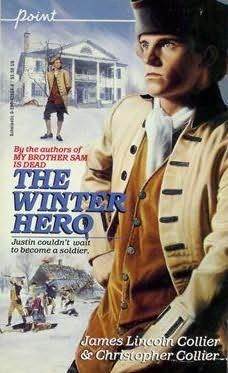
I remember getting all the costumes together; revolutionary war uniforms and clothing styles from the1770's. I shot all three covers at once to save some money, since the costumes and props were so elaborate. It was so early in my career, I must admit that I was a little overwhelmed, but I was determined to do a bit more than the standard cover of the young hero fighting in the war-torn fields. I wanted to focus on the main characters, since they were each so strongly depicted in the context of the novels.
I still look back at those covers with some fondness, although they technically show that I was young, and had lots to learn ahead as an artist!
Sarah: What was the process of creating a cover?
Joe: All of my covers were done as photo-realistic oil paintings and they were scanned or photographed for the printing process. I was only responsible for the image, the Art Directors created the title text and general layout of the final cover. I was usually given a story fact sheet with the exact requirements of the cover, the look of the characters, and locations.
I then assembled my research reference materials to match the story and the scene I was illustrating for the book. I always used professional models and a photographer to shoot my reference. I used Michel Legrou, owner of Media Photo Group, and he is one of the best photographers for romance! After shooting the models in the photo studio, I edited all the photos down to a final pose that fit the story.
Using the photographs, I created a black and white pencil sketch with lots of detail to show the layout, design, and pose of the purposed cover. After the sketch was approved by the Art Director, I had the sketch photographed, and the reference slides printed out to full color prints. I transferred my approved sketch to the final canvas, and sometimes did an under-painting in a warm monotone to start my painting.
Finally, I was ready to start painting the final artwork, usually taking about a week to complete the final oil painting. I can remember carrying many wet paintings on the crowded subways of New York as I was delivering the art to the client!
Sarah: I find the changing images on romance covers fascinating. In the years you were working on cover art, did you notice any changes or trends?
Joe: Yeah, there were many trends that came and went over the years! I can remember a long run of male heroes portrayed as cowboys or mountain men. Another trend was the female heroine as a bride, complete with wedding gown, veil, and bridal nosegay. I think the most unusual, if not short-lived ideas was showing the heroine pregnant with child! And let's not forget the poses with a dominant heroine versus a passive hero, that was always a favorite.
However, with all these trends the one constant factor in every cover was the publisher’s commitment to research what their readers wanted to see. We took great care in matching the cover images to the stories that the readers themselves wanted to experience and read about. I never forgot that I was creating a cover that would spark the imagination of the reader, and my goal was to keep it as realistic as possible. I always tried to make the characters and situations believable. When I look back over my work, I can see my own artistic trends and styles that have stayed constant. I typically used warm earth tones with some cool accent colors to offset the warmth. I created nearly 200 covers over my career, and each one was a learning experience–I never took the work for granted.
Today of course, the covers are created in Photoshop and it's a completely different way of working from the days of oil paint and canvas. I left the romance field in 1998 to pursue a career as a Digital Artist for motion pictures, and so I lost touch with paperback publishing over the many years. Although now, I must admit I miss the cover work, and I often think of going back to book illustration someday. I would be interested to see just how I might approach a cover with my computer skills, and how my film career might influence my thought process. I know I will always work to create something of visual interest to somehow connect with the viewer. After all, that's the fun of being an artist!
Sarah: Can you tell us about what you do now, and how your skills from cover design transferred into digital design?
Joe: I'm enjoying my career as a matte painter in the motion picture industry.
Matte painting is the time-honored technique of painting in the backgrounds and other environmental elements that would be too costly and prohibitive to build on the set. The emerald city in The Wizard Of Oz was a matte painting, and so was Tara in Gone With The Wind. I could endlessly list shots throughout the history of film that use the technique. It truly is movie magic.
Since my painting style is photorealistic, it was an easy transition for me to move to visual effects and computer animated feature film.
Digital matte painting uses the same concepts as traditional matte painting, but the computer allows for more camera movement and better blending of painted elements with live action. Most of my work is painted in Photoshop and then applied to 3D geometry using high-end software packages like Maya, Nuke, and Cinema4D. If I've done my job well, you'll never know you're looking at a painting. My work appears in Shrek, The Polar Express, Superman Returns, Spiderman 3 and many other films. I'm currently working on the sequel to How To Train Your Dragon for DreamWorks, which will be released next summer.
Thanks Sarah for the opportunity to share my story with you. It's been so nice for me to take a trip down memory lane with some of these vintage covers!
Thank you to Joe for being so patient with my endless questions!
Joe was kind enough to share some his artwork from his romance cover portfolio. Do you remember any of these covers?

Ann Major, The Goodbye Child. Silhouette, 1991.

Tess Mallory, Jewels of Time. Loveswept, 1998.

Karen Leabo, Man Overboard. Silhouette, 1995.

Ana Leigh, Proud Pillars Rising. Leisure, 1991.


Saranne Dawson, A Talent for Love. Harlequin, 1990.

Beverly Bird, To Love a Stranger. Silhouette, 1988.

Connie Harwell, Texas Woman. Leisure, 1991

Helen Conrad, Wild Temptation. Dell, 1986.

Wow! What a wonderful feature to wake to this morning. Not only is Joe’s career interesting but the amount of thought and commitment to each book that went into each cover is readily apparent. Thank you both!
This is one of the most interesting interviews I’ve read in a long time! This really shows that art is art, no matter what method you choose to express it. Joe, your work is beautiful. Matte painting is difficult, and impressive, because it’s the art of illusion – even with Photoshop, etc. there must be challenges to that line of work. I can’t say I recognize any of the covers, but I love that Joe has come forward to be interviewed and share his vast knowledge with all of us!
Such an interesting post – I had to pop by and thank you. Fascinating! I had always wondered how the painted covers were done…and now I know. Thanks for featuring Joe and giving us a glimpse into a cover artist’s world.
I definitely remember that Beverly Bird! I probably cracked the cover on all those Silhouettes, but I had a fondness for her back in the day.
I have to say that I’ve always been a big fan of matte artists. I think people might be surprised by how much of what they see in a movie is actually painted. I remember watching a making of “Star Wars” that featured some of the matte painting used and thinking all those sets I painted in high school were like a kindergardener’s drawings.
Thanks for inviting Joe over to play.
This interview was FABULOUS! So interesting! It also confirms suspicions I always had about the process. There’s a Johanna Lindsey (one of her westerns?) with a cover model who is obviously Fabio with black hair. If you looked closely, you see that the tips of his luxuriously flowing mane were still blonde, like some poor shmoe had painted him as was and then had to change it to match the book.
Thanks for the great article.
What a great interview. I definitely remember seeing his last name signed on some of the covers of the old categories I used to read, but never knew anything about who the artist really was. Really interesting, and glad to hear he’s found continued success. The cover of A Talent for Love is one I particularly remember—so beautiful. I’m not sure I ever read the book, but I think I held on to a copy I bought in a box of used books just because I liked the cover so much.
This has to go down as my favorite interview on this site. Obviously, a kind and sensitive man who puts a great deal of thought in his work, in whatever media he’s working. The only thing I found negative is that the interview came to an end. Thanks for posting.
Awesome interview! Thanks to Mr. DiCesare for sharing such a fascinating story!
I am pretty sure I read Texas Woman, obviously because I couldn’t resist the cover. I have a Swiss cheese memory, but that cover to me says biking through the midwest circa 1993, it says epic flooding, Salvation Army store, 25 cents…I think I read that in a tent with a headlamp, and it was absurd and I loved it. I’m going to have to hunt it down and find out.
Fantastic, fascinating interview. Thank you.
I had both THE GOODBYE CHILD and MY BROTHER SAM IS DEAD with those covers! And I still think the Goodbye Child model is a sexy hunk! HE has that Pierce Bronson chin thing going and is not prettied-up jailbait.
That was a great interview. I loved reading about how covers were painted and what he does now. Thanks to both of you.
What a great interview! I’d love to hear more about how Romance publishing works today as well as more stories from Mr. DiCesare. It would also be awesome to see some of the actual oils he did. Any chance of a follow-up with him? Thanks Sarah!
“Proud Pillars Rising”? Not even subtle. LOL
Seriously – this interview was so cool and informative. I’m sorry to have come of age in a time where actually painting the covers is a thing of the past.
Very interesting! I recognize most of those covers. Thanks for sharing and making me smile on a Wednesday-behaving-like-a-Monday. And while I know that Night of the Hunter has an easily mocked cover, the story itself will go down as one of my all-time favorites. I wish they’d reissue it in e-format.
What a fabulous interview, and great images! Thanks so much, Mr. DiCesare, for sharing your work and insight with us.
I used to read a lot of Silhouette Desires, so The Night of the Hunter definitely looks familiar, as well as the Beverly Bird book. Having an attractive and eye catching cover performs a vital function, because it helps me to remember if I’ve read the book or not! Even decades later I sometimes spot a familiar cover in a used book store and can immediately recall the story. I like Mr. DiCesare’s artwork, because the human figures are properly proportioned and not performing any impossible contortions. The 3 Revolutionary War ones are especially good, but the Texas Woman is making me a bit nervous, I’m afraid she’s about to roll over onto a cactus.
HA! Not only do I remember some of those covers, I still own about half of them. LOL Night of the Hunter, btw, is a FANTASTIC book. Loved it. Angsty secret agent hero. Mmmm.
I just wanted to add, in a slightly off-topic way, that the daughter of some family friends of mine attended Pratt Institute on a full scholarship, and afterwards went into a career as a tattoo artist. For those who don’t know, Pratt is a top notch school, and it was not what her parents had in mind for her, but it’s actually quite a lucrative profession. So you never know where your art will lead you!
Loved this! He should totally put the originals up for auction. What amazing collector’s items!
Thanks, Joe!
Very interesting interview. I’ve always wondered how it was done, and now I know. This is the kind of thing I like to read about how this cultural product (romance novels) is made. I’ve always loved that style that I call ‘vintage covers’, now I Know they are oil pictures and how they are made.
Thank you Mr. DiCesare for your beautiful work. You have no idea how many lives you’ve touched. I love reading in any form but when I look at my long list of digital books, I have trouble remembering what they are about without the cover art to trigger my memory.
Thanks for the great interview.
I know they get snarked on a lot, but I miss the old Silhouette/Harlequin covers from the late 80s/early 90s. They are some of all time favorites. I have a bunch of those Man of the Month titles on my keeper shelf including the Jennifer Greene.
I don’t recall any of the romance but I definitely remember My Brother Sam is Dead. I recall checking it out of the library when I was in 5th grade. And now I have to track down the sequels because that was before the internet.
Wonderful interview, what fun! Joe DiCesare is a good sport as well as a good painter.
I thought the art in the first “How to Train your Dragon” was spectacular and will pay close attention to the sequel.
Cover art in general … there was a particular artist working on Signet Regencies, who I now discover was Allen Kass, and those covers were really appealing to me. Another artist (Francis Marshall … thank you Internet) worked on Barbara Cartland romances (which one of my grandmothers read by the dozen, so of course I did too when I visited) and the covers were just divine. A good cover is so important to a book.
Mr. DiCesare’s Revolutionary War YA books were gorgeous.
Awesome interview—I definitely have a few of those books 🙂 Thanks to Mr. DiCesare and Sarah for a great feature today!
Thank you both for a really interesting interview. I think that you should come back into book illustration, Joe, if only to “mend” the process because too often these days the characters on the cover are not at all like those in the book. With your experience you could tell the publishers where they’re going wrong!
Seriously, your covers are amazing and so is your work on films. Thank you for sharing the details.
Thank you Sarah, and a heartfelt thanks to all the readers here!
What a special honor it is for me to see such nice comments!
Joe
What a great interview! Thanks to Mr. DiCesare for sharing. I loved seeing all those old covers.