
Can you feel the excitement as we reveal the cover of Susanna Kearsley’s upcoming Bellewether?
Her previous covers have a similar look. They remind me of a whimsical, old photo, but this new cover is a big departure.
Interested in the upcoming Bellewether or haven’t heard about it yet? Here’s the plot synopsis:
“The house, when I first saw it, seemed intent on guarding what it knew; but we all learned, by the end of it, that secrets aren’t such easy things to keep.”
It’s late summer, war is raging, and families are torn apart by divided loyalties and deadly secrets. In this complex and dangerous time, a young French Canadian lieutenant is captured and billeted with a Long Island family, an unwilling and unwelcome guest. As he begins to pitch in with the never-ending household tasks and farm chores, Jean-Philippe de Sabran finds himself drawn to the daughter of the house. Slowly, Lydia Wilde comes to lean on Jean-Philippe, true soldier and gentleman, until their lives become inextricably intertwined. Legend has it that the forbidden love between Jean-Philippe and Lydia ended tragically, but centuries later, the clues they left behind slowly unveil the true story.
Part history, part romance, and all kinds of magic, Susanna Kearsley’s latest masterpiece will draw you in and never let you go, even long after you’ve closed the last page.
The book was due out in October 2018, but Sourcebooks Landmark has bumped up the release to August 7th! Yay!
Now let’s hear a drumroll for the cover.
Are you ready?
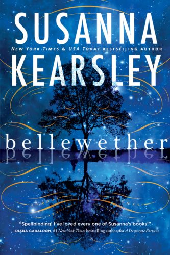
What do you think? I personally think it’s quite eye-catching. I know I’d pick it up in a store if I saw it.
As a bonus, Kearsley dropped by the Sourcebooks offices and did a video with the cover designer, Art Director Adrienne Krogh, about the process of creating something new.
Sarah: I LOVE this video. With all the discussion online and off about cover art and the process of cover development, listening to Susanna interview the designer and art director is (for me) the best part of this reveal.
Excited for Bellewether? What are your thoughts on the cover design? Let us know!

It’s pretty but I like the matching covers. Goodreads shows a “burnt corners” style cover for the Canadian edition so, I don’t know. This cover reminds me of a newer Alice Hoffman cover or something. It’s very of the current [magical] women’s fiction cover styles.
It is pretty, though.
Susanna Kearsley is one of my favorite authors, and I am ecstatic about a new book so the cover could be old brown paper and I would be picking it up. She is the reason I realized I had always been reading romance even before I started reading Romance.
While I do really like this one, I adore the matching styles of her previous releases so it’s a tough call for me.
Ahhhhh so gorgeous! I really love it.
(But just a quick note – I think there’s a typo in the spelling of the title throughout this post? On the cover, it’s “Bellewether” not “Belleweather.”)
I love it! Something about her previous (matching) covers hasn’t done it for me. Side note: it reminds me, in the best possible way, of the in-color kindle opening screen when I open as an app on my tablet. I adore that logo, so I absolutely mean this as praise.
It’s beautiful.
It’s not the aesthetic I associate with her brand (The Winter Sea is one of my favorite covers ever!) but I like it. It reminds me of Kiersten White’s stunning The Chaos of Stars cover. The colors are beautiful.
Which war does the synopsis refer to?
I noticed the title is spelled wrong as well although the cover itself is lovely. The war is the French/British/Indian war of approx 1759-62 I believe, across the border of what is now Canada and the US. United Empire Loyalists etc
I dunno. I do like the woo-woo factor on a cover when that’s the content. But I also like the consistency of her previous covers. They say “Kearsley” to me, and brand isn’t something we necessarily want to sacrifice, is it? Needless to say, I pre-ordered as soon as that option was available. Glad to see they’ve pushed the US release forward; I wasn’t anticipating waiting that long.
@Stephanie: OOPS. My bad! I entirely missed that – corrected, with apologies.
It is pretty, but I think I would have to buy the Canadian cover because, as others have said, the dreamy burnts corners look is her brand; I see a cover like that, I know it’s Susanna Kearsley. I also prefer covers that tell me something about the contents, and swirly tree just doesn’t tell me anything.
Beautiful, but almost YA or middle grade feeling to me. Not romance.
@Laurie: Thanks very much. I realised it was ‘historical’ and in North America, but apart from that, no clue.
Google: Bellwether – 3,500,000 results.
Bellewether – 49K results (most of them pertaining to this book)
The cover makes my brain hurt, the giant misspelled word on the front just makes it look self-published. I realize it may be a proper name or some other alteration of the original word, but nobody glancing at the cover knows that.
If it were spelled the usual way, the cover would be a bit busy, but nice.
It’s beautiful but kind of generic — it could be the cover for any of thousands of books in multiple genres. It doesn’t make me want to buy the book, because it doesn’t give me any clues as to what it’s about.
I am super excited for this book. She is one of my very favorite authors, and a book from her is always a big treat. I think the cover is lovely, but I admit that I prefer the previous look. Still, I’m not the reader they are trying to pul in with a cover — I was already going to buy this as soon as it’s released, and on the Kindle I pay very little (as in no) attention to covers.
Thanks for the news on possible early release!!
Good point about the cover being less (or not at all) important for Kindle buyers. I don’t pay much attention to covers. I don’t even pay much attention to titles. Sometimes I don’t even remember the title or the author, because I don’t have the reinforcement of seeing them the way I would when I pick up and hold a physical book. And don’t get me started on audiobooks. I listened to a four-book series on audio, loved it, and now can’t remember the name of the series, the titles of any of the books or the author. I even mentioned them in a comment on SBTB that I also can’t remember. I’m hoping some identifier pops into my brain before I embarrass myself for going to HaBO for a book I “read” last month!
A beautiful cover, and, like all Susanna’s books, I’m sure I’ll love it.
I think it’s beautiful and a nice departure from the typical romance cover. It looks similar to Nalini Singh’s Allegiance of Honor to me.
It’s a beautiful cover, though it says A Wrinkle in Time more than something I would picture coming from Susanna Kearsley. But maybe that’s meant to indicate this book is venturing into new territory, as it were?
One issue I have is that the note at the bottom implies that Diana Gabaldon was the author of A Desperate Fortune
Boring Cover! I love the Canadian cover though!
You can solve the problem of never seeing covers (nor interior illustrations) on your Kindle by getting the Kindle free reading apps from Amazon. These work on computers, tablets or smart phones.
Instead of the simple text list, the App gives you thumbnails of the covers. The list of covers can be sorted by recent purchases, authors or titles. The size of the covers and text is limited by the size of the screen you’re viewing with.
Beautiful cover! I’d definitely pick this up in a bookstore. Can’t wait to read her new book.
Not seeing the cover on the Kindle is not a problem. Not remembering the title and author of a book because it’s not visually reinforced is a minor annoyance. I sometimes read my Kindle books on my phone, tablet or computer — one reason I have a tablet is to read books and magazines with illustrations — but the regular Kindle is a superior reading device you’ll pry from my cold, dead hands. I actually have a “back-up” Kindle because I take my Kindle everywhere and occasionally leave it somewhere (I’m on my eighth: three lost, three broke/died, the one I’m using and the back-up).
What I really should do is keep track of my books on goodreads. Unfortunately, the audiobooks I can’t remember were borrowed during my “Romance Unlimited” trial and aren’t listed in my Audible library (unlike my Kindle Unlimited books, which are all listed on Amazon).
It looks like a throwback to the original covers from her late 90s titles. I like it.
Gorgeous cover!! It would definitely catch my eye. Looks like a great read!
I love the Canadian cover & was hoping for the same or something similar. Regardless I was thrilled to finally pre-order my copy from Amazon earlier this week. Can’t wait to read this.
Breathtaking! So fresh and magical- I would definitely purchase if I came across this in store!
Love the cover! This would definitely catch my eye and make me read the back!!
Love the new cover! It makes me excited to read the book. Love the change!
The title is listed in amazon as Bellewether. Since a “wether” is a castrated ram and “belle” is a feminine adjective, my brain is stuttering. And why would a romance involve a castration? What, do you suppose, is the actual title?
LeslieAnn, apparently that is the title. And I have the same problems with it. I think it’s a bad idea to have a title that (a) looks like a misprint, or (b) doesn’t really say anything about the book. So basically, a lovely but not genre-specific cover with a title that says nothing about the book. Not good, no matter how aesthetically pleasing it is. Apparently people who are familiar with the author already like it. But as someone not familiar with the author, the title is annoying enough that I’d probably pass on it as “a book that’s probably going to annoy me.”
That is: once I’m in nitpicking mode I find it very hard to get out of it.
I feel like the only one who likes the title, but I’ve been fascinated by the concept of a bellwether – in its metaphorical sense of a leader or trendsetter – since reading Connie Willis’s fabulously convoluted and inventive sci-fi romance novella of the same name. (Which reminds me: time for a Willis re-read!) The unusual spelling seems like some literary or historical puzzle of the kind that Kearsley does really well: I look forward to finding out its significance.
Somehow, this definition makes it even worse:
Bellwether – Wikipedia
https://en.wikipedia.org/wiki/Bellwether
A bellwether is one that leads or indicates trends; a trendsetter. The term is derived from the Middle English bellewether and refers to the practice of placing a bell around the neck of a castrated ram (a wether) leading the flock of sheep.