 Every now and again I get finished copies of books, which is nifty, especially now that hard copies come with colorful treatments on the edges, or embossing and foil on the covers.
But I kept seeing this one book on my desk out of the corner of my eye and had to look again to remember which of the Fuchsia Pink Contemporaries it was. It kept giving me a double-take because there have been so many Fuchsia Pink Contemporaries!
Which got me thinking.
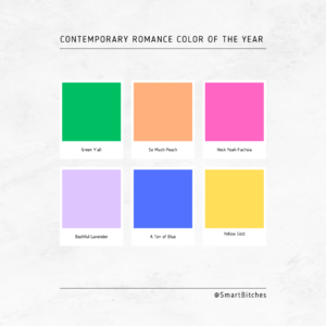
I think we need to declare a Contemporary Romance Color of the Year.
Pantone picks a color of the year, and there’s been mountains of research into how one color trend moves from industry to industry, like interiors and wall colors to automotive paint, for example. Color is an integral part of branding and iconography, and certainly some colors would lend themselves more to one genre over another.
There are now color schemes that I mentally associate entirely with one genre.
For example: if you are writing suspense, well, Suspense is Blue and Gold.
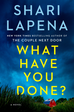
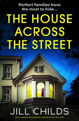
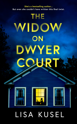
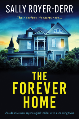
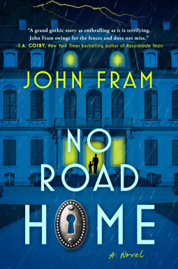
See what I mean? This was only a sampling of all the Suspense is Blue and Gold cover designs I spotted.
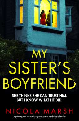
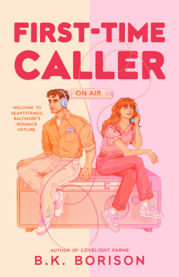
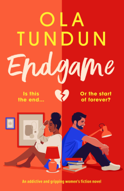
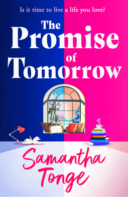
I also noticed this trend, which doesn’t quite qualify as a single color, but is definitely a repeating motif, one which I’m calling Split Down the Middle:
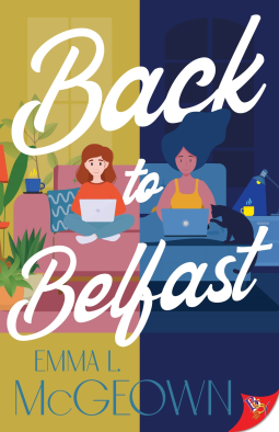

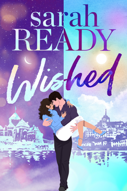
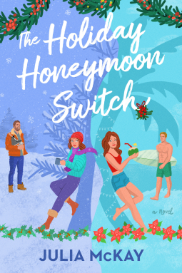
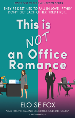
Unrelated: it’s probably not a great thing that my brain loves patterns SO much because this is the result.
Also: I am not, like, REALLY not good at spotting AI covers. Like Katee Robert said in a podcast interview with me, it’s like trying to spot the fae and I’m very unskilled at it. So if you recognize one of these covers as AI, please know that I’m not trying to celebrate AI art or promote it or anything like that.
Patterns, though? I’m extremely good at spotting those, as you’ll see in the next few weeks. I’ve got quite a collection of covers sorted by color, and it is QUITE a competition for Contemporary Romance Color of the Year.
I’ll be posting collections of covers as entries in the competition in the coming weeks here and on social media (you can follow us on Facebook, Instagram, Xitter, and BluSky) and then we’ll vote on which one you think is THE Color of Contemporary Romance for 2024.
Can you guess what the leading color contenders are? What colors have you spotted most on Contemporary Romance?

I love this post! I response to colors and patterns, so I’m excited to see what you share, Sarah. .
Ooh I’m excited to see where this goes! My TBR/read suggests blue is a strong contender this year, but I’ve also seen pink and yellow.
It’s not just colours, it’s fonts too.
I can spot a suspense or contemporary/rom-com just by the lettering.
@hng23 – OH YES, fonts and type treatments galore. Covers today remind me a lot of how many covers back when digital books were a new thing featured Scriptina everywhere. SO MUCH SCRIPTINA.
@Nicolette – You have excellent suggestions!
@Stefka – I’m so glad I’m not alone in having a brain that loves color and pattern!
I love this. I’m such a color nerd. Every year, I wait with bated breath every year to see what the Fiesta (dishware) color of the year is.It usually comes out in the early part of the year, early March at the latest. I have even paid attention to what the Pantone color in an attempt to guess what the Fiesta color is ahead of time, they seem to often overlap by a year or two, but there’s no direct correlation.
The Fiesta color this year is a very, very pale light blue they call sky. Very pretty, but not one I see a lot on romance book covers. The only one I can think of is the Lucy Score book, THINGS WE NEVER GOT OVER. Even that is a little darker than the Fiesta color. I wonder if it’s a color that picks up dirt and fingerprints quickly, so it isn’t used often for physical book covers. . .
I love this idea! I can’t wait to see what you find. From gut feel, I’d say pink and yellow, but I could be completely wrong.
I am laughing because just yesterday I was helping a patron pick out books and explaining that Yes Actually You Can Judge A Book By It’s Cover, That’s What Publisher’s Marketing Departments Are Paid For
I love this idea! I respond very strongly to color, especially after spending so many years in an industry where matching decor trends and colors was SO IMPORTANT. As Design Director part of my job was to keep abreast of places like Bed Bath and Beyond and Linens and Things to see what was popular especially in kitchen linens, bed linens, and living room upholstery and accents, since that was where many of our stitched designs were going to end up. I imagine book designers and marketers must have to do something similar.
Pink has been popular for book covers in general this summer. I work in a public library and the new books display usually has a few books on each shelf displayed face out. I was bored one night, and I think I found a pink or related color book for each shelf, in all genres, even non-fiction. We were very color coordinated for a day or two!
Contemporaries aren’t my strongest point, but this idea is fascinating, and i felt compelled to go look and guess. I feel like there’s a subtrend in color too, so it may depend on what gets published the most this year?
riches/big cities/workplace/career theme (Sports stars, office settings, business travel, doctors) are having a lot of light blue, light teal, very Elsa look
vacation/small town/weddings/neighbors/rural are pinks, usually a mix of Sunset pinks: one super light and one intense.
opposites/rivals/wacky hijinks (getting close to suspence, but lighter and more comedic) have lots of bright Yellow, i felt like there were fewer of these though.
I feel like there are color trends with fantasy romances too. Lots of black, red and purple
I’m not up on the color trends but am here for posts about cover colors!
That thriller blue/gold combo has a long history in Gothics and the like, going back at least as far as the Nancy Drew covers. Those thriller covers don’t thrill me that much, but their ancestors are among my favorite things. I imagine the colors are meant to evoke the “distant light or lit window in the night” motif, which (as you can see above) they’re still often paired with.
Yeah, my money is on pink. The contemporaries all seem to be pink cartoon covers right now.
I’ve definitely noticed the split down the middle style. I thought it was really clever and interesting on the first few I noticed, but wow, some of those examples are really meh.
I’ve also noticed a lot of BOLD colors on contemporary covers recently, competing with the soft pastels.
I love this post! Studying covers and how they copy each other, or make drastic change, is so fascinating. I’ve been watching my fantasy romance shelf slowly transform from dark blues and black to lighter colors (mostly purple) as cozy fantasy romance takes off.
Based on my most recent contemporary romance reads, I’d guess blue with an “opposing” font color of red/pink/orange.
I’m looking forward to more cover collections!