
TW/CW: I have some startling news. I request that you hold on to your butt and possibly fetch your blood pressure medication if necessary.
Harlequin is releasing a hardcover of Heated Rivalry in September – a special edition of a book that is doing moderately well right now in terms of sales and borrows. LOL.
This is the cover.
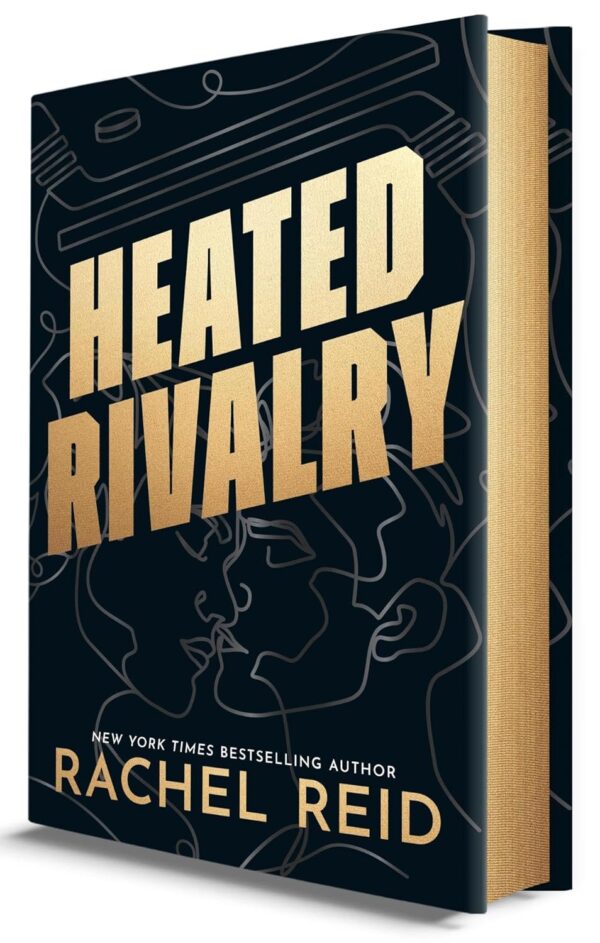
Y’all.
Y’all, what is this.
Are those…robots? Robots and some hockey sticks?
I ranted about this on Bluesky because my own blood pressure was about to max out and my Losartan was about to rise up out of the bottle and slap me into next week.
My head is tilted so far my cranium is about to bounce down the hall like a macabre cat toy.
This is embarrassing. The secondhand embarrassment is measurable on multiple scales, including the one in my bathroom. WAHT IS THIS.
Is this an AI textbook? Heated Rivalry: AI vs. Humanity?
Why are they robots? Which one is Ilya?
Why is this the cover image? Why is one of the hottest properties adapted into one of The Hottest Shows Ever being released in hardcover with…line robots?
I cannot get over the TRON of it all.
My nature is of course to question myself: maybe I’m not the intended audience? Maybe this doesn’t appeal to me for reasons I won’t understand.
But for WHOMST is this? To what readership does this appeal?
And, again, how is there not a tie-in cover? You know, just one image featuring those two people who portrayed two random bland ass characters that absolutely no one is writing Tumblr posts and AO3 fic by the metric ton about?
What is happening?!?!?!
If I had to sum up in one image:
So I ask you: what genre do you think this is? If you’d never heard of Heated Rivalry, what kind of book would you think this was?
Nonfiction? Corporate spy thriller? AI textbook?

What the etch-a-sketch?
Did they think they were cooking with this? This isn’t cooked. This is some ingredients left on the counter until they came up to room temperature.
Justice for the beloved and beloathed Cover Snark-ees, at least it’s (usually) clear who they’re attempting (and failing) to target
Looks like a thriller in which an ex-cop/soldier gets caught up in spy shit with a technological angle. Did they accidentally post an image from the designer’s “in the style of other genres” loosening-up exercise?
I hate it. Harlequin continues to fumble *everything* related to HR….
If I didn’t know this was about hockey, I would definitely think this was a love story of an android and a person.
This is a nonfiction book about the tech industry about the scandalous (abusive) relationship between a tech executive, who read Murderbot too often, and an ai robot.
This is a book about an anthropologist (character emerging from the spine of the book) who is putting together an ancient skull.
This 100% is a romance novel from the Blade Runner universe (futuristic noir) and features two androids dreaming of electric hockey sticks.
This is a cover of a book no one wants to read.
Harlequin should apologize to Rachel Reid.
Well, Ilya is Russian so maybe it’s meant as a tribute to Soviet Propaganda Art except you can’t lift the pencil/pen/stylus from the drawing except to draw a puck at the end.
The only thing I can think of as to why there isn’t a tie-in cover is that they don’t want to pay the actors (or won’t pay them enough) to use their faces. Because this is just ridiculous at this point.
A plain, black cover with a foiled title and edges would be miles better than this monstrosity.
My work bestie and I were hypothesizing that they went with this design hoping it would appeal to more general/literary readers and not romance readers, because the design is so overshadowed by the title font that it’s almost background noise to the title and author name. AGAIN: Harlequin NOT catering to their audience (AKA ROMANCE READERS).
I’m really really REALLY annoyed at how Harlequin keeps fumbling the puck when it comes to this series.
Not giving us a full run of photo cover mass market paperbacks when they could have – RUDE.
Doing deluxe paperbacks (in September) with sprayed edges and they claim something is different about the cover art, but I don’t see it. Again, not giving us what we asked for.
Mother Rachel said she’s been asking for tv tie-in covers, just like the rest of us, and that Harlequin has them in the works, but let’s be real: they have promo photos that were shot for the series. How hard is it for them to be able to get the rights to reproduce that art for the books? I can’t think it’s THAT difficult.
I mean, as if Hudson and Connor WOULDN’T want to be on the book cover. Hudson would want to show off his “9 lbs of clappable material” (that man is absolutely unhinged and I love him for it), and they have too much love and respect for Rachel and the fans and THE ROMANCE GENRE itself to ever deny us a good tie-in cover. This is 100% on Harlequin.
Harlequin hates making money, apparently. They need to stop trying to appeal to non-romance readers and just GIVE US WHAT WE WANT. The book doesn’t need to be “elevated”. It IS ALREADY. It’s amazing and perfect and I can’t tear myself away from the series or AO3 long enough to do or think about anything else.
It looks like Space ghosts with antlers. So maybe a science fiction shifter ghost story?
Wow. Talk about a missed opportunity. What on earth is this blandness? I would not be willing to spend money on this in print. Bleh.
This, folks, is what is known as backlash avoidance, AKA Obedience In Advance. They’re trying to sneak this book past the MAGA homophobes without attracting their attention. Literally Nothing To See Here.
Confusing. lol.
We know we need a collector’s book, but we don’t want it banned, so we’ll confuse everyone.
This cover would not even attract a second glance so I definitely wouldn’t buy the book.
@EC Spurlock
Thou hast said it. Hiding from the book burners and it’s already too late. Fucking go big or go home.
Sci-fi retelling of Song of Achilles (which I would totally read btw), and if such a book existed, it’s still an unforgivable cover.
In talking with another friend about it, she said “Yeah I agree it’s more manly… but it’s not good. It’s a feelings book, it needs a feelings cover. This looks cold and sterile like we’re going to be discussing sociology.”
Yes. Exactly.
@PamG: “Go big or go home”, indeed. Unless you’re living under a rock at this point (basically), chances are you’ve heard of HR and everyone knows it’s “the gay hockey show” (I’m not going to drag out my soap box and rant about people who call it that participating in the erasure of our bisexual consent king Ilya Rozanov and how we don’t do bi erasure in this house).
They should embrace it and be unapologetic: THE queer hockey romance is here, get over it.
monograph in science and technology studies. perhaps a serious scholarly study of how humans interact with AI bots. the author gave the designer a brief that was nonsensical and she did the best she could to come up with something “conceptual” that didn’t involve paying for cover art.
@kimalah1 nailed it, definitely getting flashbacks of Socialist-Realism-style Government Approved Art (that my parents emigrated away from… sigh)
Alternate book title:
We, Robots, Boldly Go Into Glorious Soviet Future
…Someone please come up with a good “in Soviet Russia” joke. All I got is “In Soviet Russia, hockey plays YOU” and it’s not quite hitting the spot.
I’m getting Tron mainly but also some Atlas Shrugged vibes. I glance at this and think: scifi with a side of libertarian propaganda. It just screams not for me.
To be fair, I don’t loathe the cover with every fiber of my being, so much as I find it bafflingly unrelated to the book. I have definitely seen worse covers, and I have always hated a screen tie-in cover, and have no love for the cartoony cover I vaguely recall it having in the first place. I am certainly open to hearing what on earth the designers had in mind, genuinely curious what they had to say about it.
A Pygmalion retelling about an incel who builds a robot boyfriend and teaches it how to be exactly what he wants, until it gains enough sentience to set out for a better life.
This is the cover for slash fiction of Jude Law in Gattaca making out with Jude Law in AI.
No one impulse buys a hardback these days, and the audience they imagine which is like “oh no, people can’t see me ENJOYING HOCKEY SMUT” will read it as an ebook so that no one else will know, they will never be buying the fancy hardback book to display on a shelf.
@Escapeologist “In Soviet Russia, hockey puck shoot YOU.”
“In Soviet Russia, gay hockey romance read YOU.”
What caught my attention is the line art of what looks like a gun on top. Definitely an AI spycop drama about a guy/robot with split personality.
I love the original cover, from before the cartoons took over the series. It somehow conveys both the emotional heat and the sporting rivalry while leaving the reader to imagine Ilya and Shane for themselves. That one still appears in my kindle library on all my devices, although for some reason the later books have switched to cartoon covers everywhere except on my actual kindle. Ancient technology has its advantages sometimes.
I’m thinking, Do androids dream of electric hockey players? Horrible cover.
At my local bookstore they pile the popular books on a couple of tables. One of the tables is candy colored romantic comedies and the other table always brings to mind Tolkien “We like the dark,” said all the dwarves. “Dark for dark business!” Which is a roundabout way of saying that in the context of current marketing trends, even the color choices for this cover send the wrong message about what the book is about. I’m assuming that they believe the book is popular enough that it can take that kind of risk, but it’s weird.
@oceanjasper: YES, thank you! I love the OG photo covers, too. They definitely did a better job of communicating the heat level in these books and also made space for the heavier subject matter around mental health issues and other stuff that crops up in the series that just isn’t conveyed in some Instagrammable cartoon cover. I will never not resent that Harlequin never made half the books in the series in the mass market format. (I’m also annoyed at myself for not buying “Game Changer” in mmpb to complete that format as best I could when I could have, because secondhand copies are now stupid expensive. I did buy HR and TLG in mmpb because Shane and Ilya are my beloved idiot babies and I need them in every format.)
I haven’t heard about it, and it looks like sci-fi to me.
The art style used for the kiss art is VERY similar to a range of image components available on Canva. Like, if you search “kiss line drawing” there, I quickly get some options with this general look. I’m not saying “this was made with pre-made Canva graphics,” but I am definitely saying, “I think this was chosen to imitate the same trend, or may even be the work of the same artist.”
This definitely makes me glad I went for the special edition hardcover although I might pick this up and try my hand at designing my own dust jacket for it depending. I have some ideas already but I am by no means an expert cover designer, I just know what I would like.
Oh wait to amend my prior comment this *is* the special edition? I dunno why but I thought the cover was different when I preordered it….
Eh… I’m not mad at it but I think I’ll flex my muscles and learn about cover design and see if I can have fun with a new dust jacket. At least those are pretty replaceable (although I’ll keep this one in storage)