
I’ve been talking about writing this post for months, ever since I started saving cover art and realized I’d ended up with more than 30 different covers.
So you know how there are a lot of romances that look very similar to one another? There’s the two people facing each other with something in the middle illustration, the two people standing with their backs to each other illustration, the – you get the point.
My point is, successful styles for cover art can begin echo one another across publishers, and branding for one author can become branding for a genre. This happened with Twilight, and with 50 Shades of Grey, too.
Remember these?
Remember all this cover art?


Books published in the same genre began to shift the marketing and cover art to align with the biggest title.
So, let’s talk about mystery! You know, since this is a mystery website and all.
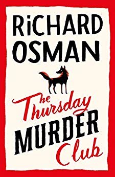
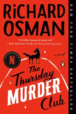
I’m presuming you’re familiar with The Thursday Murder Club by Richard Osman, yes?
(I’m also presuming you have seen the trailer for the upcoming Netflix adaptation, but that’s not why we’re here.)
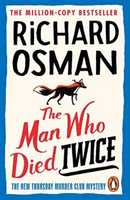
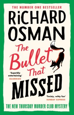
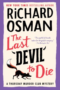
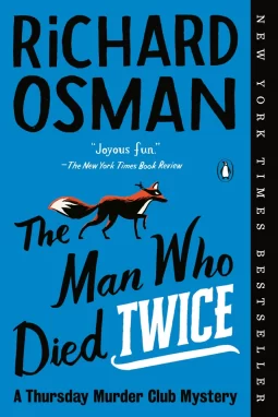
There’s also the sequels:
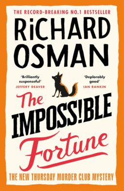
The Imposs!ble Fortune is out in September.
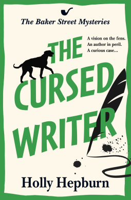
You’re seeing the pattern, here, right? Excellent branding, no question. The stark contrast, minimal illustration, slanted letters, and type treatment are consistent and identifiable at a glance.
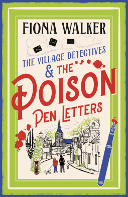
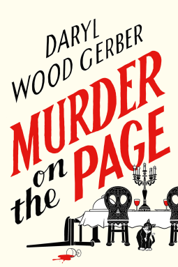
But, have you noticed HOW MANY BOOK COVERS ARE IN OSMAN STYLE NOW?!
Like, seriously. SO MANY.
I’d look at NetGalley every so often and find 12 more. So I decided to post them all, because what was the point of collecting Osman Covers if I didn’t show them to someone?
Get ready.
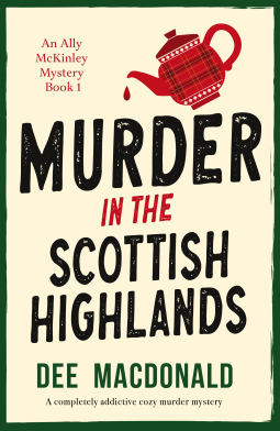
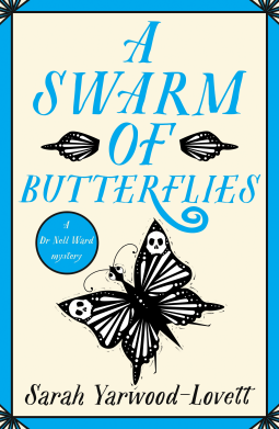
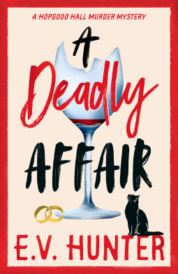
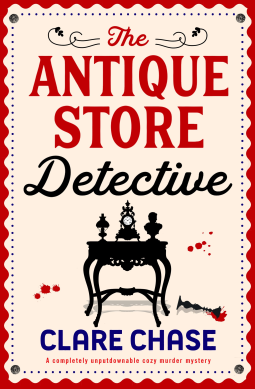
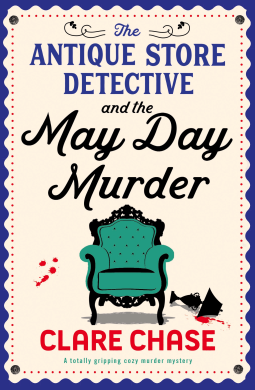
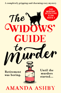
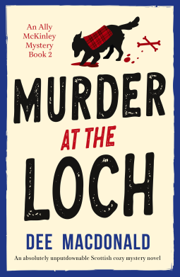
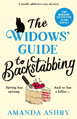
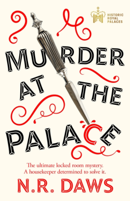
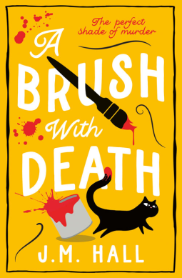
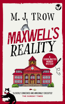
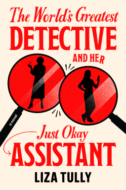
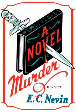
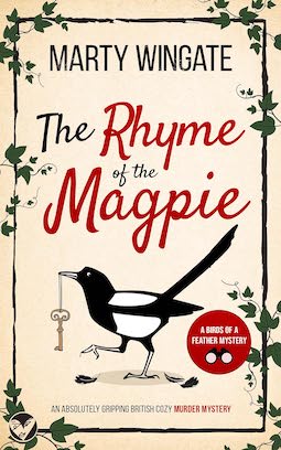
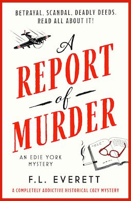
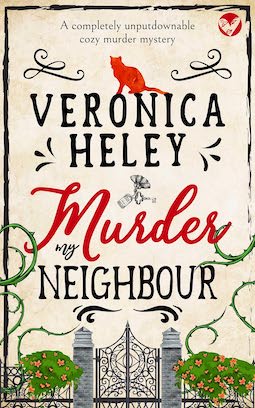
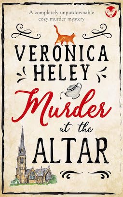
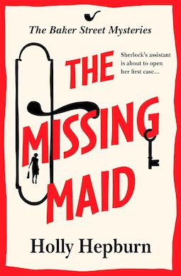
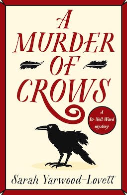
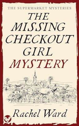
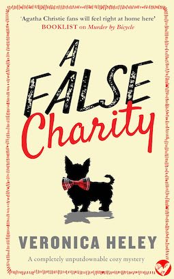
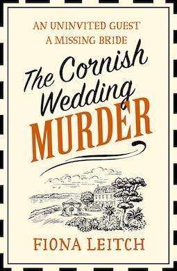
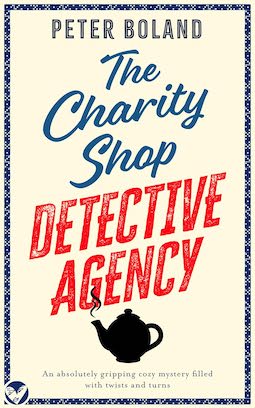
So, do you see the pattern? No? Well, that’s the end of my file until I collect more!
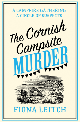
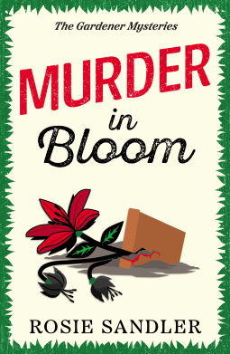
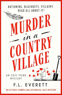
It seems to me that if someone is writing cozy mysteries, possibly set in the UK, the cover motif is SET.
How soon until this is a Canva template? Think it’ll be called “Cozy Osman?” Cream background, border, black motif, red text, possibly slanted. Done!
And – oh, ho ho, the Osman books are getting new covers!
Goodness me, I can’t imagine why there would be new covers. What a mystery about a mystery!
Have you noticed any Osman Covers? What’s your reaction to all this?
There’s also Janice Hallett and Faith Martin’s book covers. Very much in this style. I find this cover style is very prevalent in Kindle Unlimited books. I assume b/c it’s cheap and easy to make and very easy to understand even in a tiny thumbnail.
I’ll be honest, it’s very repetitive, but I also kind of like it B/c it’ tells me a few things 1) It’s a mystery on the cozy side. 2) it’s not set in the US. US set cozy mysteries need to have cats and dogs and balls of yarn. maybe some food and books. All it a very colorful palette.
I really only like cozy in an non US setting so it works for me as a way to separate what I want to read. Now, I will say Sarah Yarwood-Lovett is not quite traditional cozy (there’s always more action at the end) and Janice Hallett writes more dark comedy mystery one offs than “cozy.” But I still have enjoyed them both. If authors start using it for US set books, it will cease to be useful for me, personally.
The Retired Assassin’s Guide to Country Gardening: A New Zealand Paranormal Cozy Mystery by Kuttner has a cover in this style.
There’s a lot of books out there and being able to easily judge them by their covers is useful. Maybe not fair or completely accurate, but useful.
The mystery covers make me feel comfortable – that sounds a little silly. But I know immediately that I won’t know details about a corpse that I visual over and again and might keep me awake when I’m trying to fall asleep. I think branding like this is helpful for sales too, it’s like gas stations, the more there are, the better for everyone.
I noticed the plethora of 50SoG-like covers about ten years ago when I was working at a library. I can really respect when an author gets so big, they set the tone.
One issue that might arise, as it often does with marketing trends, is if it gets used for books outside the expected. There’s no rule that says books with these covers must fit a certain definition, so I can imagine the pushback and broken expectations of it got used for a grittier mystery
I’m on the opposite end of the spectrum. I find copy-cat covers boring and repetitive and it makes me wonder if the same is true of the content.
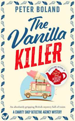
I discovered the Charity Shop Detective series because of the covers. I’m enjoying the series very much!
I think similar covers is very much a cozy mystery thing. They all look similar & welcome Readers in.
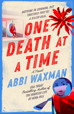
ONE DEATH AT A TIME by Abbi Waxman is not cozy or UK-set, so I was surprised at its cover. But I loved these characters, this book and would read it no matter what was on the front. Highly recommended.
@Sandra: I also find these copy-cat covers “boring and repetitive” and I’ll add “lazy,” too. I don’t mind so much with non-romance books since I don’t collect them anyway (just read from the library), but I really hate it with romance books. The worst, as I’ve said before, is the current prevalence of cartoon covers. They “might” be okay on a closed-door romance but they’re turning up on open-door books, too, and I’ve had several authors in their newsletters warn readers that the book is steamy in spite of the cover. It’s a form of censorship in my opinion, whether it’s external or internal. I’m a grown-up and I don’t believe adults or children will be harmed by a shirtless man on a cover. I live in Florida and shirtless men are all over the place and somehow we have all survived.
When the covers and fonts are in a trend, the publisher is counting on you to mistakenly buy the wrong book a few times, and those sales add up.
I’ve been burned by this cover trend. I enjoy Fiona Leitch’s series, and I’ve found a few other good reads by investigating books with similar covers, but I’ve also found some real stinkers that were either just not good or had significantly non-cozy content. Also, I thought Leitch’s covers were much cuter before they were redone in this style…
I’ve definitely seen this kind of cover, including at least one of the ones above, in my also boughts/recommendations. I’ve tried a couple but found them not much like Osmond.
Still, I can understand the temptation. I have a mystery series with Tule Publishing where I’ve gotten tons of compliments on the covers, but sales aren’t where they should be based on comp titles and reviews, so there’s some talk of new covers. Originality doesn’t sell as well as the copycats do.
One trend I’ve noticed recently (on my library’s website) is that large print editions sometimes have a different cover. For example, flirting lessons by Jasmine Gulliroy or Swept Away by Beth O Leary had pretty different covers for the North American large print editions.
Well, you interesting habit of collecting similar book cover has saved me time looking up cozy murder mysteries to read. THANK YOU! I’ll let you know which I enjoyed. Please continue with the NetGalley searching. My geeky heart is squeaking!
I think I remember reading an article about cover design – I think it was on Reedsy – where they upheld the Osman covers as examples of brilliant design. So is it any wonder that this style was copied by indie authors (and others), especially as it’s so easy to DIY?