
Welcome back to Cover Snark!
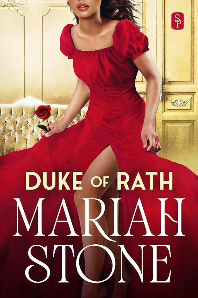
Amanda: Is she poopin?
Elyse: The moment you realize it wasn’t just a fart.
Sarah: That’s what the rose is for. She might need a few more for poo-pourri purposes.
(Also, hand to heaven, if you have to share a bathroom, especially while traveling, Poo-Pourri works REALLY well.)

Elyse: I hope that’s a typo.
Sarah: $10 says the title came first and the book was built around it.
Elyse: Did a 12 year old boy come up with it?
I’m all for a good double entendres but lord.
Maya: So is the pitch she’s a grieving widow and he has priapism?
Sarah: If it lasts longer than three chapters, please call your doctor.

From PamG: It’s definitely not the original nor illustrated, but it’s all kindsa ugly. Looks like a gruesome assemblage of body parts in a puddle of blood. It’s pretty repellent to me.
Sarah: Are they melting? Too close to the space heater? Sunbathing on a volcano that woke up? What on earth?
Amanda: Is Before Girl like a timeframe indicator like BC and AD?
Sarah: Judging by the cover, it marks the start of catastrophic global warming.
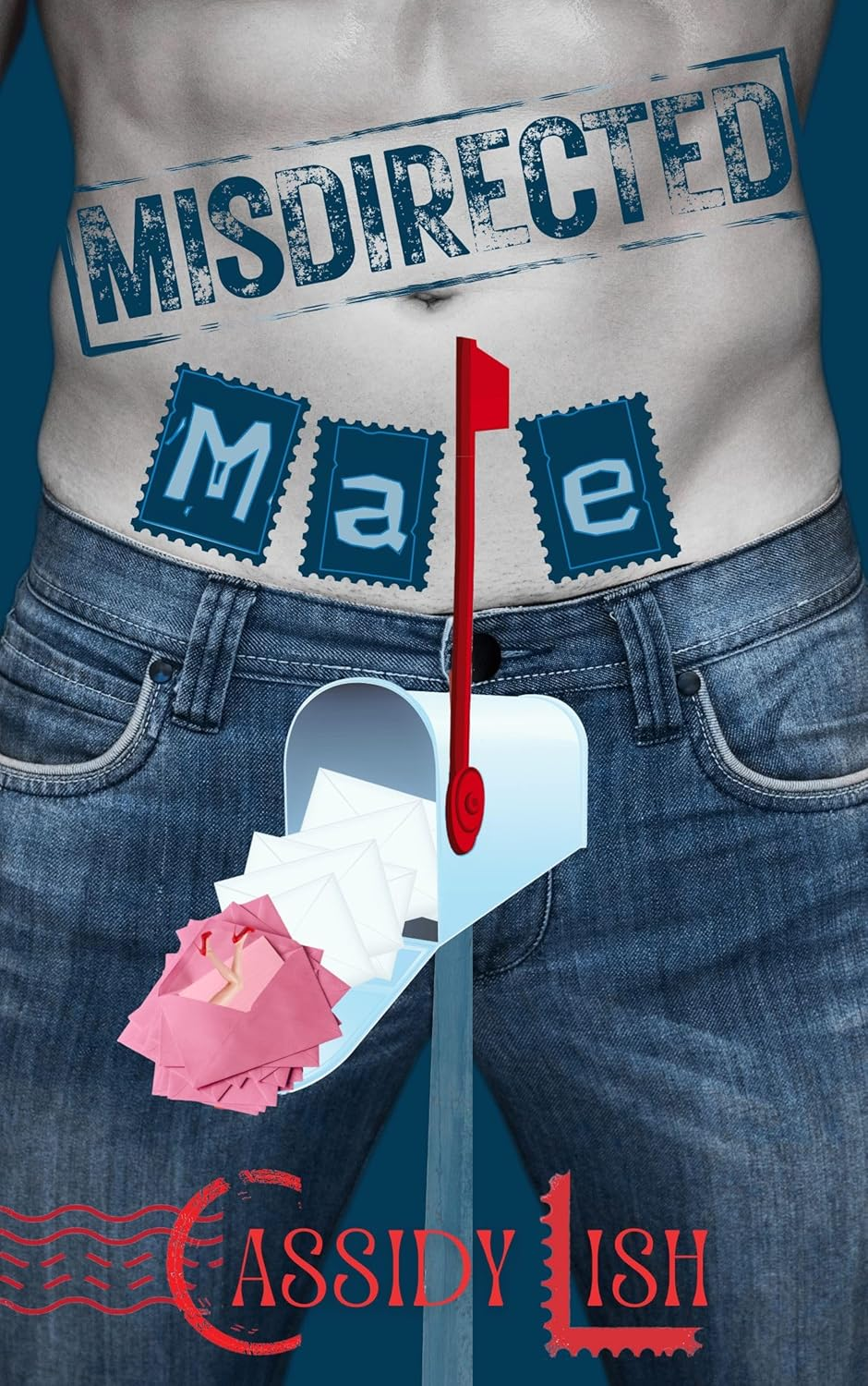
From Leslie: Misdirected Mae? And why is the guy dead? At least, his torso is dead. Maybe what is in his pants (or in the mailbox) is not dead. Hard to say.
Sarah: I can’t believe I’m typing these words, but: the mailbox penis is not subtle.
Amanda: I thought that was a stack of maxi pads at first.
Tara: My first thought was “dick in a (mail)box.”
Sarah: If step one is to cut a hole in the (mail)box, and step two is to put your dick in that (mail)box, is step three a visit from the postmaster general?
The first thing I thought when I saw the DOR cover was “ Did she just shart?”
I’ll never unsee that.
i’m with Amanda – my first thought on BG was that this was Adam before Eve. “No girl – Adam smell armpit and take nap”.
MOURNING WOOD: Seems to imply the “wood” is caused by mourning. Is that one of the 5 stages of grief?
MISDIRECTED MALE: The upright mailbox flag looks like a dick symbol, so does the mailbox (referencing sleezy “I’ve got something for you right here” lines), so do we have dueling dick substitutes? Also, what does “misdirected male” mean? Is he lost? Making his “deliveries” to the wrong place?
Talk about a complete 180, the cover of Mourning Wood is now completely different. When will this illustrated cartoon cover trend?
No one going to question the title on #1, given that Rath and Wrath are not the same? (I did just check online to see if I was just not recognizing a common alternate spelling or something).
I enjoyed reading Before Girl but don’t recall time spent on a beach. Now I’ll have to go back and check my memory. I thought Kate Canterbary would have enough authorial clout to get a better cover.
My guess is the Duke of Rath owns a ham factory and just walked in after slaughtering a pig. Enough to discompose anyone.
What is Mourning Wood resting his head on? A rock? A skull?
Before Girl: “This is how I looked before my transition. Unfortunately the doctor doing my bottom surgery got carried away and Frankensteined me. Without anesthesia.”
I actually like the cover of “Before Girl.” Besides my oft-expressed appreciation for shirtless men, I really like that he has a smile on his face and that we can see his face (or at least a lot of it). I know I’m in the minority these days. I also know I’m in the minority in my extreme dislike of current cover trends. Cartoons and abstract drawings tell me exactly nothing about the content–in fact, one author in her newsletter said to ignore the cartoon cover and promised the book was actually steamy.
Misdirected Ma(l)e is pretty awful for the most part, especially with the mailbox/flag confusion. However, I can still pause and appreciate what they did with the initials of the author’s name. If they’d kept to that rather than messing about with the not very subtle dick references, it could have been a good cover.
I suggest a swarm of termites for Mourning Wood. Very sad termites.
@LML I think that’s a rumpled white bedsheet the man is lying on in the cover of Before Girl. I just reread it and enjoyed it, but can confirm there is no beach scene.
@JoanneBB: Probably not what they meant, but “rath” is another name for Irish early medieval ringforts.
From beginning to end, I have but one thought: Is this Mismatched Fonts Week?
Misdirected Mail? What a missed opportunity of a title. It could have been titled “Coming Postal,” in homage/satire to Sir Terry Pratchett’s book.