Welcome back to Cover Snark!
Amanda: Ow my eyeballs
Tara: Even he’s looking away from it
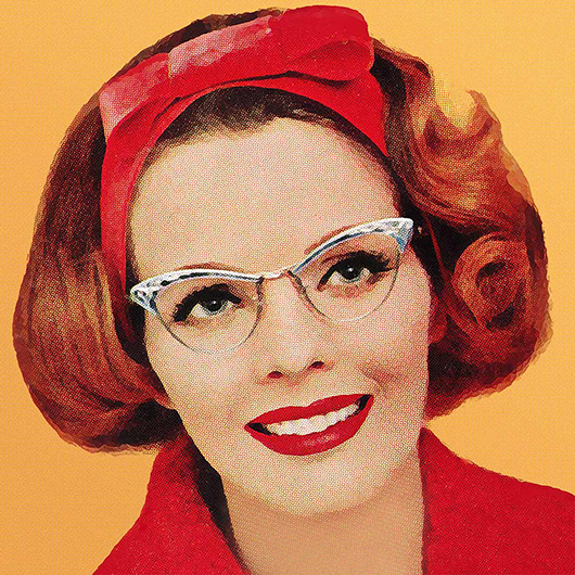
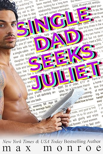
Sarah: Individual Sarah Seeks Eye Doctor Appointment.
Those words are appearing on my lids when I close my eyes. It’s like staring at the sun.
Sneezy: I thought we were friends.
Elyse: I’m sorry, the what??
Sarah: What.
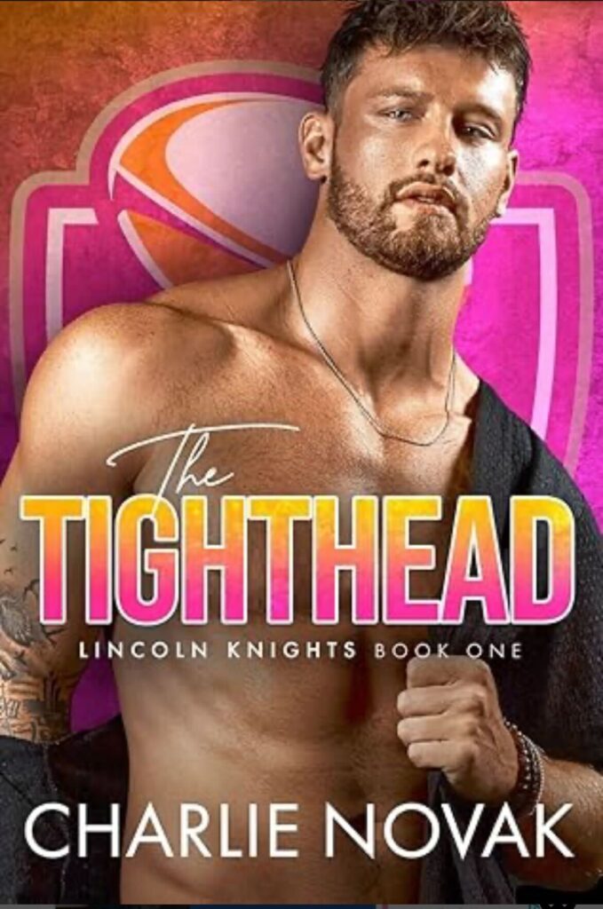
Amanda: Did they misspell tight end?
Update: That is a rugby ball not a football and tightheads are a rugby position. The more you know!
Sarah: I’m kind of enchanted that the rugby team logo is in Dunkin Donuts colors. Are the Lincoln Knights sponsored by Dunkin?
Sneezy: The shadows almost make the cover look like it has bisexual lighting. Maybe Dunkin is bi too.
Sarah: I cannot stop laughing.
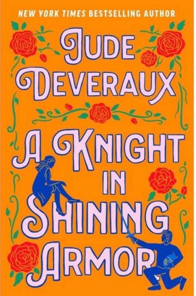
Amanda: This feels like a very specific shade of 1970s orange.
Sarah: It’s so funny.
A very clear case of “this may be a book you remember with fondness, but this cover is not aimed at you.”
Tara: That’s exactly what it is! It made me raise an eyebrow.
Sarah: Like a high school theatre production poster.
Sneezy: I had a questionable beverage that colour once, probably.
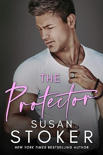
From Kathleen: What is his face doing? The expression, is he in pain or upset? Please advise!
Sarah: The dog farted. And those things, they don’t break up or dissipate. They hang like a noxious cloud visiting each person, and the cloud just reached him. There is no escape from dog fart cloud.
Also I thought at first glance that it said “The Profecfor.”
Sneezy: Maybe there’s a smol scent spritz thing in his necklace that was supposed to fight the cloud but made it worse.

Re rugby: there is also a loosehead prop, which sounds messier.
Someone needs to write a romance set in the world of cricket, as I feel there’s potential in several of the fielding positions such as long on, or fly slip. Perhaps less so for square leg or silly mid-on. But you have to respect a game that has built-in tea breaks.
I have eaten in restaurants with aesthetic themes similar to that Jude Deveraux cover.
Single Dad Seeks Welder’s Goggles: Ouch indeed. Ordinarily, photoreactive epilepsy is only triggered by flashing lights, but I do believe they’ve found a single-frame versuib.
The WTFhead: Is rugby another of those sports, like hockey, where the players periodically take time off from their pursuit of a round object to engage in some spontaneous fisticuffs? That certainly seems to be what the cover model is planning.
A Knight in Eye-Watering Armor: How disappointing. With a different color palette, this could have been featured on Cover Awe instead.
The Missing Eye Protector: Eye injury, or attempts to avert same, does seem to be a theme this week. Was it planned that way?
I’ve noticed that Jude Deveraux’s new book has kind of a “romantasy”-looking cover. Which makes sense, since it’s a fantasy kind of romance. It just doesn’t register as Jude Deveraux to me on sight, which is really important with these established authors. Her name is much smaller and on the bottom of the cover, rather than big letters at the top.
That orange KISA cover is giving 70s, for sure. I think I’ll keep my special edition hardcover and my dreamy, flowy dress trade paperback versions, rather than have my retinas burned out by looking at that orange. I know they’re trying to hop on the Instagrammable bus, but it’s so orange that even the white letters of the title look orange!
* version (baaaad fingers!)
Does the younger generation even know about newspaper personal ads…? It seems like such a dated reference at this point.
The Tighthead looks like he has overindulged in the Devil’s Lettuce and is waiting for Taco Bell to open.
KISA was the first time travel romance novel that I read. Probably early 1990’s. This cover is a travesty. It really looks like the cover of A Daughter of Fair Verona by Christina Dodd.
re KISA (warning–I’m going to be cranky): I really despise the cartoon trend, especially for older romances and their authors that I know and love. I honestly feel that the new covers diminish the books by making them seem like light-hearted, maybe rom-com (not saying anything bad about rom-com because right now I need light-hearted fiction a lot), even when the book is not actually fluffy. It makes me wonder about who is making these re-covering decisions and what they’re really saying about adult readers. And, to those who say, “well, this is what’s selling,” I say “if there isn’t any other choice, then of course it’s what’s selling.” I’m to the point that if I don’t recognize the author, I won’t even click on a book with a cartoon cover so it’s an automatic “no sale.” If I do recognize the author, I still might ignore it since I dislike the covers so much I do not want to reward them with a sale. (Told you I was going to be cranky. But I’ll stop now even though there’s more to say.)
After regaining my sight due to the Juliet cover,all I want to ask is who thought that it was a good idea to make one of my first and fondly remembered romances look like a cartoony needlepoint cover?
Like WHY? It’s like a Whitman’s Sampler book cover.
The rugby one looks interesting and the fourth one is just a bad font victim.
THE PROTECTOR cover reminds me of the cover to A LITTLE LIFE, one of the most depressing books ever. The cover is a photo of a man grimacing. It looks like he’s in pain, but I read somewhere that he’s actually having an orgasm. THE PROTECTOR just looks like he realized he shouldn’t have eaten that food that was past the sell-by date.
Devereaux cover looks like a vintage or antique playing card deck.
Juliet… not sure my eyes will ever recover.
Tighthead… not sure I can top the Dunkin’.
Protector… seems to be pained, but not necessarily in pain.
I keep coming back to the trivial fashion question: what is Tighthead putting on/taking off? the bit over his left shoulder drapes shapelessly like a blanket/towel/shawl, but the bit over his right hand (which by color & texture appears to be part of the same thing) has a seam. This bothers me more than the color scheme, which just makes me think of beach/tropical themed smoothie shops.
The orange Knight in Shining Armor glows like it is radioactive. Haven’t read the book, and that blazing cartoon does not make me want to.
@Empress of Blandings – yes to cricket-themed romances! We need them! For one, cricket is the second most popular sport in the world after soccer (mostly because it’s huge in the Indian subcontinent). For another, as you said, the technical terms lend themselves to punning titles. “Bowling a Maiden Over” “Fine Leg” and “Caught In The Slips” are just begging to be written. I’ve got several ideas…
Bad brain! Bad brain! Stop chasing those plot bunnies and keep working on your WIP!