 I’m BACK!
My Dropbox runneth over with contemporary romance covers that feature a single color, and my brain dances like a kaleidoscope of candy.
If you’re just arriving here at the mayhem, welcome!
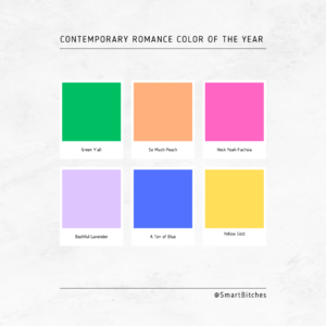
I’m taking really good look at the Contemporary Romance Colors that are most prevalent on covers this year and attempt to identify what is the CR-COTY, the Contemporary Romance Color of the Year.
In my last post, we talked about Green.
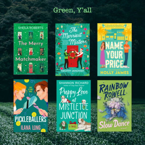
A LOT of Contemporary Green Romance, and debates about whether something is green or blue – very fun.
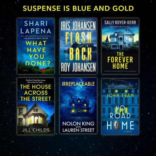
And as I mentioned in the first post about my color obsession, there are color schemes that are so closely tied to one genre, like Suspense is Blue and Gold.
This month?
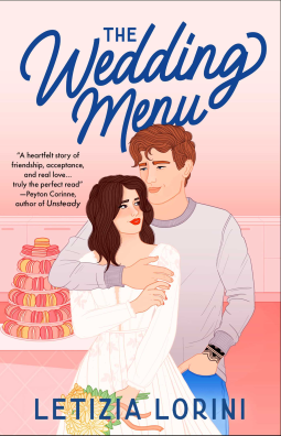
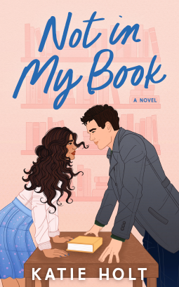
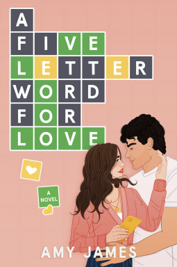
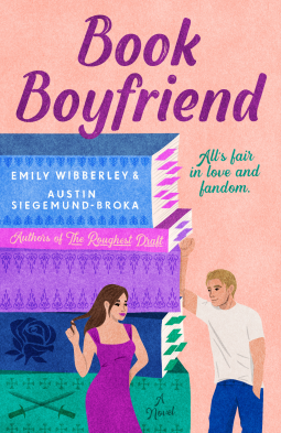
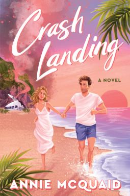
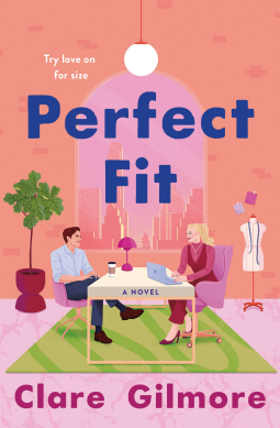
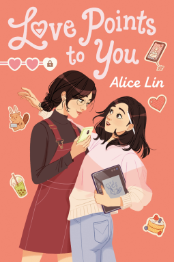
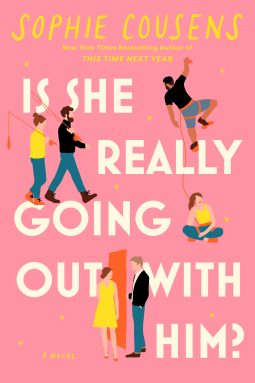
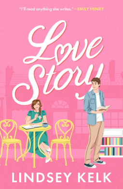
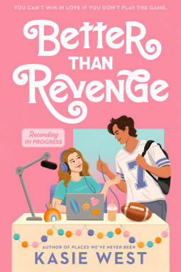
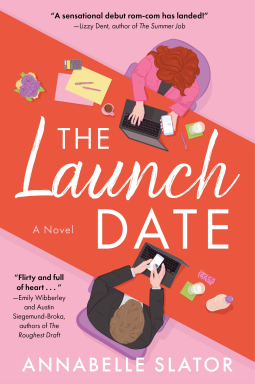
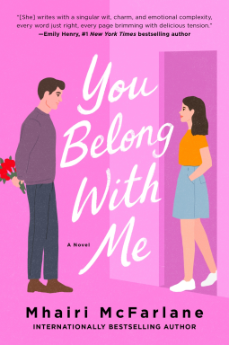
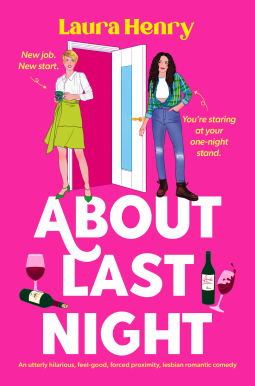
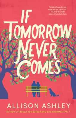
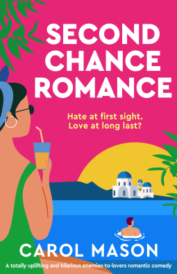
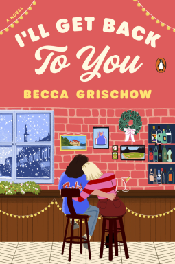
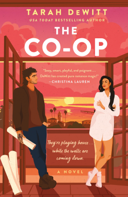
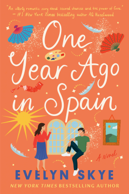
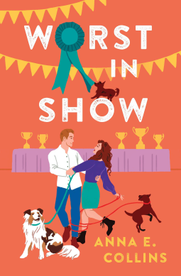
PINK & PEACH
A very obvious choice for Romance, right?
Get ready. It’s about to get very blushy in here.
And, an honorable mention for I think these are peach, pink and orange:
Isn’t it interesting how the peach and pink flow into one another? I know the latter set are more on the orange side but this particular color family is really interesting.
So why pink & peach? What do pink or peach mean within color theory?
Pink has some meanings I guessed before I started looking: love, compassion, comfort, and in some contexts, calmness. Kendra Cherry writes that pink within color psychology usually means “love, romance…femininity, as well as with seasons, rituals, and holidays such as Valentine’s Day.”
Pink is also a very gendered color, especially pastel pink indicating a girl baby, or a stronger pink indicating that it is October and the Komen Foundation might have made more licensing money. (I will never get over the Pinktober Fracking Drill Bit. Not ever.)
Color associations for pink include sweetness, playfulness, peace, and friendship, with hot pink and my beloved fuchsia symbolizing bold excitement: while red often represents “heat and passion,” pink more often represents “romance and charm.” Hailey Van Braam writes that “too much pink can be overwhelming and may come across as overly sweet or naive. It’s important to balance pink with other colors to create a harmonious and appealing palette.”
Peach conveys a similar set of meanings: comfort, warmth, joy, and optimism. The color, according to every source I looked at, was named after the fruit, which originated in China and was cultivated in Persia, the source of the name “peach.” The color is also associated with encouragement and playfulness – both apt concepts for a contemporary romance cover, especially with the dominance of rom-coms! According to Adobe, “The energy that peach color delivers isn’t overbearing — it hangs in the balance of good fun.”
Peaches also symbolize fertility in many contexts, including in classical art. Isabella Meyer writes at Art in Context, “Peach is seen as a warm and inviting color, often associated with softness, comfort, and a welcoming atmosphere.”
And I’d be remiss if I didn’t note that all of these shades are very human, in that they appear on some of our bodies, especially on or around intimate parts.
So both peach and pink evoke romance, contentment, fulfillment and affection, and they look good together, too – hence the pairing on so many of these covers! They are associated with spring – rebirth, renewal, and growth – all logical elements for a romance, too.
What do you think peach and/or pink conveys for Contemporary Romance? What other similar covers have you spotted?
And which do you prefer so far, the pink/peach or the green ones?

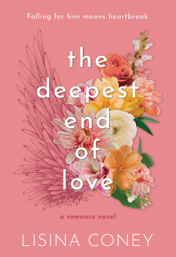
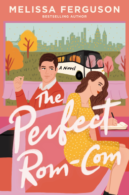
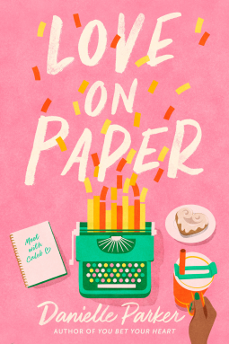
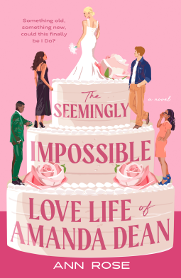
To the green/blue question, try Ismy.blue to test your perception.
You know, this is a downside of reading almost everything on my Kindle paperwhite. Cover art is in b&w and only visible when I seek it out. Grumble.
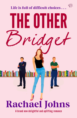
I have a real problem with that bright orange on LAUNCH DATE clashing with the pink background. They should have skewed that background more toward the peach.
That being said I tend to think of pinks and warm colors as very traditional for contemporary romance, especially rom-coms. To me it denotes a lighter, fluffier story with a low angst level. Fuschia denotes a more passionate story with more intense, angstier elements. And I know a lot of fast-food places tend to decorate with a lot of orange because it is energizing and makes people tend to eat more while not lingering and taking up seats, so on a book cover it feels like a very action-packed story.
love the pink
I actually have a set of tools that are hot pink, including a drill.
Pink is my signature color. 😉 It actually is. Before STEEL MAGNOLIAS.