Welcome back to Cover Awe!

Cover design by Diahann Sturge
Carrie: Love the pink against the gray and how the two shades of pink and styles of dress tell us so much about the characters!
Amanda: The gauzy curtains, fairy lights, and pink arrangements add some lovely softness.
Sarah: Everything about this illustration is gorgeous. Pink on gray makes the figures stand out – it’s so lush.

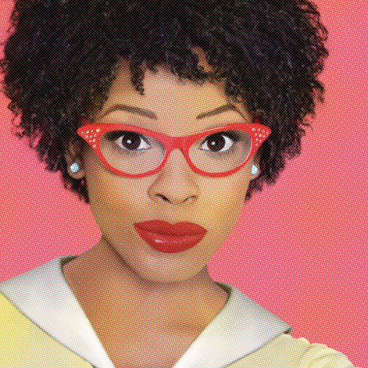
Cover illustration by Carolina Melis
Amanda: This cover just tickles me to pieces. I’m not in “awe” of it, but it elicits a positive, silly reaction for sure.
Elyse: His look of anxiety is amazing.
Sarah: The art direction meetings must have been really fun!

Shana: Wow, look at Bold Strokes, pulling out this beauty!
Tara: I know! Can you believe it? Hopefully we’re going to see more cover excellence from them.
Amanda: It’s the eyes and lips for me!
Sarah: Oh, my, the cheekbones and the warmth of the eyes.

Amanda: I love this UK cover. The figures and their fashion choices are much more detailed than the US version.
Sneezy: Ma’am, you can’t look that sexy in that blazer.
Sarah: This reminds me of Kristen Stewart on the red carpet, blazer no top. Also: Birks!

Gorgeous! F/F covers really seem to have come on in the last decade or so. I remember some absolutely hideous ones from publishers who really should have known better.
(I like the chicken too.)
Tbh I have to admit that I really dislike the Bellefleur cover. The background is great, and I like the intention, but the woman on the right gives me strong uncanny valley vibes, which makes her positioning feel threatening to me rather than seductive, which in turn makes me interpret the woman on the left, who does not give me uncanny valley vibes, as alarmed rather than seduced, so when I look at this, I feel kind of creeped out and very worried about the woman on the left. (But it’s probably just me; I have a sort of hair-trigger uncanny valley radar and basically can’t watch 3D animation because of it, so.)
I have to agree with Star on that first cover: initially I thought the woman on the left was pulling a cardboard cut-out close for a kiss (which, yes, I thought was odd), but then I noticed the hand of the woman on the right gripping the dress. Then I zoomed in on the faces and the one on the left looks more startled than excited, making this seem more predatory/overpowering/scary than seductive/sexy/cute.
It’s made me lose the initial happy feelings I got from spotting the pretty dresses and colours.
That last book though, now that’s seductive/sexy/cute.
Star: What you say is interesting, because I get the same level of realism from both women. What’s the difference that you notice?
I agree. Cover 1 looks menacing.
Whew, glad it’s not just me after all!
@Mikey – @Luce said it well. There’s something cardboard-like about the overall vibe of the right woman, both in the odd stiffness and over-straightness of her body and the mostly blank face, whereas the left woman has a much more natural body positioning and a clear facial expression. (@Luce, I thought she was a cardboard cutout at first glance too.) The right woman’s body language also doesn’t quite match her facial expression, especially with the gripping hand, which itself doesn’t quite fit with the rest of the body. The left woman’s hand around her neck also looks a little off somehow, but for some reason that detail doesn’t strike me as intensely.
Also the energy is very off: both of their energy directional lines are going to our left, which implies that right woman is going towards left woman but left woman is pulling back. In a good clinch, the energies should be directed towards each other even if one person is bent backwards. The fourth cover does this very well: the woman on the right is literally walking away from the other woman! but her energy is still very much directed at the other woman, like her face, and the left woman’s is directed towards the right woman, who is even behind her, although not as strongly. The fourth cover, not my favourite colors, but the body language is really well-executed; if someone were giving a TED talk on this, this one would be a good example of how this should look on hard mode.
Actually, now that I’ve written all that out, I see why the left woman’s hand in the top cover seems a bit off to me: it doesn’t seem to be following the same directional energy as the rest of her body, which is not how energy directions work (even if a person’s energy is directionally scattered, chaotic, or ambivalent, the whole body will reflect this), so my brain kind of doesn’t think that her hand is part of her body, but it’s not overly bothered because the rest of that arm isn’t visible. It’s bothered by the right woman’s gripping hand, though, because the whole arm is visible and therefore indisputably hers.
If she were a man, would we feel she’s menacing, or would we just accept it? Would we be spending so much time dissecting it?
I think it’s just an intense look like we see on hetero covers. It’s a beautiful cover.
For the Bellefleur, what is leaping out to me is that the brunette is holding her neck with a lot of tension in order to keep eye contact and is actually leaning away with her chest even though her left hand is I think supposed to be creating the sense that she’s pulling in. So it looks uncomfortable because she probably was uncomfortable holding this pose.