Let’s talk pretty covers, shall we?

Jacket art inspired by the works of Jeff Maning
Elyse: First of all, the purple + gold = A+
Secondly, I need a shark tooth headband to wear to every meeting ever
“Excuse me did you just mansplain me? Please see my shark tooth headband and reflect on your choices today.”
Amanda: I picture her clearing her throat and just pointing to the shark teeth.
Sarah: This is such exquisite illustration work. And, the amount of nostalgia I just had for crystal necklaces is substantial.
Maya: Ohhhhh so pretty!! That’s another YA series with amazing covers.

Maya: loving the bright cheerfulness of this one!
Sneezy: And her eyes!!!! She looks so HAPPY!!!!
Amanda: Smizing!
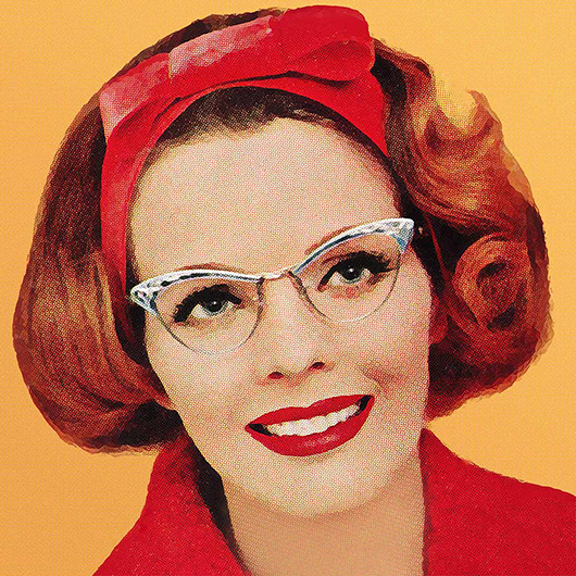
Sarah: I freaking love this cover. I love the peonies, I love the hair style, I love the eyes and the smize, and everything just looks so cheerful and hopeful. A+, excellent, no notes.

Sarah: We might need to do another Harlequin Desire cover gown challenge soon.
Also: JUMP SUIT.
Amanda: I wish I could get on board with jumpsuits and rompers.
Sarah: What’s stopping you?
Amanda: The thought of being tits out in a public restroom.
Sarah: Fair
Elyse: You could get a Stadium Buddy.
Shana: I loooove jumpsuits. But the bathroom thing is the number #1 barrier I hear from folks. I still think nothing is worse than peeing in bodysuits though.
Maya: Ohhhhh! What if our next Desire gown throwdown is nominating dresses/jumpsuits/party wear we want to see on a cover?
Amanda: Like how we’d style our own cover?
MAYA THAT WOULD SEND ME INTO A DAYS LONG RABBIT HOLE OF LOOKING AT DRESSES
Maya: SAME!!! I’d have to tell everyone “I’m on vacation” when really I’m just looking at pretty things all day!!
Sarah: I love that idea. Dress That Cover.

Cover illustration and design by Farjana Yasmin
Elyse: I love how the ball of yarn is a heart.
Maya: I love all the textures!!!
Amanda: I didn’t even notice all the textures at first! How subtle and wonderful!
Sarah: OH, the heart – that’s adorable!


I was squicked out that they’re apparently lying on the floor of a laundromat (my first thought about public floors that people walk on with their outside shoes is always “PARVO!” and it’s all downhill from there), but I’m charmed to a weirdly enormous degree that the purple yarn is winding through the border around the title.
@Lena Brassard: I didn’t realize it was a laundromat at first. I saw the basket as a porch railing and wondered why the bottle of laundry detergent was sitting there. It wasn’t until I read your comment that I realized the circles in the background were actually washing machines. In my defense, it was early and I hadn’t had my coffee yet. Great colors though.
All of Darby’s covers have been pretty.
If I ever wanted to go on an idiotic rant about reverse discrimination, I would point out that romance novels featuring women of color always get the prettiest covers.
@Louise — There was a remark from one of the pioneering Black romance writers (in a podcast here? or not on this site? ugh, why is memory) that when she started in the biz, publishers would put objects on her covers instead of people because they thought pictures of Black people would scare readers off. Needs another century of extra-pretty covers to make up for it.