
It’s pretty cover time!
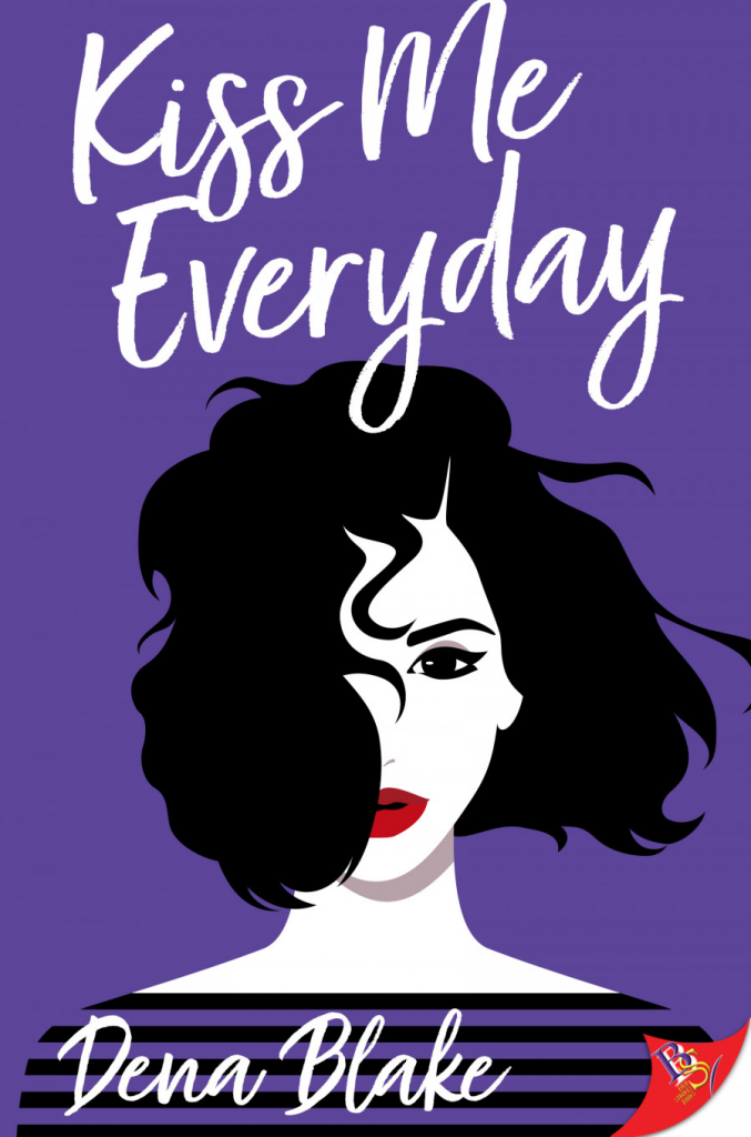
Tara: I think this is the first cover from a lesfic publisher that made me say “whoa”. I really like the use of colour on it.
Carrie: WHOA
The color, the blocking – it looks so clean and modern and also sultry as hell.
Tara: Right?! I’m in love.
Susan: Oh I like that!
Catherine: So dramatic!
Amanda: Would love to see this as part of a cover recreation challenge! Some people on Instagram and TikTok occasionally recreate book covers IRL.
Sneezy: Omg! That’d be so cool to see!
Carrie, I agree with everything you say!!! How did this artist make me fall in love with just some blocks of colours?!
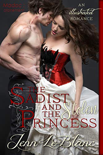
Cover design by Jenn LeBlanc/Illustrated Romance
Amanda: Not a full on awe because there are some questionable font choices but I actually appreciate a model with scars (fake or no) for a PHYSICALLY SCARRED HERO.
Shana: I’m in love with his scars and their body language is hot AF too.
Amanda: I know cover design has a lot of moving parts but the amount of scarred heroes in romance are definitely not reflected on covers.
Sneezy: Mmf! Ya, I love the scars too, though I’m contractually obliged to roast the amount of flexing happening.
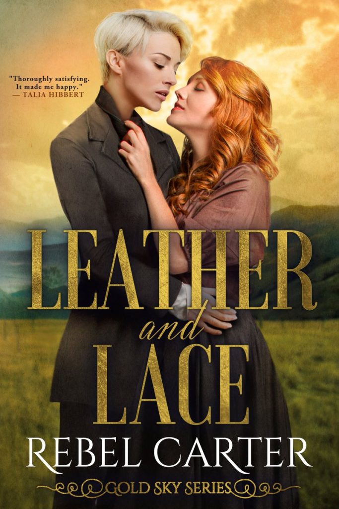
Cover design by Nadine by Badalaty
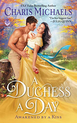
Cover illustration by Chris Cocozza
Amanda. I love this and its obvious Snow White vibes.
Carrie: It’s frothy in the best way.
Aarya: The best Avon covers have backgrounds of detailed/gorgeous landscapes. I love it when the entire cover is pretty, not just the dress.
Carrie: OMG I just noticed that there is a deer in the background because OF COURSE THERE IS. I just want to climb into that cover, past the couple making out, and lie down on the grass where everything is fine.
Claudia: Had to look hard for the deer!!
Carrie: It’s clearly a magical, tick free, flea free, non-garden eating deer, just like that is clearly magical grass that won’t cause giant welts to appear all over my body when I lie down on it.
Sneezy: Non-garden eating!
Shana: That apple!
Catherine: I love the colour palette of this.
Cover design by Najla Qamber Designs
Sarah: Listen, I know that a fair portion of my fascination is that I need a haircut and this model has my haircut in white, but this cover is gorgeous good.
LOOK at those PRETTY LESBIANS KISSING WITH GREAT HAIR.
Amanda: Such great hair.
Sarah: I mean, I had the haircut on the left at the start of the quarantimes. I might have the other one by the end, provided I can find my old curling iron.
Kiki: The covers for this series have been pretty great across the board! The lettering and the light (and the hair!!) are fantastic
Sarah: Absolutely stunning yes.
Elyse: Omg both of their hairstyles 🥰
Sneezy: The white haired model makes me question just how straight I am.
Narrator: Sneezy is, in fact, not straight. There is well documented evidence of her roiling lust for Frida Kahlo.
The Kiss Me Everyday has a really strong 80s vibe to me and immediately put me in kind of the music video for Take On Me.
“An apple a day will keep the [bad duke] away” is how I read the Avon cover after reading the blurb. Then again, the heroine bodygard/surveillance officer is nicknamed “The Huntsman” so that apple definitely is multi functional – you could even squeeze an Adam & Eve reference in there, I’m sure!
But mostly, I like the conniving glance the heroine shares with us. Makes me feel like I’m in on the joke, whatever it is.
I’ll be in my bunk
These really are great covers! I love that they’re all great in such different ways. 🙂
Leather and Lace puts me in mind of the early Gay Freedom Day parades. “Mary is an active member of Dykes on Bikes. Susan is equally committed to Lesbians for Lipstick. When the two meet, sparks fly.” (I looked it up. The former group still exists; the latter doesn’t seem to.)
May I say it is just SO NICE to see a F/F book with the kind of swoony, atmospheric clinch cover usually reserved for HET books. That is stellar inclusivity.
I just cannot get past the black slashes on the heroine’s front on The Sadist and the Stolen Princess. I found a bigger picture and I guess it’s feathers on the dress but really, it looks like somebody spilled the ink and forgot to clean it up. Otherwise, I do like the hero’s scarring and the coloring and the pose.
@FashionablyEvil
The Kiss Me Everyday cover evoked more Pat Benatar or Joan Jett to me. I love the fun 80’s vibe of the cover.
I dunno about those scars. They look very fresh to not have any trace of removed stitches showing.
The Sadist and the Stolen Princess just isn’t in the same league as some of the others. The hero is fine. But there are just way too many fonts on that cover. So, so many fonts. And her corset is stupid. It’s bright red, so it will show through any light colored dress. And second, feathers? on a corset? Why would you do that? It’ll destroy the very lines you’re trying to create with a corset and you’ll have feathers sticking out the top of your dress.
Who doesn’t have lust for Frida?
No love for the weird feathery corset.
Nor for “Duchess for a Day” because (apart from the odd leaning clinch pose as well) I’m so over it with big curly copperplate typefaces for the title, which title covers the bottom half or third of the image, which is a bright colour representing the heroine’s skirt. Like the eighteenth-century “this woman is sitting on a table” skirt, except it doesn’t go straight down at the sides but makes a triangle (yes, I did happen to do a bit of fashion research when it was such a thing after “Bridgerton”).
All the love for the gorgeousness of “Leather and Lace”. The font (and it picking up the “golden” colour) is very much for the win, especially since it’s not just doing the default sort of font, and the two leads are wonderful! I am so impressed!
Kiss Me Everyday has Patrick Nagle art vibes from the 80s
Kiss me everyday reminds me of the Agnes and the hitman cover!