Pretty pictures time!
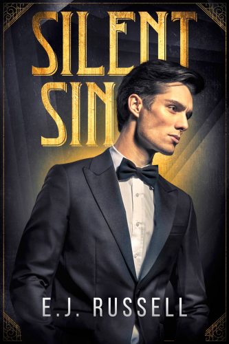
Cover design by Natasha Snow Designs
Elyse: I love how simple yet striking this cover is.
Amanda: The art deco (is that art deco) elements are definitely selling this to me.
Shana: I need all the cheekbones, all the time. And the font feels like it would be at home in a Frank Lloyd Wright house.
CarrieS: Right away I want to know what silent sin he is thinking about.
Sarah: Those cheekbones are both silent and a sin.
Lara: Also the rich details of this cover is a beautiful holiday from those 2D illustrated romance covers that are in vogue at the moment.
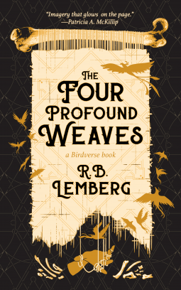
Cover design by Elizabeth Story
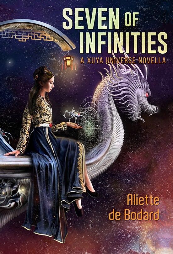
Amanda: A Birdverse book you say. Tell me more about these birds. And what I really love is all the little details, like the tapestry is hanging from a bone.
Shana: It’s monochromatic, it’s fantastic!
Elyse: There’s a gothic element I love.
CarrieS: I love the stillness of the cloth contrasted with the movement of the birds.
Sarah: The weaving hand at the bottom! The bones as a flourish motif? I love this.
Lara: I’m creeped out in the best possible way.
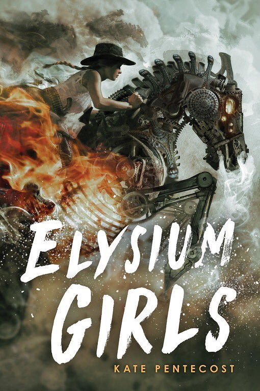
Amanda: I, too, would like to ride a flaming scrap metal horse into battle.
From Goodreads: “This was very cool! It’s not the most “my thing” as far as genres go but I had to read it to confirm it was Sapphic as reported, and I read the whole thing in a couple of days so it was certainly compelling!”
Susan:
Elyse: This reminds me of the opening for West World.
CarrieS: Horsies. Take my money.
Sarah: Whatever they’re doing, I support it.
Lara: It’s difficult to choose which part of this cover I love most… the flaming metal horse? The badass rider? The font?! I love it all.
Cover art by Maurizio Manzieri
Sneezy: Let’s ride together, Amanda!!!!
Amanda: OKAY!
Sneezy:
Shana: This cover is drawing me in with its spooky song, sung by robot spiders
CarrieS: the combination of fairytale/traditional and science fiction elements causes me, again, to say Take My Money.
Lara: I’m loving the fine-drawn delicate details!

re ELYSIUM GIRLS: Cliff Nielsen has been one of my favourite illustrators for a long time now (I’m a book cover design nerd; I can explain why so many romance covers are disappointing). He’s famous for his fantasy & sci-fi covers & this one does not disappoint, it’s beyond gorgeous. I will always stop & look twice at a book he’s done the cover for.
@hng23: Why? Why are so many covers disappointing? And why, oh why, do so many heroines have the wrong colored hair? How hard can it be to page through one or two chapters to find out?
I enjoy cover awe more than cover snark…I have nothing against snark, but I enjoy seeing amazing covers pointed out and the artists appreciated.
@hng23: I’d LOVE for you to explain why so many romance covers are disappointing!
Sarah and the gang please ask hng23 to do that post, pleeeeease.
Pleeeeeeease can you do a guest post on covers :_)
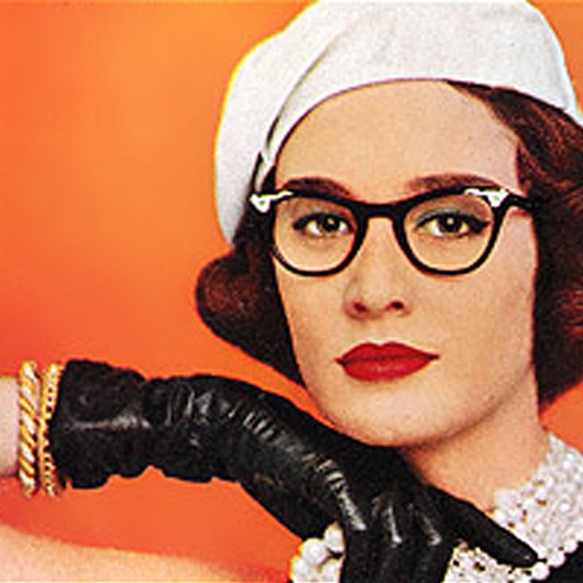
Oh, the covers, I’m glad I’m not a judge in a cover competition, they are all gorgeous, and I want to read them all. But damn, those cheek bones *sigh*
That first cover looks like Leyendecker ad. I’m loving the sense of time period. And that Elysium Girls cover is just amazing, I’ll throw my money at it too. All of these are so fabulous!
“Lara: Also the rich details of this cover is a beautiful holiday from those 2D illustrated romance covers that are in vogue at the moment.”
I feel SEEN. lololol
All the covers mentioned are gorgeous
@LML, etc: Off the top of my head, some thinky thoughts. I don’t have anything to do with producing books, so I’m hardly an expert. I just like to look at the covers & read about how to make them.
1. Cartoon covers reduce the characters to a single dimension & imply that the story will be an easy, cute, fun read. (Not all the time.) They started out as a economical way for indie & diverse authors to get their work noticed (yay!), but when they became successful, publishers jumped on the bandwagon & now everybody gets a cartoon cover, whether or not it’s appropriate for the story.
2. The half-naked oiled up male models on contemporaries (especially sports romances) are supposed to appeal to ‘the female gaze’ (because romance novels are all about the sex, amirite Bitches?) but they’re static portraits, they tell you nothing about the plot or characters. More importantly, where’s the heroine? It’s her book too.
3. Historical covers, rather than reflecting the period they’re set in, get generic, vaguely period hairstyles & dresses in colours that never existed back then, sometimes with a horse or a sword thrown in so you know that it’s olden tymes. (Also cheaper if you don’t have to pay for visual research or accurate costumes & props.)
3a. The heroine’s hair does not match the description in the novel because it’s not in the artist’s brief. (I don’t know if artists are given a copy of the book to read first.) Neither is her body type, if she is not slim. She almost never wears glasses. The hero is always be tall, smooth chested & buff. Their looks are based on current idealized body types.
4. Stock photos + poor photoshop skills. I know some authors can’t afford to do it any other way, but FFS there are free/cheap online courses in book cover design. I’ve learned tons about book cover design just by watching Chip Kidd lectures on YouTube. (Highly recommended! Not only is Mr Kidd considered a god among designers, he’s also very amusing to watch.) Also, this is why we have libraries. Books to read for free!
5. Really disappointing? Seeing the same stock photo used over & over again. Especially when it’s been poorly altered. (See #4).
Now I need a cookie.
Thank you, @hng23. Please have a virtual cookie with my compliments.
Excellent cookie-deserving job, @hng23. (I love chest hair and waxed ahistorical chests give me SADNESS.)
Just came here to say I love that you credit the artist (and link whenever possible!) for beautiful enticing covers. (And that you DON’T for the godawful Cover Snark covers.)
@Kareni: Thank you for approving my rant! (The real cookie was delicious.)
@marjorie: Thanks! I feel that beauty should be seen & its creators recognized for their efforts. OTOH, nobody deserves credit for a botched job.
Which reminds me: here’s the link to Cliff Nielsen’s Wiki. You may recognize some of his previous covers (Jane Yellowrock, Kate Daniels, etc). He’s quite prolific. https://urbanfantasy.fandom.com/wiki/Cliff_Nielsen#PNR
More importantly, where’s the heroine? It’s her book too.
This needed to be said.