Over the weekend, Susie Felber, daughter of the late and very awesome romance author Edith Layton, contacted me and many other excellent people (such as Love in the Margins) via Twitter to ask for help – specifically, help with cover images.
Oh, sure, no problem. I have ZERO opinions about cover art. (Heh.) And we aren’t huge Layton fans or anything, especially not Elyse, who wrote an entire entry detailing how Layton’s books were her comfort reads during health problems.
Elyse probably didn’t squeal loudly upon seeing this image that Susie sent me, of course – an entire stack of Layton novels before they went off to be digitized for our future reading pleasure:
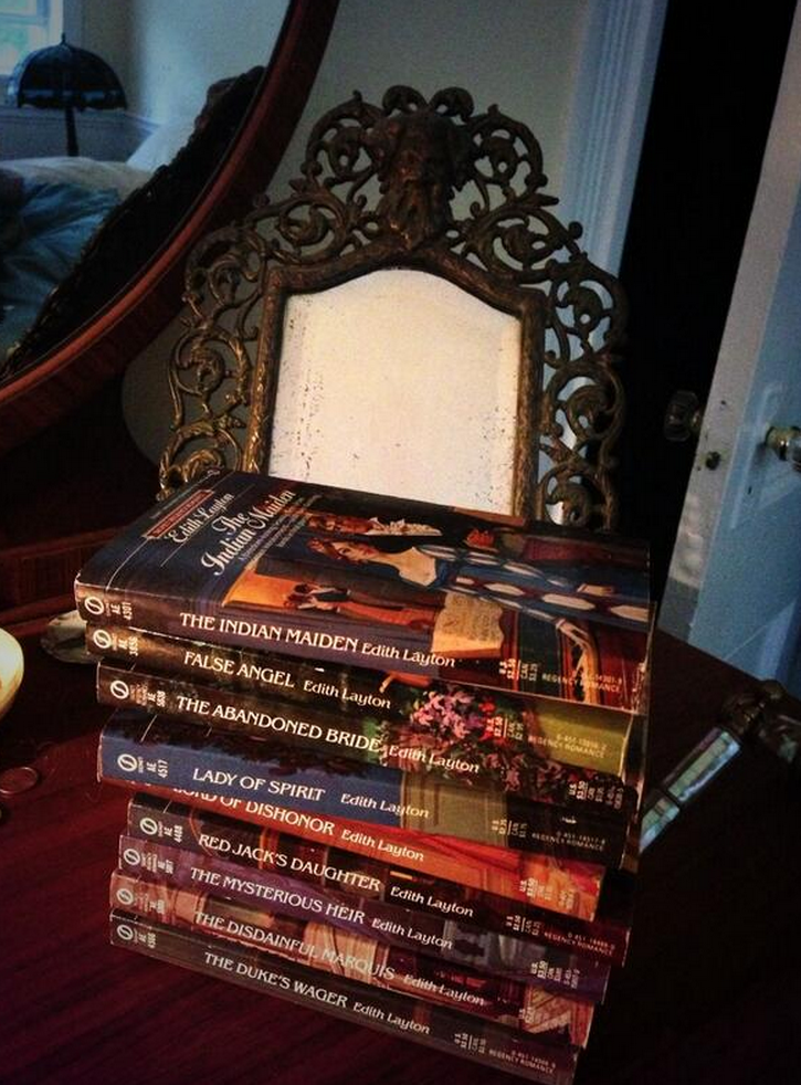
Yeah, we are SO HAPPY ABOUT THIS OVER HERE YOU HAVE NO IDEA.
Anyway.
Here’s Susie:
The virtual presses are finally moving on the Edith Layton out-of-print backlist and originals. I’m so beyond excited. Many dull personal reasons for the delay.
Don’t have a pub date yet but THE DUKE’S WAGER will be out before 2015 as will — here’s exclusive news — before 2015 a never-before-published Layton Christmas novella that has the adventures among the high and low life of Victorian London: from the servants at the Palace and the Queen’s own chambers to Billingsgate, and the mudlarks’ favorite taverns. All I can add is cats figure prominently. Of course there’s a dog… but my mom wanted to throw a bone to felines. She loved them but was crazy allergic. And I love this story.
SO Untreed Reads has asked for my input on The Duke’s Wager cover, which will then I’m sure have a look/theme that will carry over for all the other trad Regencies I’m sure. I know how passionate people are about covers, esp. Regency fans, and I know in e-pub so oft the covers are… well… you know. They don’t hire illustrators usually so seems options are romance photos, fashion plates, a talented designer…
My sincere Q for all the Historical Romance fans, and Regency fans especially is… what turns you on or drives you nuts on e-book covers? What do you want on a Layton cover? And is what the Regency fans clamor for appealing to general romance readers to help snag new readers?
The publisher sent me a form to fill out for my desire for cover art and I am of many minds and it takes a village, I think. If your readers could point to examples of what they love or hate, or just wanted to rant about covers… or tell me they could give a flying flip… well it would be a great gift to me and I promise to heed the will of the great internet hive mind!
First off, the bar is already really freaking low for Edith Layton’s novels in digital format. I mean, you can’t possibly do worse than this default image:
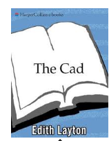
ETA, July 2017: which has now been replaced with this one — hooray!
So don’t worry too much, is my first piece of advice.
First, a bit of context:
When Susie mentioned fashion plates, she means historical fashion images that so many heroines look at to choose the newest fashions. You can find a bo-drillion of them (that is a mathematical term. No, it is. I made it up!) on Pinterest.
For book covers, they look like this:
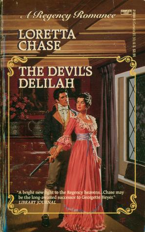
Romance photographs, as Susie mentioned, are also an option. Here are a few examples of Regencies recovered for digital release with photographs:
(NB: I really liked The Devil’s Delilah – gave it a B+.)
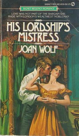
Originally, the books pictured above, and most Regencies of that time period, featured illustrated cover art, an expense not really possible for every book at this point. Here is what the above books looked like in earlier editions (my apologies for the teeny tiny Lady in Green. I couldn’t find a larger image):
And here’s the original cover for The Duke’s Wager:
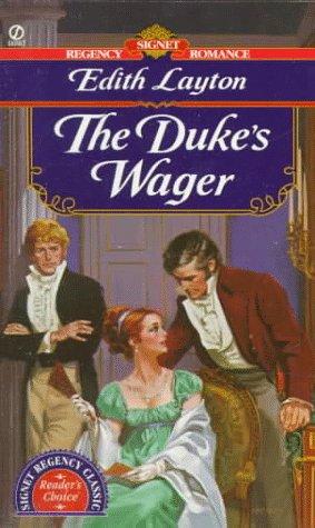
Very different, right?
So in terms of figuring out how to develop covers for the Layton books (which I am SO excited about, like chair hopping excitement), a few questions come to mind. Are covers for ebooks important? Absolutely. They might not be seen once the book is purchased, especially if one uses a retailer that defaults to opening the file on the first page of the first chapter, but they are a very important sales tool in terms of communicating genre (romance!), and subgenre (historical! possibly with pistols?), at a glance. With the number of cover images that scroll past the eyeballs of a prospective ebook reader, the cover has a difficult job to do, and in a smaller space, too.
With the re-release of classic Regencies, there’s room for something different, I think. I have never been a fan of photograph covers on historical romances, Regency or otherwise. I know there wasn’t color photography back then, and there’s only so much shiny satin fabric I can look at before thinking that everyone at that photoshoot had to be so sweaty within five minutes. Satin is unflattering and doesn’t breathe. So, yeah, I find photograph covers on historical romance distracting. The Chase cover for The Devil’s Delilah isn’t the worst thing, but I like that model’s smile a lot. Otherwise, I tell my brain, “Pretend it’s a painting or something. Stop being distracted.”
Doesn’t always work.
The fashion plate illustrations fit the time period, but they don’t always look very interesting. They’re fashion plates, so they’re pretty…flat.
So all that to say: I don’t love the methods currently in use, but don’t have a ton of great ideas, either. I know Sourcebooks uses fine art images for some of their re-releases of previously-published historicals, specifically the Georgette Heyer novels. I love those covers. Adore them, actually. I know instantly what they are, and love how many images of women are front and center on each cover.
I don’t know if there’s budgetary room for fine art images, but that’s my personal recommendation. Images of women that aren’t photographs and are in historically-appropriate garb instantly communicate to me, “This is a historical romance!” And, while I’m pondering, I’d also recommend a common element on each cover so that the Layton covers match in some way, either a banner or an insignia that’s visible but not overwhelming to the image. That way, all on one page on virtual shelves, they look like a set. (And then I can buy one after the other after the other because I have poor impulse control like that).
But I think Susie asks the important questions, and I sent them over to the other Bitches to ask their opinions: What turns you on or drives you nuts on e-book covers? What do you want on a Layton cover? And is what the Regency fans clamor for appealing to general romance readers to help snag new readers?
Elyse:
I can’t breathe. My hands are numb. I need to put my head between my knees.
Okay, okay. I’m better.
Look you could put a picture of Rob Ford on the cover of a Edith Layton novel and I’d buy it, so I’m not the person to ask. You could do a Crayola doodle of a stick-figure in a top hat. But. If we’re talking more traditional Regencies, then I really like the fashion plate or art idea. It tells me this is a traditional Regency, which will have a different feel from it’s more contemporary cousins.
But like I said, I don’t care. Just

GIVE IT TO ME NOW.
RedHeadedGirl:
I think we might need to send over an emergency beer cheese soup delivery over to Elyse. That’s the Wisconsin remedy for shock, right? I’m pretty sure I’m right.
I don’t like covers that have not a goddamn thing to do with the book inside. If you’re just gonna have a woman, at least make her match the heroine’s hair color. Get the general feel of the era and location right, and I’ll go with you anywhere. I REALLY like the fashion plate idea. Like, I REALLY like it.
Carrie:
I like the fashion plates too. They are a little flat, but some of them have great facial expressions. I can’t wait for the novella. Clearly, I need to read some Edith Layton ASAP. The only advice I can really give, not having read these books yet, is that if the books have dogs and/or cats, own it! Put a dog on the cover if you can – but it has to resemble the dog in the book. And the same goes for the other cover images – they should match the characters/settings/time period of th ebook as closely as possible.
Amanda:
Wow, this is a tough one. For most historicals, I think the go-to covers are a headless (and possibly shirtless) hero or the hero and heroine in some sort of torturous embrace. I definitely prefer the former, though I’m really liking the covers for Grace Burrowes’ Lonely Lords series. The heroes are font and center, though they could be torso-less for all we know. I also like what foreign translations do with romance covers. Case in point, Meredith Duran’s Bound by Your Touch.
In order: English, German, and Spanish.
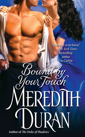


Out of the three, the German version is my favorite. I’d probably be more likely to give it a second look in a bookstore, because after a while, covers with the hero and heroine in the throes of passion tend to blur together.
While Edith Layton is a much loved name, I definitely wouldn’t want her to get lost to new readers. Also, make sure the cover models’ proportions are on point with human anatomy. I don’t want to worry about whether the hero has a dislocated shoulder or that the heroine’s boobs start at her neck.
What about you? What do you think? Do you have any suggestions or recommendations?




I like the newer Kinsale covers mentioned earlier and I love the Heyer Sourcebooks covers.
But I’m just excited that I’ll finally be able to read The Duke’s Wager – like Elyce, it could have a stick figure with a top hat on the cover and I’d still buy it.
Dear SB bloggers and readers,
I am overwhelmed by your generous and brilliant advice, understanding, and real-life examples. Really more than I’d hoped or dreamed of…and the only problem I have is that you don’t all agree. OK not true—no one is clamoring to see heavage—and that’s good because no way I was gonna go that route.
Also unexpected is the support for my mother’s books, and I’ll admit that reading your comments I got teary-eyed a few times. OK more than a few times.
I’m posting similar on IMGB because they too came through in the biggest, baddest way.
I know all the votes aren’t in so I’ll be refreshing this page only about 1000X/day.
I will add that I too wish I could go for original illustration—I’ve a close friend who knew my mother well and still does them for Kensington, among others, and would do it on the cheap for me, but it’s still beyond my/our budget right now.
But I’m on the hunt and you’ve given me the direction I sorely needed. And I’m still re-reading comments. Yes the Q of what Regency fans want/vs. other readers is a toughie. So too the ability to craft a beautiful cover on an ebook budget.
As mom would say—We shall see!
Thanks so so so much. xo
Susie
“Look you could put a picture of Rob Ford on the cover of a Edith Layton novel and I’d buy it” SNORK ACTUAL COFFEE-ON-THE-MONITOR SPIT-TAKE, THANKYOUVERYMUCH.
But I feel the same.
I too said my piece on Love in the Margins, but here I’ll just add OOOOOH I love that Shadowheart cover!!
And how menschy was Edith Layton, to call out her cover artists for praise on her blog? So sweet.
Hey one question if anyone is still listening… how do you all feel about a handsome man only on the cover? Not undressed. And in Regency garb, of course. Photo or fine art…. Seems appealing to me but… not very common. Do most not want a solo guy on the cover?
Not saying I’m leaning there, just curious. Unless I could put Rufus Sweell on the cover in which case ALL Layton’s would have him.
(My mother would’ve put David Bowie on all the covers)
Susie @ #44:
I for one am often okay with a solo guy on the cover—and if he’s fully dressed, that’s unusual enough in my experience that it’ll get me to take a second look at the book. It’s one of the big things I loved about Zoe Archer’s Blades of the Rose covers.
If the book’s one predominantly in the heroine’s POV, though, it would strike me as odd if she were not represented on the cover. So for me it would depend on who gets the majority of the camera time.
I am pro-handsomeness in general, but in this case, no. I get so irrationally annoyed when the guy doesn’t look just the way the author describes, or some tiny thing about the image hits me wrong and I go ew. (Female desire is a skittish beast.) And photos and illustrations both can look so dated so quickly—think of all the mullet-strewn covers libraries have to prune.
I also think a great strength of the books of Edith’s I’ve read has been that she wrote both men and women well, and putting just the dude on the cover invites the “reader, put yourself in this story with Mr. Smoldering here” thing, which is fine for a Black Dagger Brotherhood book but not for one with strong female protagonists.
I think Rufus Sewell looks like a flounder. Sorry. I’m with your mom. (BTW, my daughter had an Aladdin Sane onesie as a toddler and when you asked her who was on her shirt she’d say DAVID BUBBE!)
The David Bowie thing explains a LOT. (no, I don’t still have a Bowie poster on my wall. I’m like, way too old for that. Wait, don’t go in the bedroom…)
I liked the covers from the 90s (early 2000s?) that didn’t have people at all. They featured fans, or flowers, or a carriage—think Amanda Quick novels. You solve the problem of the cover model not matching the reality of the story, and it still says “historical”.
What I really want to say though is how very very excited I am at the re-release of these books. It’s a testament to Ms. Layton’s outstanding writing that years after they were first published we fangirls are squeeing with excitement over getting to read them again.
First, let me say how thrilled I am to see these books coming available. Not only The Duke’s Wager, but I’m dying to reread Lord of Dishonor & The Disdainful Marquis. Red Jack’s Daughter is another favorite. Nix on the bare chests, since these are trad Regencies. It’s hard to top the original cover of The Duke’s Wager, not only the look of it, but it tells the whole story. Regina looks just the way she’s described in the book, and the Marquis is hanging over her while Sinjin is hanging back.
I think art covers would be suitable, I’m a fan of the Heyer reissues. I also like the idea of a painting or photo image of an object connected to the book, for instance something playing on the word “wager”, for The Duke’s Wager, dice or a deck of cards? Or what about silhouette art, which might be less costly to do than paintings? It would give the set a distinctive look if all the covers were all done in b&w silhouette images. This is the type of thing I am thinking of: http://tinyurl.com/mm7prs7 A silhouette of a man and a woman on the cover of the Duke’s Wager would be perfect because it’s not a spoiler, you don’t know which man she ends up with. Also, with silhouettes you are not clashing with readers’ inner images of what the H&h look like.
@Susie Felber, I would go for a handsome man on the cover, if the title is about a man, like Lord of Dishonor. But if the title is about a woman, like The Abandoned Bride, I would expect the cover to have a woman, or an object connected to a woman(a shawl, fan, gloves, etc.)
Is using the original Signet art an option? Because, for those of us of a certain age, that’s just swoon-worthy.
@meoskop:
Coffee. Everywhere.
“Dance, magic, dance!”
Oooh, I like @ Karin’s silhouette idea. Or a cameo—that might tie in with the idea of an object on the cover and can show a person.
The cover of Carla Kelly’s A Wedding Journey shows an interesting way to flat out tell when the story is placed instead of using art to convey the information. Where it reads “Signet Regency Romance”, change the text to “An Edith Layton Regency Classic” on each book.
I agree with everything Ros said at 36 about the Heyer Sourcebook covers. While I don’t dislike most of the actual pictures, nearly all of them are completely inappropriate for the particular books they are on.
I also have nothing against photographs, as such. Do the people who object to them as being anachronistic also object to seeking movies based on Jane Austen novels?
Add one more very happy reader looking forward to getting those classic Regencies to enjoy all over again.
I am not all that choosy about covers, particularly cover art for e-books, with the proviso that I think they ought to communicate something about the story. In this case, being reissues with a rabid backlist fanbase, I personally feel the emphasis should be on the Edith Layton name.
I would place the name at the top, with Layton in a bigger font size, on a second line, and slightly indented from Edith.
I would then place the title at the center in Italic as on the original Duke’s Wager cover.
For that particular title, I see, as a background, a composed photograph of a woman standing in the near distance – full length, seen in 3/4 profile from the back but with her face turned slightly toward the reader – and a male handshake (black coats, white gloves) in the foreground.
That is all. 🙂
Reply to 42 Susie Felber
I don’t mind a man alone on a cover, as long as he is depicted as you have described.
And I agree with the previous that your mother’s name should loom large on the page.
While existing fans would buy the books irrespective of what the cover looks like, I imagine that you would like to attract a whole horde of new readers, so I do think that the images you choose will be of great importance.
For example, even though I don’t generally like photos, I quite like the new Sandra Scwab covers – they give huge emphasis to the author’s name and the photos have great energy. I would now recognise a Sandra Scwab cover at a glance. I’m amazed that I like them, because they have a modern feel, but their liveliness seems to help me overlook that.
And I love Laura Kinsela’s work, immediately recognising her new covers, even though the one with the horse badly lets down the story, in my view. In fact, the new covers don’t seem to me to reflect the rich imagery and deeply passionate story-lines in her works.h(Does anyone know where one can buy her Letters from French in ebook, as opposed to audiobook? I can’t find it anywhere)
And, harping back to Lucinda Brandt. As I’ve said previously, I much prefer artwork, usually, and loved the original Salt Bride cover much more than the photo one that has replaced it, but am forced to admit that the new photo cover for Salt Bride Redux is superior to the original artwork version. (And the cover design in this case IS a single man, in this case dressed for the Georgian era. I recommend that you have a look at both versions – I wish I knew how the clever people above have imported the images, but I don’t.)
So I don’t think it matters if you go with photos, as long as the Layton name is predominant, the image has the energy of those used by Shwab, and/or the beauty of the original ones used by Brandt. And that you get a “look” which is consistent and grabs a reader’s eye.
PS I was forced to Google Rob Ford. I hesitate to be overly critical, as it seems he has just been hospitalised, but NO, NO, NO.
My apologies. It is impossible to edit posts so I can’t correct my errors. It should be Sandra Schwab, Laura Kinsale and Lucinda Brant.
The missing words etc, can hopefully be overlooked.
kinda off-topic but LOOOOOOOK at these gorgeous redesigns of the Margaret Peterson Haddix books!
http://www.stackedbooks.org/2014/09/hardcover-to-paperback-makeovers.html
There were Edith Layton regencies? How did I miss this?
So thrilled they are going to be reissued and I can get my hands on them as ebooks. Have no space for more books.
Have to say like a lot of people above I hate headless covers and when the cover has nothing to do with the book or the characters.
This news has absolutely made my day. Am now getting off the internet before something else get’s me down…
@Susie Felber – I’m not sure if you’re still monitoring the thread, but I thought of another example.
There was a SBTB post about the differences between the US and UK covers of several historicals by Lisa Kleypas. The US covers are good examples of what I think wouldn’t work for an Edith Layton cover (except for the first one, minus the awful step back). The UK covers use photography in a way that I think could fit an Edith Layton novel (although I don’t think they fit Kleypas’ style).
Here’s the link: http://smartbitchestrashybooks.com/blog/lisa-kleypas-uk-vs-us-cover-showdown
I think a man on the cover could work, if it fit the book. I’ll second whoever mentioned Zoe Archer’s Blade of the Rose covers. The Warrior cover makes me swoon and I don’t usually swoon over covers.
I also like all of the suggestions of putting images of relevant things on the cover instead of people – flowers, buildings, fans, whatever.
Here’s an example of some Carla Kelly reprints (think someone else mentioned these) – they use a silhouette pretty well – http://www.carlakellyauthor.com/books_historical.html
It’s a pity illustrator Georges Barbier is long dead, since I’d love to see how he could develop a series of Regency covers.
https://www.google.com/search?q=“georges+barbier&biw=1745&bih=829&source=lnms&tbm=isch&sa=X&ei=7NE2VPH7OJSAygT-7oKwAQ&ved=0CAYQ_AUoAQ
The problem with photographic clinch covers is the expressions are rarely believable, more often than not veering into either dyspepsia or anesthesia, and the non-clinch variations of photorealistic covers (back view of voluminous dress, headless torso, etc.) is that they’ve been used so much now they’re rarely memorable.