
Over the weekend, Susie Felber, daughter of the late and very awesome romance author Edith Layton, contacted me and many other excellent people (such as Love in the Margins) via Twitter to ask for help – specifically, help with cover images.
Oh, sure, no problem. I have ZERO opinions about cover art. (Heh.) And we aren’t huge Layton fans or anything, especially not Elyse, who wrote an entire entry detailing how Layton’s books were her comfort reads during health problems.
Elyse probably didn’t squeal loudly upon seeing this image that Susie sent me, of course – an entire stack of Layton novels before they went off to be digitized for our future reading pleasure:
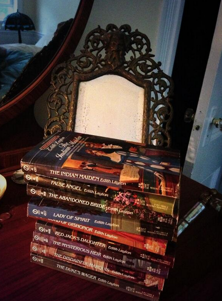
Yeah, we are SO HAPPY ABOUT THIS OVER HERE YOU HAVE NO IDEA.
Anyway.
Here’s Susie:
The virtual presses are finally moving on the Edith Layton out-of-print backlist and originals. I’m so beyond excited. Many dull personal reasons for the delay.
Don’t have a pub date yet but THE DUKE’S WAGER will be out before 2015 as will — here’s exclusive news — before 2015 a never-before-published Layton Christmas novella that has the adventures among the high and low life of Victorian London: from the servants at the Palace and the Queen’s own chambers to Billingsgate, and the mudlarks’ favorite taverns. All I can add is cats figure prominently. Of course there’s a dog… but my mom wanted to throw a bone to felines. She loved them but was crazy allergic. And I love this story.
SO Untreed Reads has asked for my input on The Duke’s Wager cover, which will then I’m sure have a look/theme that will carry over for all the other trad Regencies I’m sure. I know how passionate people are about covers, esp. Regency fans, and I know in e-pub so oft the covers are… well… you know. They don’t hire illustrators usually so seems options are romance photos, fashion plates, a talented designer…
My sincere Q for all the Historical Romance fans, and Regency fans especially is… what turns you on or drives you nuts on e-book covers? What do you want on a Layton cover? And is what the Regency fans clamor for appealing to general romance readers to help snag new readers?
The publisher sent me a form to fill out for my desire for cover art and I am of many minds and it takes a village, I think. If your readers could point to examples of what they love or hate, or just wanted to rant about covers… or tell me they could give a flying flip… well it would be a great gift to me and I promise to heed the will of the great internet hive mind!
First off, the bar is already really freaking low for Edith Layton’s novels in digital format. I mean, you can’t possibly do worse than this default image:

ETA, July 2017: which has now been replaced with this one — hooray!

So don’t worry too much, is my first piece of advice.
First, a bit of context:
When Susie mentioned fashion plates, she means historical fashion images that so many heroines look at to choose the newest fashions. You can find a bo-drillion of them (that is a mathematical term. No, it is. I made it up!) on Pinterest.
For book covers, they look like this:

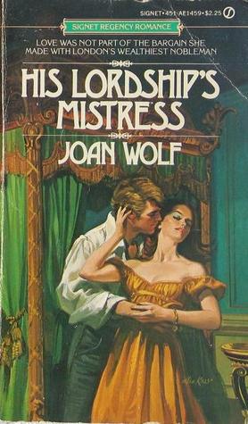
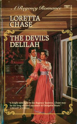
Romance photographs, as Susie mentioned, are also an option. Here are a few examples of Regencies recovered for digital release with photographs:


(NB: I really liked The Devil’s Delilah – gave it a B+.)
Originally, the books pictured above, and most Regencies of that time period, featured illustrated cover art, an expense not really possible for every book at this point. Here is what the above books looked like in earlier editions (my apologies for the teeny tiny Lady in Green. I couldn’t find a larger image):

And here’s the original cover for The Duke’s Wager:
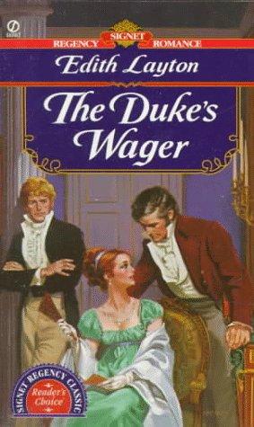
Very different, right?
So in terms of figuring out how to develop covers for the Layton books (which I am SO excited about, like chair hopping excitement), a few questions come to mind. Are covers for ebooks important? Absolutely. They might not be seen once the book is purchased, especially if one uses a retailer that defaults to opening the file on the first page of the first chapter, but they are a very important sales tool in terms of communicating genre (romance!), and subgenre (historical! possibly with pistols?), at a glance. With the number of cover images that scroll past the eyeballs of a prospective ebook reader, the cover has a difficult job to do, and in a smaller space, too.
With the re-release of classic Regencies, there’s room for something different, I think. I have never been a fan of photograph covers on historical romances, Regency or otherwise. I know there wasn’t color photography back then, and there’s only so much shiny satin fabric I can look at before thinking that everyone at that photoshoot had to be so sweaty within five minutes. Satin is unflattering and doesn’t breathe. So, yeah, I find photograph covers on historical romance distracting. The Chase cover for The Devil’s Delilah isn’t the worst thing, but I like that model’s smile a lot. Otherwise, I tell my brain, “Pretend it’s a painting or something. Stop being distracted.”
Doesn’t always work.
The fashion plate illustrations fit the time period, but they don’t always look very interesting. They’re fashion plates, so they’re pretty…flat.
So all that to say: I don’t love the methods currently in use, but don’t have a ton of great ideas, either. I know Sourcebooks uses fine art images for some of their re-releases of previously-published historicals, specifically the Georgette Heyer novels. I love those covers. Adore them, actually. I know instantly what they are, and love how many images of women are front and center on each cover.
I don’t know if there’s budgetary room for fine art images, but that’s my personal recommendation. Images of women that aren’t photographs and are in historically-appropriate garb instantly communicate to me, “This is a historical romance!” And, while I’m pondering, I’d also recommend a common element on each cover so that the Layton covers match in some way, either a banner or an insignia that’s visible but not overwhelming to the image. That way, all on one page on virtual shelves, they look like a set. (And then I can buy one after the other after the other because I have poor impulse control like that).
But I think Susie asks the important questions, and I sent them over to the other Bitches to ask their opinions: What turns you on or drives you nuts on e-book covers? What do you want on a Layton cover? And is what the Regency fans clamor for appealing to general romance readers to help snag new readers?
Elyse:
I can’t breathe. My hands are numb. I need to put my head between my knees.
Okay, okay. I’m better.
Look you could put a picture of Rob Ford on the cover of a Edith Layton novel and I’d buy it, so I’m not the person to ask. You could do a Crayola doodle of a stick-figure in a top hat. But. If we’re talking more traditional Regencies, then I really like the fashion plate or art idea. It tells me this is a traditional Regency, which will have a different feel from it’s more contemporary cousins.
But like I said, I don’t care. Just

GIVE IT TO ME NOW.
RedHeadedGirl:
I think we might need to send over an emergency beer cheese soup delivery over to Elyse. That’s the Wisconsin remedy for shock, right? I’m pretty sure I’m right.
I don’t like covers that have not a goddamn thing to do with the book inside. If you’re just gonna have a woman, at least make her match the heroine’s hair color. Get the general feel of the era and location right, and I’ll go with you anywhere. I REALLY like the fashion plate idea. Like, I REALLY like it.
Carrie:
I like the fashion plates too. They are a little flat, but some of them have great facial expressions. I can’t wait for the novella. Clearly, I need to read some Edith Layton ASAP. The only advice I can really give, not having read these books yet, is that if the books have dogs and/or cats, own it! Put a dog on the cover if you can – but it has to resemble the dog in the book. And the same goes for the other cover images – they should match the characters/settings/time period of th ebook as closely as possible.
Amanda:
Wow, this is a tough one. For most historicals, I think the go-to covers are a headless (and possibly shirtless) hero or the hero and heroine in some sort of torturous embrace. I definitely prefer the former, though I’m really liking the covers for Grace Burrowes’ Lonely Lords series. The heroes are font and center, though they could be torso-less for all we know. I also like what foreign translations do with romance covers. Case in point, Meredith Duran’s Bound by Your Touch.
In order: English, German, and Spanish.
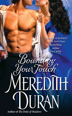


Out of the three, the German version is my favorite. I’d probably be more likely to give it a second look in a bookstore, because after a while, covers with the hero and heroine in the throes of passion tend to blur together.
While Edith Layton is a much loved name, I definitely wouldn’t want her to get lost to new readers. Also, make sure the cover models’ proportions are on point with human anatomy. I don’t want to worry about whether the hero has a dislocated shoulder or that the heroine’s boobs start at her neck.
What about you? What do you think? Do you have any suggestions or recommendations?

I don’t like books that promise hot and heavy on the outside, say, with a naked male chest, and then don’t deliver on the inside. The heat on the cover should be appropriate to the content, is what I think I’m saying.
The prom dress covers drive me nuts, because you can’t even tell what period the book is supposed to be. I’ve bought a few Victorian set books (a period I dislike) thinking they were Regency.
But, having said that, I’ve been on the other side. It’s incredibly hard to find appropriately dressed characters on the stock image sites, and these days everybody uses stock images. A talented cover artist can make it work, but all too often it’s just a woman with floppy hair and a prom dress, with some script slapped over the skirt. However, it’s Hobson’s choice – the images just aren’t out there unless you’re willing to spend a fortune on a custom image. Even then, they get the costumes from theatrical costumers, and they’re just not accurate.
What about beautifully photographed single images, 50 Shades style? Whatever anyone might think of the contents, the covers were fantastic, and went a long way towards selling the books.
I have every single one of Edith Layton’s Signet Regencies on a shelf 5 feet away from where I sit! The thought of digital editions makes me very happy indeed; she is one of my all-time favourites.
I’m not crazy about photograph covers for historicals or Regencies and I loathe the current craze for headless covers. The other thing I can’t stand are the covers where the heroine has her back turned to us with her dress hanging open or curled up provocatively on a couch with her dress hiked up over her knees. It’s like they’re trying too hard. It’s a historical! See the fancy clothes! It’s got sexy-times in it! See all the skin!
The fashion plates, although historically accurate, just look amateurish as covers and Edith Layton deserves way, way better than that. I like the idea of a well-photographed single image, but the one thing I beg is that they stay consistent: same script, etc.
Now, if you will excuse me, I have to run around the house shrieking, “Oh my God!” while dancing with glee at the thought of a new Edith Layton novella!
I second the Meredith Duran German cover recommendation. I find it annoying if the hero doesn’t match the image in the book or in my head. Full on scenes can look dated after a while. The German cover of the Meridith Duran book eliminates those problems. I should mention that Elyse’s post got me into Edith Layton. Thanks girl!
I’m going to third for the German cover recommendations. Or even going something more old school similar to the Lisa Kleypas Devil in Winter covers. Personally, I’m over the bare chest on the cover. It’s been done so much lately that if I see a naked chest on a cover of a book—regardless of subgenre—I just by pass the whole book. Probably not the smartest idea but it’s just done for me. Especially if they’ve got that tribal tattoo shirtless, headless guy on the cover. I can’t stand him and he was everywhere for a while.
I am sick to death of torso covers as well as headless covers. I know the message there is supposed to be ‘look how sexy the hero is’—I get that, I really do. And that not showing the head is a way to let the reader identify with the character and make up what they look like. But neither of those tricks works for me. A hero’s state of dishabille on the cover is not what makes him sexy to me, and I never insert myself into the position of the heroine; I always imagine her as ‘this awesome person whose adventure I am now observing’.
I love that German cover on the Duran book, though. And I’ve seen other German covers for romances that were just stunningly gorgeous—for Kate Noble’s Blue Raven books. I really liked this one for the translation of Revealed. Which, come to think of it, looks like it might have been done by the same people that did the Duran cover. 😀
I like the look a lot. It’s still “heroine in a dress facing away from the camera”, but they’ve done stuff to it to evoke a period feel and I really like that. It makes me want to actually buy those editions of the books (which I could get away with because I’m slowly studying German anyway!).
I love the German cover as well. But for these Regency reissues I am not sure it says enough about the book. Carla Kelly has had a lot of her Signet Regencies digitized. Some covers combine a photo of the heroine and the setting, while others show the lead couple and the setting. They are as much a formula as the old Signet illustrations, and are ok in my opinion. I suspect they are made from a combination of stock images, which would make sense to keep the cost down without looking cheesy or unrelated to the story.
I like the photo covers better than the fashion plate/Regency period painting ones. To me the photo covers are more similar in style to the original Signet paperbacks.
I also like the Georgette Heyer Sourcebooks covers—gorgeous! I have nearly all of these in digital form but if I had room I’d collect the paperbacks as well.
Others that I really like are the Penguin Intermix Signet titles—they use paintings also (many have landscapes only, no people).
I like the Heyer covers and also the original covers on Lauren Willig’s Pinks. The simplicity of the covers on the books by Sherry Thomas and Courtney Milan is attractive too. I love Edith Layton’s books with all my heart, so whatever is on the cover is fine with me.
I would love to see actual period dresses—not necessarily with a model, mind you. From a dress form to a dress spread on a bed, I would be fine with that. And if it happens to be a dress that matches (or at least comes close to it) a scene in the book, all the better.
Otherwise, I’m with Amanda, that German cover is pretty damn great.
I posted on the LITM thread too, but I have more thoughts on this.
I think communicating the heat level and overall tone on the cover is key. These are trad regencies – they should appeal to a wide audience from hard core romance readers to Jane Austen / Georgette Heyer fans who don’t necessarily identify as romance readers. But they’re different from a lot of current Regency romances in both heat level and writing style.
That’s why I lean towards using fashion plates or fine art, like the gorgeous Heyer reissues. You could use photos but they need to be historically accurate enough and clothed enough to say “trad regency” and not “wallpaper historical with lots of sex.”
I love the cover to Lauren Willig’s Mischief Under the Mistletoe and I think it conveys the right tone – http://www.laurenwillig.com/books/mistletoe.php
I agree with cleo’s comment that the fashion plates or fine art conveys traditional regency better. Like others have said, I like the German Duran cover, but it possibly has a slight steampunk vibe to me. This one is similar, but i don’t know how accurate the attire is:
http://www.barnesandnoble.com/w/the-american-bride-karla-darcy/1114671443?ean=2940016200118
Both the German cover and the one I linked above jump out at me right away. The Lauren Willig cover that cleo linked is great as well.
I really like these, though it may just be the color palettes that are drawing me in:
http://www.barnesandnoble.com/w/a-ladys-guide-to-improper-behavior-suzanne-enoch/1103367456?ean=9780061662218
http://www.barnesandnoble.com/w/lady-alexandras-excellent-adventure-sophie-barnes/1110199396?ean=9780062190314
Using the focal object type covers would need to be used with caution as they have been well established as being on erotic books. Something like this could work though:
http://www.barnesandnoble.com/w/black-dukes-prize-suzanne-enoch/1001868687?ean=2940013486027
On stuff to avoid though, I have two thoughts:
1. Grossly inaccurate historical covers, e.g. dresses from the wrong time period.
2. Frilly scroll-y writing that is hard to read.
I have MANY opinions about covers but I’ll try to keep it brief. I despise the naked chest man or couple in a clutch covers intensely. Hate them. I feel like they’re dumbing down some really amazing books (see Joanna Bourne’s spy series for a great example). I am also really not a fan of the lady in the fru fru, shiny dress with frilly fonts (see Courtney Milan’s books) because they are so bland.
I tend to agree with cleo, in general I almost always like the German book covers when I compare them (hmmm) but I think a book cover similar to what Lauren Willig uses is really good at conveying genre without insulting. I also like the fashion plate or fine art for the cover for the same reason.
I’m on record as absolutely loathing fashion plate covers. I wonder how many new readers are attracted to them?
I don’t like photographs of people for historical novels usually, but that German book cover is stunning. I would rather have the fashion plates or graphics that are based on the same theme with some element of the book, either graphic or photo, to give each book individuality.
The cover Cleo linked to is lovely. If it is a photo, it avoids what I dislike about photos on historical romance: somehow the people never look like they are from the 1800s.
The Georgette Heyer covers are beautiful and my absolute favorite in this discussion. I don’t care for fashion plate illustration cover art. I find many of the dress styles and facial drawings unattractive. If someone dislikes the style or face, continued interest in the book slips away.
Some years ago HQ re-issued a series of Betty Neels’ work over several months. Each cover was a fresh impressionistic painting (or pastel) which had little to nothing to do with the stories. They were, however, immediately recognizable and engaging. Isn’t this the great challenge of an e-book cover? To provide information about the story and to engage a new-to-the-author reader within a tiny, tiny space.
@Patricia:
Ditto that. ENOUGH WITH THE NIPPLES.
SBSarah: *gasp* I cannot believe my eyes! The Smart Bitches, tired of the magnificent mantities????
*snerk*
@Meoskop: I’m with you on that one and it seems that we may be in the minority. Not a fan of fashion plates.
Really like the german cover for that Meredith Duran novel. (Mostly because I love dark/purple lipstick.)
Honestly, I mostly go for the photo covers because they feel less musty and fussy? Although it should be noted that I’m one of those useless millennials so it could be my preference because I’m youngish. I think the covers where it’s just the girl in a huge dress are preferable to the torrid embrace ones though (a la the Rule of Scoundrels series).
In terms of covers I like purely aesthetically, I’ve always liked this cover http://avonromanceau.files.wordpress.com/2012/02/say-you-love-me.jpg (but couldn’t make it through five pages of the actual book) although it doesn’t really scream romance necessarily.
Speaking of romance novel covers though, THIS TOTALLY REMINDS ME THAT THERE EXISTS A GOTHIC ROMANCE NOVEL ABOUT AARON BURR (http://wtfbadromancecovers.tumblr.com/post/94447619713/from-original-submission-there-was-actually-a). I mean, beyond the fact that if you’re going to write about one of the original American politicians you might as well go with Alexander Hamilton, the cover is actually kind of nice in a retro way.
Add me as another romance reader who’s beyond bored with the naked and headless male torso covers. Also the photos of obviously modern couples in bargain basement pseudo historical costumes.
The Sourcebook Georgette Heyer covers are a much better option if there’s budget for using older art images. Most of the Heyer ones are authentic older paintings, but not masterworks that would cost a fortune for the rights. My only gripe with the Sourcebooks editions is that their proofreaders had no idea of Heyer’s period slang and often made ridiculous changes that really clunk in the middle of some of her light hearted scenes. But you don’t see those till after you’ve bought the books.
I think one of the things we’re all responding to in the German covers is that they’re so much classier than most of what we get from North American ones these days. I go back to traditional Regencies because I get bored with all the obligatory sex scenes in most modern romances. So few of them really advance the plots or characters. If the personalities of your h/h aren’t involved, it’s just another few pages of insert tab A into slot B and make noises.
Budgeting for cover art that not only catches a readers eye, but also reflects the author is really important. I love the D.E. Stevenson covers designed by Eileen Carey, mentioned in a recent Dear Author post. The style is very distinct- you know it’s a Stevenson book, and it definitely reflects the time period.
http://www.amazon.com/Miss-Buncles-Book-D-E-Stevenson/dp/1402270828#reader_1402270828
Though these are not romances, as soon as you see these covers, illustrated by Cliff Nielsen, you know its a book in the Bloody Jack series. It reflects time period and has a very distinct style. In fact, they “updated” the covers in that series to appeal to young adult readers, but they just ended up looking generic. They went back to the older covers.
Original cover:
https://www.goodreads.com/book/show/295652.Mississippi_Jack
Updated cover:
https://www.goodreads.com/book/show/6042959-mississippi-jack
And finally, the new ebook and audiobook covers of Laura Kinsale’s books are beautiful. When you see the cover, you know who wrote the book. And Nicholas Boulton is a pleasure to listen to. Does anyone know who did the illustrations?
https://www.goodreads.com/book/photo/18218224-my-sweet-folly
https://www.goodreads.com/book/photo/20486728-shadowheart
I think the covers on the e-books need to be simple and elegant, rather than flashy and sexy.
The Lady in Green cover hits all the right notes to me. I think the covers on the Sourcebook Heyer releases are wonderful and my only disappointment is that they don’t
tell us the details of the painting but only give credit to the agency. The cover on the German edition is also very restrained would fit the style of traditional regencies.
I don’t like the new cover for His Lordships Mistress at all, or the one for Devil’s Delilah either. They don’t fit the books in tone or style.
JW, I am now following the http://wtfbadromancecovers.tumblr.com/ Who s.ays Tumblr is just about porn?
I love the original cover art – they hint at the story within, genre-appropriate taste level.
Who is the audience for these ebooks? If it’s someone like me who already owns the paperbacks, the publisher would be clever to use the original art work to make the book instantly recognizable.
I’m not a fan of “chest” books; I don’t want to be embarrassed if someone (my teen daughter, my too-easily-amused spouse) catches a glimpse of a book cover on my e-reader or on my Adobe ebook device on my laptop. (And that’s not even venturing down the path of humiliation for paper books.) What I do like are the fashion plates, they’re elegant and set the mood for the time period. The art covers of the Georgette Heyer books are also very attractive, but, as other have mentioned, they need to bear some relation to the story. What I find most attractive is the evocative image of a historical object relevant to the story, such as those on the covers of Sylvia Day’s historicals, e.g., Don’t Tempt Me, A Passion For Him. (Why is it that the smexiest books have the cleanest covers?) The headless woman in historical dress covers are my next favorite cover look, such as that German example. Bottom line: I want classy, not cheesy.
Samanda @ #20:
YES. EXACTLY. There’s an elegance to those German covers that really appeals to me, and which I don’t feel like I usually get with American covers. They’re really nicely understated. I’ve poked around a little further, looking for other German romance releases—Joanna Bourne’s got some nice ones too, it turns out. Look up her books on Kobo’s site, you can see ‘em!
Definitely makes me want to stock up on German translations of romances and do with them what I’ve been doing with The Hobbit, reading in multiple languages at once. 😀
1. Generally don’t like photos
2. Don’t like the bare chest pics for non-steamy romances. Truth in advertising, people.
3. I mostly like the fashion plates for Regencies. Seems to fit the mannered style of the stories.
4. And I also love the idea of art work suitable to the time period. Oxford and Penguin do it with their classics all the time. Not sure if that’s cost effective or not. I have no idea what the cost of reproducing classic art is, though I have a vague notion some sort of fee is due the owner of the painting (usually a museum). But I would be REALLY ticked if the art was from the wrong period, I would HATE a Regency heroine in Victorian garb, for example. And yes, we notice that stuff.
5. If there’s a pet in the story, a pet on the cover is going to work nicely, (unless she has a pug and you show a wolfhound on the cover, of course)
I’d like to take a moment to advise Miss Felber on what not to do for an ebook cover:
1. Do not use Poser.
2. Do
not
use Poser.
3. Did I mention not to use Poser?
4. Lastly, do not use a cell phone picture of a do-it-yourself floral arrangement. (Yeah, you know who I’m talking about.) (Or maybe you don’t.)
I don’t particularly like the fashion plate covers I’ve seen – and I don’t think they would intrigue new readers too young to remember the original Signets (those are my cover catnip!).
I went to the Impressionism, Fashion and Modernity exhibit at the Art Institute of Chicago last summer, and THOSE fashion plates were so much more gorgeous than any I’ve seen used as covers.
Perhaps Regency fashion plates weren’t as detailed as the later ones, but they had a lot more going on than the snippets of plates that get put up on covers – they were whole scenes, with backgrounds and other people. I understand that authors don’t want a cluster of five women in dresses on the cover, so the fashion plates get edited -but all the background and context seems to get taken out too.
I’m not a huge fan of photo covers for historicals – but like them better than the one-dimensional fashion plates.
Is there no way the rights to the old covers can be secured? They were gorgeous.
And if a photo of the couple doesn’t work – what about a photo of gorgeous English setting? A manor house covered with fall leaves, a Christmas yule log, that type of thing?
I have always found the covers of the old hardback Dutton/Putnam Georgette Heyers to be both lovely, historically accurate, and faithful to the book. Like this one:
https://www.goodreads.com/book/show/3527077-the-unknown-ajax
Also, the books themselves may have been crap, but the old Barbara Cartland paperbacks from the 70s had some lovely covers.
I report with interest that the source of the German covers mentioned above appears to be these folks:
http://www.egmont-lyx.de/
They have wallpapers of some of their covers, too, including one of the Kate Noble covers, AND a Nina Rowan too!
To echo a bunch of earlier comments, I love the Sourcebooks art covers, dislike photos on historicals, and think clinch covers with half-naked people are ludicrous on Regencies. But I was thinking that something like the ones on Julia Quinn’s recent books, the ones with a book cover or open book, would work very well on a Regency. Or an item from the story—a fan or a glove or a piece of jewelry.
To this day, some of my favourite cover art is that of Francis Marshall’s glorious covers for Barbara Cartland’s books. I outgrew Dame Barbara long ago, but those covers were to die for.Marshall had been a fashion illustrator, & boy, did it show.
What great, great news.
I love the German cover as well, but agree with the readers who assert they will buy the ebook versions irrespective of the cover. Yes. Yes.
I will even buy them if they have my pet peeves – headless, bare torsos, dresses inappropriate for the period, a heroine in modern make-up, a hero with a sulky, indulged face who is supposed to be tormented and suffering – indeed, any image which makes it clear the illustration in some significant way does not match the story.
I like the new Heyer covers very much, even though they are very different from the ones I have collected in paper. I think the new designs will be more long lasting than the current obsession with huge dresses obliterated by large-lettered titles and author names. In the end, these designs have become so commonplace that they all bleed into one another.
I much prefer the new Heyer designs any of the photographic designs. They give a look to her works that is not only visually interesting and alluring, they become immediately identifiable as hers.
For example, I loved most of the original artwork covers for Lucinda Brand’s books, but in particular the one for Salt Bride. I loved the colour, the design and – well, everything about it. It is one of the very few covers of a romance that I’ve gone back again and again to look at with real pleasure. The cover for Salt Bride Redux didnt work as well, because it was stilted. Despite that, the author has very recently reissued her works with new covers – photographic ones. I’ve mourned the loss of the Salt Bride one, recognised that the Redux cover is an improvement on the previous design and tried to be open- minded about the rest. However, with her new covers that closely resemble the Lonely Lords design I’m left cold.
But, as I said, I know I will buy these intended re-issues even if they have pot-boiler covers of a couple in a ridiculous clinch, or with a ship in the background when none occur in the story, or whatever crazy illustration someone who has never read the books decides.
I’m very excited about the Layton reissues. It’s so nice of her daughter to put such thought and care into her mother’s books.
I love trad Regencies and I really, really love those old, original covers. Too bad they can’t be made available for authors to reuse. Barring that, I like covers that still clearly set trad Regencies apart—the fashion plates, old artwork, or something along the line of that German cover. Photos, especially of shirtless men or women whose gowns are falling off, really don’t suit the sub-genre.
And I second the boo/hiss for the publishers that don’t supply any cover art at all for their ebooks (HC and Ballantine are prime offenders).
Well, I am going to be a dissenter regarding the Sourcebooks Heyer covers. I like the idea of using fine art very much. But those covers seem to have pictures chosen almost at random. I’ve looked at a lot of them and wondered who on earth the people are meant to be, because they don’t fit the story at all. Plus a lot of them are completely the wrong period for the books. And the wrong feel. And everything is wrong, wrong, wrong about them. But other than that, they’re great.
For the Layton books, if they do go for fine art, there is a ton of fine art that has recently been made available without copyright restrictions. The Getty collection is one, but there are several others. Some are non-commercial use only, but a lot is unrestricted and would be ideal for book covers. So this doesn’t have to be an expensive route to go. There might even be some better fashion plates amongst the various collections.
I’m with everyone who loves the German cover and the Willigs. I don’t mind photograph covers as long as:
1: the people on the cover match the people in the book;
2: clothing is accurate to the historical period of the book (cover photographers take note: just because it’s a long dress does not make it universally historically correct! It’s not the length of the skirt that matters, it’s the shape of the bodice, especially when that’s usually all you see!)
3: heat level matches the heat level of the book (no bare torsos/dresses slipping off if there’s little to no sex.)
Another cover I’d like to point out as excellent is this one for Mary Robinette Kowal’s latest: http://www.tor.com/blogs/2014/09/designing-the-dress-for-of-noble-family-cover-image (as you can see she hand-sewed the dress herself, but obviously not everyone has that luxury). Despite being the cover for a Regency-era fantasy, this would make a perfect trad Regency cover, I think.
I’d also like to suggest another option. I own a bunch of Heyer rereleases from the late 70’s which had beautiful watercolor covers featuring still lifes. They were paintings of objects you might find on a lady’s dresser, including pearls/jewelry, flowers, lace fans, gloves, etc. and prominently featured a miniature portrait of the heroine, of the type that used to be painted on ivory and carried around in the pocket back in the day. It was all done in pale pastels and soft focus for a dreamy, nostalgic feel. If you could do something like that with a soft-focus photograph, i think that would make a splendid cover. You can’t even find these online anymore, so I’d probably have to scan one to show you what I meant.
Those of us in the OMG Edith camp – I was curious and checked. Some of her old website is still being hosted, in particular the page where she talks about her individual artists.
http://www.iment.com/maida/friends/edith/artists/artists.htm
I use a (slightly) older model of eReader. I use the book cover of whatever I’m reading as a screensaver, so I favor eBook covers that can do two things:
1. Be reasonably safe to carry in public.
2. Look nice in grayscale.
Everything else is gravy.
Thanks EC Spurlock. I love the story of the creation of the dress by the author and her choice of character for the cover, but, sadly, after being entranced, the final design doesn’t do it for me.
And thanks to meoskop for the link – it reminded me how much I liked the old Christmas covers in particular. What a shame they can’t be used again. Just goes to prove that Susie Felber’s task is huge, as many of us will have totally different views.
Thanks to all the people who have provided links.
I’m impressed by them, but can’t figure out how to do it so they become highlighted. This is the previous cover of Salt Bride I love, although it looks much better full size and the colour is cleaner/brighter in the original as well.
http://www.goodreads.com/author/show/4416532.Lucinda_Brant