
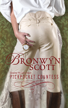
Ain’t no booty like historical booty. And Harlequin knows it, yo. Thanks to Carin, we have not one but TWO historical back-that-up covers.
But wait, there’s more!

Carin and I are both somewhat alarmed by the second cover. As Carin said, “I do think the first cover model wears it better, though I may be distracted by the green mist on the second cover, which I can ONLY see as visible fart odor….” Yes. Gaseous-looking curls emanating from a backside can only mean… something not good.
My question to you: whose historical booty reigns supreme?

I think I should add that I do really like Sinful‘s cover. It’s one of the ones I showed to my publisher when asked what covers I like out there right now. I thought something similar with a man in drawers sweeping a woman off her feet would be fantastic. Sort of like this (only with a hot guy):
Both had me laughing.It looked like she was pulling that pocket watch out his a$$ in #1. So I thought about #2, but then I saw the noxious swamp gas and it set me off again. Plus the flower in Sinful looks like it’s growing out of his pants.
Screw the covers. I now have, “Ain’t no booty like historical booty” running through my head.
Fie on you. FIE! *shakes fist*
#1—couple looks like they’re dancing the lambada, and I give the guy extra so-bad-it’s-good points for the VERY visible zippers on his supposedly historical boots.
#2—green noxious gases. ‘Nuff said.
Hmm. Camp vs. flatulent.
Not much of a choice, but you’ve made me laugh after a wearying day at work.
Thanks!
I say we _swap_ the guys on the covers. The pose of the guy on the first cover combined with the noxious green gas on the second would be far more appropriate… [grin]
Whew! Thanks for the laugh. That second cover is all wrong. How come someone in the art department didn’t make the obvious fart connection? Too bad, really.
The first one, I’m most bothered by the shiny patch on one butt cheek. I don’t know why it bothers me so much, but it does. 😉
My dyslexia kicked in when I read this, and thought, “his cock is doing WHAT?”
TOTALLY. As soon as I went back and looked again (after first thinking it was a woman), I thought he was positioned exactly like Scott Hastings in Strictly Ballroom, when he and Fran were dancing backstage during the Tina Sparkle fruity rumba extravaganza. Really girly hip movements.
That was such a good movie. I think I’ll watch it again this week.
It’s my go to movie when I need cheering up. Paul Mercurio’s lovely arse is just part of the pleasure 😉
Hmm, well the flower (which looks more like a rose, in this case) is supposed to be an orange blossom, which does play a symbolic role in the story. But I also think the art department was trying to soften up the look by adding a feminine touch. It is after all a romance.
I dunno, I really like the Sinful cover. It’s unlike any cover I’ve ever seen on a romance, in a good way.
I don’t really have an opinion of men’s butts. I have an opinion on the influence of early-posters. More than half the responses after the first made mention of the flatulation fog in the foreground. And the puns! I’m so glad I wasn’t drinking when I read them, and didn’t pick up my Diet A&W until I was typing this.
My head exploded a tiny bit
I always enjoy looking at a well-muscled male derriere. My husbands’ is particularly fine which is one of the reasons I was attracted to him in the first place. He is a sweet, kind man too.
I have a great photo of Johnny Depp (taken from his rear) posing for a few thousand fans at a premier. He is wearing cream color pants and looks so much better than the guys on those book covers. Go Johnny! Go!!
I decided on #1 right away, because #2 is way too broad shouldered and muscular. I like ‘em lean and lithe. Then I noticed the top of the boots are in the photo on #1, and I DEFINITELY decided that was the better one. Boots! The boots are hot.
I like the upper back of #2, but I did think he was in his underwear until I saw the boots. And now I can’t not notice the green gas.
The 1st one is confusing. Surely he can feel that watch chain, right?
I’m digging the second cover. The two things I noticed the first time I saw this cover were his back and arms. Then, his tush. Didn’t even pay attention to the green gas until now….thanks.
#1 is way cuter and more fun. I like having the woman’s hand copping a feel while they’re dancing.
#2 is distracting in that I’m waaaaayyy more interested in staring at his back than his butt. Besides, I can’t really see this one’s butt that closely.
Of course, I had not made the connection of the green artistic renderings as gaseous emanations before, but then I haven’t noticed the rose until today either.
The first one is cute and clever. Sounds like a fun read.
I liked the second one best though, I guess I too read far too much paranormal and fantasy stuff to see the green mist as noxious fumes.
Definitely think that cover #1 is a winner….cover #2…not so much…does look like the dude is farting….
I do like the first one, love the way she’s grabbing his ass. And a fine one it is, how could anyone think that’s not a man?
*gigglesnort*
Number one for me, definitely. The ass in it is more flattering, for one thing. Don’t know if it’s the pose or the cut of the clothes, but RAWR.
Number two? Err… sorry. The greenish.. whatever.. is a little too off-putting for my tastes.
-J
I think the cover of Sinful is fabulous!! The guy has got a great body and a great butt… one of THE best butt covers out there!
As for the green smoke, it never even entered my mind to think of it as body gas… why would it? That is a ridiculous thought. If you read Addicted, the prequel to Sinful, then you would remember the red smoke on it’s cover, representing Opium. In Sinful the green smoke represents Absinthe.
Forget the covers though and just read the book! Charlotte Featherstone weaves an amazing story that will stick with you for a long time, she is a brilliant author! 🙂
Like the first cover. I agree about the prettiness of the dude, though. Still, that’s the one that grabs me. teehee
I agree with Cheryl! I love the cover of Sinful and think it is sexy! This is an amazing book, something I would love others to try if they haven’t already. Really?!? We had to think of farts, never crossed my mind either.
The first cover. Although WHERE is she pulling that watch from? There are no pockets nearby. Effeminate men are fine by me. I don’t need my romance heroes to be He Man.
You all missed it..
Green Farts = alien
It must be a Paranormal Romance cause everyone knows that if he were human his farts would be blue..
Is book #1 a romance featuring a pair of cross-dressing lovers ? Because if the guy is the one wearing the dress, that would explain why the one in the breeches has such a feminine arse.
ooooh, definitely the first cover. Not that the first booty is better than the second, it’s the awesomeness of the heroine clearly grabbing his ass. What other covers show true, deliberate groping? Much less on the part of the heroine, and in a period novel no less! This cover made me smile and put a skip in my step in the midst of a blitzkrieg of Harvard finals—that is an accomplishment and the definition of awesomesauce.
first one even without the green gas on the 2nd cover. First one fun and frisky, second one, deadly.
This is exactly what I saw, too!
The second cover Sinful is perfect for the story it tells. If anyone would take the time to read this Brilliant book they would know that the cover is self explanitory……..Farts?? Come on and give me a break!! The green relates to Absinthe. Read the book and I guarantee that your view of the cover will change dramatically as you relate it to the story.
Where the HECK was that watch being kept?
I think we all know where that watch was being kept.
Green farts are alien, human farts are blue?! Come on, everyone knows your typical deviled egg/pickled egg fart is yellowish brown from the sulphur content. Beer farts are more greenish. Blue is a totally alien color.
Yo, she’s a pickpocket. that’ why she’s holding the watch.
After looking at cover #1 for more than a few minutes I realized they are not dancing or standing, rather the are against a wall. His pose is because he is leaning towards her against the wall! It took a while to figure out the weird pose, but the butt is lovely and I don’t have any arguments about butt #2 either 🙂