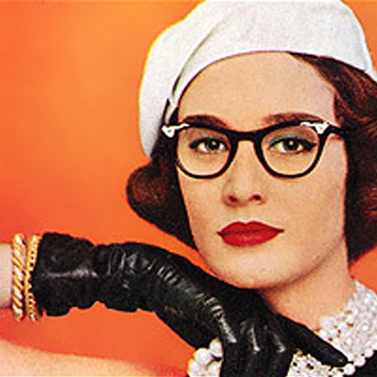
A little editorial bird told me that the origin of the clinch cover is rooted, as with anything involving boobs hanging out of tight corsets, with men. Seems men were the buyers at stores selling romance novels, and they bought more of the clinch covers, so that’s what was sold. I don’t know how true that is, but it doesn’t seem too far fetched. I mean, there’s no doubt that when I leave the buxom clinch covers around the house, Hubby tends to pick them up and take a closer look. The hetero male mind comes to complete synaptic arrest at the sight of boobs.
Whether or not the story of the Origin of the Clinch Cover is true, the fact remains that they seem to sell even now. Floral-drenched landscapes, close ups of women’s shoes, and headless torsos haven’t really made the marketing impact that the clinch has – go to the bookstore and there’s plenty of that classic clinch image on sale in the book rack: buxom mantitty grasping at half-naked women.
So I ask myself: which came first, the romance or the clinch cover? Are readers of romance trained to head for the clinch cover when shopping for reading material because so much of romance is and has been housed in that image? Or is that image preferred by enough readers of romance that the clinch continues as a iconic image of romance that will sell copies of whatever book it adorns?
In the discussion of the “Ravished” cover on the Seattle Weekly issue last week, iffygenia made a very apt comment:
I’m equally insulted by the hideous covers and *their* use of “ignorant, easy shorthand that plays into insulting stereotypes . It’s true, many people have a negative image of the genre. Not surprising, given the genre actively works to put that image out there.
In the cover survey yesterday, a lot of commenters echoed that sentiment – that the clinch covers don’t really do it for them. Chicklet, for example, said she preferred covers that “don’t depict people, either in paintings or in photographs” and that she “abhor(s) clinch covers.”
Tracy said, “I don’t think we need half naked people or people practically having sex on the covers for people to know what’s inside. I don’t like covers that scream ‘there be sex in here’” and given that I’m often reading on my lunch break while I eat, I agree with her. There’s a certain amount of professional image that one loses in a glance if there’s Fabio and a nameless model humperating on the cover of one’s lunchtime reading material. I admit: I get a little thrill reading paper-bound ARCs because they are often entirely without art, and therefore completely genre-neutral.
Teddy Pig pointed out that the older Coulter and Lindsey covers, on the other hand, “gave those books a specific character,” and he does have a point. The lurid image was a sign of the times – and may be part of what trained me as a reader to look for the clinch when it comes to shopping for romance, especially if I’m shopping for romance quickly, such as when I finished a book on a flight and grabbed something fast while I changed planes. I ended up buying a book featuring two empty beach chairs, and man oh man was it not a romance. I loved it, I thought it was beautiful, and it was marvelously well-written, but it was sad and definitely not a romance. It was in the mini-bookstore’s collection of romance mixed in with ‘women’s fiction,’ and it occurred to me that if I’d gone for a clinch cover, I would have ended up with a romance. Maybe not a GOOD one, but definitely a romance.
Perhaps that’s why clinches sell. It’s the Marketing Image of Romance Novels, and if you’re shopping without a specific title or author in mind, it’s the cover image that most likely guarantees a romance novel inside. Perhaps we are like the buxom woman on the cover: stuck in the clinch.

I think the 50% is “of all new fiction titles†(I know I’ve seen that number bandied about, but I can’t find the source at them moment *grumble*). So you may both be right, you’re just talking about a different statistic.
Romance: $1.37 billion
Religion/inspirational: $1.68 billion (includes Bibles, so it’s a bit misleading)
Science fiction/fantasy: $495 million
Classic literary fiction: $448 million
Mystery: $422 million
So Sci-fi/fantasy + Literary + Mystery = (roughly) $1.405 billion, or just a tad more than Romance by itself.
Hmmm…I guess I was using old information. Kind of interesting that the romance genre is just behind the religion/inspirational genre for sales according to the report mentioned at Dear Author. Sort of like those legends about the old west where there’d be a church on every corner and a tavern across the street from every church.
Teddy Pig, I’m thinking that if we did a Rohrshack sort of test on you using romance covers instead of ink blots I wouldn’t stop laughing for days.
“All books” includes Bibles, cook books, Rock Polishing for Dummies, etc. It’s more relevant to talk about “all fiction”. And romance does make up something damn close to 50% of that.
I have two sets of the actual Rorschach tests. From what I hear this is supposedly a big no no for a lay person to have these.
Did you know some of them are in color?
One of these days I am gonna blow mega bucks and get them individually framed for the living room wall over the couch like a big art installation
My research psychologist of 6 years, Dr. Riddle, died of AIDS and left me them in his will.
Yes, I have been written up in 3 reports he published on the psychological impact of HIV infection. He told me he did it too.
I replied that I hoped he only said nice things about me.
That sounds amazing! Talk about somethign to inspire a cocktail party. LOL!
The 21% is of “net revenue from retail sources in the U.S.” It doesn’t indicate what percentage of the total number of books sold are romances. Probably that’s a much higher percentage, since romances tend to be relatively cheap compared to other books. And if you looked at the number of romance books sold compared to other types of fiction, I’d imagine the percentage would be higher still.
Teddy is right: only a lack of sales affects a publisher—which is why I don’t buy clinch covers. From this thread, it sounds like quite a few romance readers are buying the books *despite* the clinch covers, which is a distinction lost on the publishers. They only see sales. Ergo, if you don’t like clinch covers, don’t buy them, period. That’s the only way to change the way the genre operates.
Great in theory, but it’s unlikely to yield the longed-for result. The way the publishers are more likely to interpret the lack of sales is that readers are not interested in the AUTHOR. They’d actually have to do RESEARCH beyond the obvious to find out that the lack of sales was due to the shitty cover, and they aren’t going to do that. Ask any of the authors out there who’ve gotten stuck with a truly awful cover. Even when the publisher will admit the cover was a mistake, they won’t take the blame for poor sales. It’s the poor author who gets blamed/shafted.
Well, I guess some people aren’t attracted by my covers. I’m just looking through my site logs, and apparently AltaVista managed to pick me as its random link for a while a couple of nights ago. The visitors that sent my way mostly seem to have clicked away again in a hurry…
Well with eBooks Jules the covers are much more correctable.
I see EC updating their covers constantly before putting something older with say a poser cover into print.
Good thing too!
I think this is yet another rule that eBooks get to break. The covers are much more replaceable if the story is good.
I was telling a friend of mine yesterday to just have April do a cover she likes for her so that she could slap on after she gets the contract back. Because most often you cannot keep the cover anyway.
They could be clinching, but in a less body-torturing, skin baring way.
Yes! I’ve seen a few clinch covers (sadly, only a few) where the clinch is tastefully done. As LorelieLong pointed out, The Raven Prince by Elizabeth Hoyt is a prime example of a clinch cover that isn’t cheesy or defies physics. The clinch may be a visual code, but Hoyt’s cover is one where the code isn’t cringe-worthy.
And I don’t know what book cover god blessed P.C. Cast, but I’d love to see more covers like hers on other books.
Teddy Pig—the other thing with eBooks, of course, is that a cover that works on a monitor is not necessarily one that works on dead trees. Monitors (mostly) generate their own light. Print books are viewed in reflected light, and in widely varying lighting conditions. So you could have something that looks really good on a TFT screen, and that sucks on a print book.
Wonder if we could drag ALG in here to talk about covers…
I can’t help but wonder if pre-1970s sleaze paperbacks (you know, the ones with the truly lurid covers suggestive of egregious, even criminal sexual behaviors) aren’t the precursors of romance clinch covers. Those books were intended for male readers.
I think it’s entirely possible for romance fiction to maintain the shorthand of cover graphics without going to tasteless extremes. In fact, it’s already being done. The cover for my EC novel Plagued is a model of subtlety, yet it conveys a kind of moody, angsty sensuality. I’ve seen quite a number of ebook covers that have managed to feature appealing, intertwined bods without making them look like they’re about to erupt.
I can’t help but wonder if pre-1970s sleaze paperbacks (you know, the ones
with the truly lurid covers suggestive of egregious, even criminal sexual
behaviors) aren’t the precursors of romance clinch covers. Those books
were intended for male readers.
Wry Hag,
You know how much money those pulp fiction novels go for these days? I know gays and lesbians that spend BIG BUCKS collecting those and they actually are kinda cool.
I think the same will happen with the Fabio clinch covers. Eventually people will collect them and new authors will want to use the style as something retro and fun.
Huh – didn’t know either of those things. I just realized I made a typo on the name Rohrshach earlier…it loses a little of its mystique with a “k” at the end, doesn’t it? Takes it a little closer to “Horseshack”.
Anyway. Unfortunately, I agree that not buying a book based on its cover does more harm to the author than send a message to the publisher.
It’s kind of like those people who leave little cards for waiters and waitresses instead of tips explaining why they didn’t get a tip – it hurts the wait staff at the time and effects no change to the tipping culture at large (though in this case the reason for the lost sale isn’t communicated to the publisher so they’re free to interpret the stiffing however it makes sense to them).
Now I’m even more frustrated by this issue because it seems the only way this can be decided would be if a publisher took a chance and tested the market with alternate covers. And who would willingly step up to the plate on an experiment like that when one of the assumptions going into it is that fewer sales will result?
Well, shoot! I’ve been meaning to take my Fabio-illustrated version of The Shadow and the Star off for donation…guess I should re-thing that plan.
Re-think, not re-thing. The letter “k” is apparently not my friend: popping up here, disappearing there. What did I ever do to you, letter “k”?
I will admit the first romance novel I ever read—Until You by Judith McNaught, for those who are curious—did not actually have a clinch cover. It had one of those early 90s covers with an oyster shell and a pearl. Yes, I probably ought to have guessed the connotations but I was eleven years old and just thought it was pretty. 😉
I do distinctly remember one clinch cover (at least sort of, although I don’t think either of the people were nearly as naked as others seem to be) and it was for this awful novel set during the Third Crusade where the woman in question was sold as a Saracen slave…I think it was called Love’s Fiery Dagger, and it was fairly awful.
The truth is that these little experiments go on all the time. Not controlled
experiments, but… There are romances released all the time with tasteful covers. Flowers, fabrics, a close up of a hand on a arm… something like that. So if the vast majority of romance readers HATES clinch covers, wouldn’t those tasteful books sell measurably better? Yes, there is a code, but if you are specifically searching for a romance with a subtle cover, you’d zero in on it. If those tasteful books got snatched up in record numbers, do you think every editor wouldn’t be DEMANDING that their authors get the tasteful covers? Come on.
The readership of Smart Bitches is hardly an accurate sample of romance readers in general. And knowing Kalen *wink*, I’d say that her friends are not an accurate sample either.
Romance novels sell themselves. Certainly no one is spending any money on promo for me. My book has to scream “sexy romance!” And boy, does it.
But you’re assuming that readers are shopping by cover, and I don’t think this is true. I think most of them shop by author or subgenre, and they buy what’s there. In historical romance that means a whole lotta clench. I mean, I could be totally wrong, but I see readers commenting ALL THE TIME that they hate clench covers, but I can’t think of a single instance of them raving about how much they love them*. And if they do love them, you think you’d see come clench love making its way around the web, wouldn’t you?
And I think we are finally seeing less of them, but the replacement is the naked dude torso. NDT works just fine for things like Scottish historicals (hello Monica McCarty) where you can add a kilt to signal the readers that THIS IS A SCOTTISH HISTORICAL, but it doesn’t really suit a lot of other historical periods (Why is that knight running around during a battle half-naked? Why is that Regency duke naked in the snow?).
*aside from the occasional poster on a blog like this who confesses that they don’t mind them, or that the clench holds a dirty, secret attraction.
As a publisher (of nonfiction) I can say that if readers boycott a book the author will most likely suffer—we probably would not connect the bad sales to the cover art unless a couple of things happen: a whole bunch of booksellers and/or readers provide feedback, all books in a genre suddenly tank and then we’d have to ask ourselves why, or we realize that a cover is bad. That last bit happens on occasion and if we’re doing another edition of a book then we have a chance to correct it, but that doesn’t happen often—we created the cover in first place, after all.
I sit through cover design meetings; we talk about the visual message a book will send, and sometimes we purposefully go against type. But mostly we want the target market to look at a book and pick it up/buy it. We do what we think will most likely lead to that outcome.
Not sure what the demographic of Smart Bitches is but this seems like an educated group—perhaps urban/suburban, too? If someone did a survey of romance genre readers’ cover preferences it would be very interesting to know how the socio-economic and regional demographics play out vis a vis clinch covers. This (I suspect) highly educated group hates ‘em. Does everyone?
It’s not just clinch covers on romance that turn me off. It’s spaceships on sf books and dragons/knights/unicorns on fantasies. Anything that smacks of stereotype tells me that this is More of the Same.
Strangely, I find myself enticed by most YA novel covers. They either portray humans in relatively dignified ways (i.e., not in clinches or fighting laser-breathing dragons) or tend to be more abstract and evocative.
(P.S.: I’d just like to say for the record that I bought To Tempt a Scotsman because of the name VICTORIA DAHL. Despite the clinch cover, I read it proudly in public because I couldn’t put the damn thing down.)
But the corollary is if a reader buys a book despite the cover, the publisher just sees the sale and thinks the cover worked. So I guess the best way is to contact the publishers and let them know? Whom should we contact at the publishing house? The editor, the marketing department, who? Is there a way to find contact information for those people?
And I think we are finally seeing less of them, but the replacement is the naked dude torso.
Absolutely. I admit I was using “clinch cover” as shorthand for anything featuring embraces and/or nudity. The discussion seems more about lurid covers v. books no one would make fun of you for reading at lunch.
RWA says
Some of their statistics are a bit wonky, and some of the statistics change a surprising amount from year to year… but them’s the current numbers.
On cover preferences, RWA says:
That “either” category makes it hard to interpret, but it doesn’t sound like there’s an overwhelming demand for “romantic” covers. I interpret this to mean 12% like the clinch, 35% don’t like the clinch, and 53% don’t really care.
I’d just like to say for the record that I bought To Tempt a Scotsman because of the name VICTORIA DAHL. Despite the clinch cover, I read it proudly in public because I couldn’t put the damn thing down.
Heehee. At Barnes & Noble, I was “Victoria Dhal” according to the sign, which made me feel lentil-y delicious and exotic with just a hint of spice. *g*
When I say “clench cover”, I’m talking about the classic Avon-style clench: Badly rendered, egregiously incorrect clothing, mysteriously missing clothing (why is the dude so often shirtless when this makes NO SENSE?), girl is some impossible position, usually with her dress half falling off. I just hate them. But maybe somewhere in another part of the world there are hordes of silent readers who love-love-love ‘em. *shrug* There’s no way to know, really, and I don’t think the publishers give a shit. “Good enough†is good enough. As a reader, I buy by 1st by author name recognition, 2nd by recommendation from trusted sources, and 3rd by subgenre/blurb/first page. I’d be happier with books in plain paper wrappers like ARCs.
the naked dude torso.
Do you realize how many eBooks I buy just because of this?
Do you understand how important a development this is?
Do not cast disparaging remarks upon my delicious wonderful marvelous naked dude torso or I shall weep!
More naked dude torso is better naked dude torso.
I only ask that more treasure trail be used in the creation of naked dude torso.
That is all.
Teddy, I hear you. My own books are awash with NDT, and you don’t hear me protesting. *grin*
Hey Teddy!
“Tender twinky titty tweakers.”
It made me snort decaffeinated chai spice tea sweetened with honey all over the anthropological theory article I’m (not-because-I’m-on-SmartBitches-again) reading.
What about something like Lisa Kleypas’ covers? Historically incorrect dresses notwithstanding, I heart them very much.
Oh! and I’m not against the naked dude torso but lets not have heads on them. I get to feeling a bit uncomfortable for some reason. The Loretta Chase “Lord Perfect” cover? I’m embarrassed to even look at that one.
Oh! and I’m not against the naked dude torso but lets not have heads on them.
Fully AGREE! The guy on the cover of Lora Leigh’s Nauti Boy looks constipated.
Parts is parts! Just give me the chest and ribs throw some identifying gimmick in like cowboy boot or a sword or kilt and keep the head to yourself.
I do think most of us seem to have the same taste here, despite that I’m arguing the popularity of lurid covers. I’m a huge fan of both male and female headless torsos. (What, does that sound weird?) And I love abstract covers, and beautiful (period or not) dresses. I’m just saying that what I like doesn’t necessarily correspond with what other people buy, much as I’d like it to. Ah, if only I ruled the world. *sigh*
“keep the head to yourself”
Am I the only one picturing a cover artist working late at night, finishing up and tucking a head under her arm as she leaves? *g*
I wonder if male buyers bought the clinch covers because “Hey, BOOBIES!” or if they honestly believed that women needed that image to know it was a romance.
I could just see this man staring helplessly at two different covers, one heaping with oily, tanned man titty and one with a plain, Catcher-In-The-Rye-Style blank cover with just the title and going, “Hmmm… they put a picture of the carrots on the label on a can of carrots, and my wife is so good at buying canned goods… maybe I should go with the… naked one.”
As I understand it, it was the teamsters, not the buyers. I wasn’t there, but I’ve heard this story often enough from enough sources that I think it’s probably accurate, despite some head-scratching details.
The drivers in the distribution centers would be pointed at the stacks and stacks of books in the warehouse, and told to load up and deliver so many here, so many there.
Whenever they had any leeway on which titles to take, they took the ones with porny covers. (I don’t know why they would have leeway here. That’s the part that always stumps me.)
Legend has it that they would often compare notes on the charms of the various cover models in language befitting truck drivers. And one day, one of these conversations was overheard by a publishing company rep, who suddenly understood why clinch covers sold so well even though women readers complained about them.
Blame the teamsters. 😉
Legend has it that they would often compare notes on the charms of the various cover models in language befitting truck drivers.
But they did not really reuse the female models like they did say Fabio. So in this case it was teamster truck drivers that liked Fabio.
Good point, Teddy. I’ve wondered why the male models have name recognition and a following while the female models, some of whom I’ve seen reused, are anonymous for the most part. It’s difficult to find much info on them.
Fabio-Lovin’ Homoerotic Teamsters? Hmm.
Theresa’s version is pretty much the story I’d heard, although I can’t remember where now. (It’s tagged “Tor editor” in my memory, which means I can probably blame either Anna Genoese or a Nielsen Hayden for it.) It was to do with the distribution system for those wire spinner racks in drugstores and the like. It was left up to the guys doing the actual driving to pick stuff, on the assumption that they knew what sold where on their routes. And they tended to pick the stuff with covers that appealed to them…
I’m not surprised. I used to subscribe to “Realms of Fantasy” magazine, and the editor would get many letters asking why there was almost always a 1/2 naked buxom babe on the cover. Her reply was that the majority of the subscribers were female but the majority of the news stand pick ups were young males, hence the chicks in chainmail on the cover in their effort to attract more readers.
Huh. Seems more likely that the male models are known because the female readers like the man-titty and don’t care about the female models?