
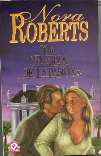
Bitchery reader Megan was kind enough to send me this “esnarc internacionale” cover, which she purchased in Spain. You might know this book as “Carnal Innocence,” but we all now know the Spanish version as something much more memorable.
Sarah: You remember that X-Files episode with the guy who had to eat people’s livers so he could make his nest of bile and newspaper under the escalator?
Well, it’s a little known secret that after watching that episode about sixty times, Ms. Roberts penned a spinoff, wherein a man with an impossible coiffure had to munch on the hair of women sporting poorly-placed silicone implants in order to maintain his own Shadoe-Stevens-esque hairstyle.
Candy: Actually, dude looks kind of like Corbin Bernsen in his LA Law days, and it doesn’t look like he’s eating her hair so much as he is performing the venus butterfly on it. That’s probably why she looks so pissed off. “Not THERE. Go south, you simpleton! SOUTH!”
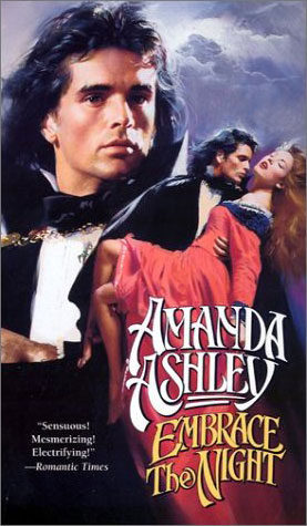
Sarah: Bitchery Reader N. Land sent this cover to us, along with the accurate notation: “It’s Count Floyd on the cover of a romance novel!”
Seriously, is there any doubt that this is a vampire book? The towering pile of visual cliches are threatening to knock me onto the floor.
Candy: Wow. Vampires with big pouts, big capes and even bigger mullets. It combines the very worst aspects of emo-gothiness, cheap Halloween costumery and white trash. You know homeboy there just loves posting to his Livejournal about the consuming darkness deep in his soul that
siers
seers
burns him alive, all the while weeping into his can of Hamm’s.
Sarah: Oh, for the love of God. That’s just a travesty. The least he could do is lend her his jacket so she won’t catch a chill. She’s already frozen her tits off.
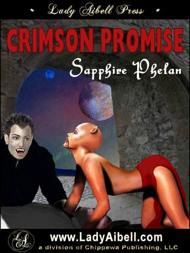
Candy: Follks, once again, we have that rarest of rarities: The Cover That Snarks Itself. Actually, I thought the cover looked sort of familiar, and then I realized that a couple weeks ago, Bam and Meljean had tried to describe this cover to me, and I said “Wow, that sounds fucked-up.”
And now I’m looking at this, and it’s even more fucked-up than what they described.
If nothing else, the fact that Eddie Munster seems to have picked up a nasty crack habit and has been driven to make bad porn with bald anorexic Vulcan vampires in an effort to support the addiction fills me with so much sorrow.
And as for Cueball, there—I feel two urges when I look at her. My first is to get out my Turtle Wax. The second is to get a giant fly-swatter.
Isn’t that Amanda Ashley a Pino cover (Pino being the artist, not some kind of bitchy editorial comment)? I ask because I was in Boca Raton this summer and was walking past a high falutin’ art gallery where they were featuring an exhibit of art by Pino.
So laugh if you will, monkey girls, but some of these cover artists are actually going out and getting real, live careers in the art world.
The cover of Embrace the Night matches the story perfectly. Oh why did I read that book?
why, oh why does the que ball head have pig ears? with the color of her skin, stance, bald head and ears… that’s just not cool.
It’s not the guy on the Nora Roberts’ cover that makes me look twice. Check out the sternum on that woman! Generally you don’t see quite so much sternum with that much boobage.
As for the cover of Crimson Promise, holy cow! I would have pulled my book, no joke, before letting it go out with that cover. Or I would’ve my own generic thing in Photoshop with black background and my handy Clip-Art package. I swear I could not do worse.
I will have nightmares now about tanned boobless vampire pig women from hell getting it on with Eddie Munster and I will blame the Smart Bitches for it!
Seriously … that is like something out of the Mexica prophecies for the apocolyps! The demon women who will come up from the earth to eat people. *shudders*
And the guy on the Nora Roberts cover is so eating that chicks hair. He’s got one of those mental disorders where you eat inapporpriate things.
I too will confess to reading Embrace the Night. The cover was a big turn-off, but I wanted to read it because of my vampire love. I regreted it.
“If nothing else, the fact that Eddie Munster seems to have picked up a nasty crack habit and has been driven to make bad porn with bald anorexic Vulcan vampires in an effort to support the addiction fills me with so much sorrow.”
OH. MY. GOSH. Are you TRYING to kill me?!? I about died laughing… I have to agree with Madd, the word “pig” should have been involved…
Oh, so that’s what Sharon Stone did before Basic Instinct—foreign Nora Roberts covers. Seriously. Am I the only one who saw that?
I think the Eddie Munster dude looks like Q from Star Trek, too. That is a truly horrible cover. It’s gonna give me nightmares.
You know, it was all fun and games until that last cover. I tried to laugh and cringe at the same time…and I think I broke something vital. No seriously, what IS that thing and why does it want to ruin everyone’s eyesight?
The cat Vulcan boobless woman looks like Salma Hayek and her cronies AFTER they transformed into vampires. But at least in From Dusk Til Dawn I got to drool over George Clooney and that tatoo. Lusting after Eddie Munster, I think, causes strokes or denotes some sort of illegal perversion.
AIEEEEE!!
BRIDE OF CHUPACABRA!
Nice that the Eddie Munster kid is still working, I guess. Miss Piggy’s diet worked, too, but the teeth? Not so much.
Maybe Lady Aibell should contact Cesar Millan. He could teach that critter to stay off the table. And out of the house. And off my bookshelf. Ick.
Am I the only one who misread Sapphire Phelan as “Sapphire Phlegm”?
I got curious (never a good thing) and I started investigating the book behind that snarkalicious cover. Found a snippet from Fallen Angel Reviews:
Say what? The whole thing is eleven pages? Uhm. Exactly how could world-building be showcased in eleven pages? When the reviewer claimed those pages were scorching, I was tempted to pony up my $2 to see for myself. Then I saw the excerpt. Not even the paperboy from Better Off Dead could get my $2 after reading that. But don’t take my word for it. Enjoy, if you dare.
You guys are going to scar Nora for life.
Oh Ana, that excerpt. SHUDDER
Aww, what did Q ever do to you to deserve that?
“Am I the only one who misread Sapphire Phelan as “Sapphire Phlegmâ€?
Thank you… that’s even worse than how I read it, which was as “failin.’” People really should say a pen name aloud a few times before adopting it. There’s another author I can’t remember now (just as well, probably) some Celtic name that makes me think diarrhea. Darragh, I think—it’s the double r with the a’s on either side. Probably a lovely woman and it’s just my gutter mind, and I guess some of that is inevitable, but there is much to be said for “Jane Smith” as a byline.
You’re right Madd. That guy has trichophagia, but usually the sufferer pulls the hair out first. Guess he’s lazy and is just going to the source. I don’t mean to poke fun at a serious mental disorder, but really. A prescription for Lexapro or Effexor wouldn’t hurt him.
Either that or she needs a trim and they don’t have any scissors handy.
Or he has pica, the uncontrollable urge to eat inappropriate things. Often suffered by pregnant women or those with mineral deficiencies. Either way, yuck.
There’s really nothing I could add to the vampire anorexic pig woman from Mars thing. Other than WTF. My eyes shall never recover.
Hu-mons
hehehehehe
Thanks Ana
It was a great book. Horrid cover aside, I really enjoyed it. The concept was fantastic and I pretty much ignore the cover for reviewing purposes, as I’m supposed to be evaluating the story.
There was blood and lust and inventive sex. The story was encapsulated nicely into the short format. It was well-written, and told of two lonely people finding comfort and succor (*snerk*) in each other. The alien worldscape was unique and the premise was fascinating.
Again, just IMHO, but it was a scorcher. I’ve read and reviewed over 400 books for FAR, and you’ve gotta do something pretty damn good to get a 5-Angels ranking from me. Ahhh, the beauty of reviewing…and the right to my own opinion.
I dunno, the Eddie Munster boy on the demon-pig-woman cover seems to be laughing just about as hard at her as we are. Perhaps it’s some sort of visual irony?
Again, just IMHO, but it was a scorcher. I’ve read and reviewed over 400 books for FAR, and you’ve gotta do something pretty damn good to get a 5-Angels ranking from me.
And there in a nutshell (no snark) intended), is why these wretched covers are so bad for the authors. I’d have to like vampires a lot to buy a story that short, and I don’t like them at all—but if this were a genre I did like I still would have ignored the story because of that god-awful cover art.
Exactly, Lia. And I think that’s where the problem is with (some) E-pubs. They want to be taken seriously as a force to be reckoned with in the publishing world, but they shoot themselves in the foot with these abysmal covers.
There are some excellent, very well-crafted covers out there, but the majority of what I’ve seen in my 400+ books at FAR are something akin to a trainwreck.
The story length isn’t such a major issue with me; I like little bites (*snerk*) of stories and I enjoy longer length tales are well. No matter the size of the book, I think that the E-pubs owe it to their authors to convey something about the book on their covers. This was NOT a comedy, so I’m not getting the decidedly comedic image that the cover conveys.
I guess what I’m asking is WHEN ARE SOME E-PUBS GOING TO WISE UP AND SEE THAT THEY’RE MAKING A BIG, COSTLY MISTAKE WITH THESE AWFUL COVERS????
I like to rip on them a much as the next Smart Bitch, but DAYUM, come on, people.
If you want to be taken seriously and shorten the gap (perceived or real) between electronic & print, let’s do away with the God-awful poser covers.
I’m making some sweeping generalizations here, I know. I’ve seen some AMAZING covers recently, so I think that there are finally some E-pubs who are “getting it”.
‘If you want to be taken seriously and shorten the gap (perceived or real) between electronic & print, let’s do away with the God-awful poser covers.’
I’m assuming the stress is on the godawful…Poser can be gorgeous if done by a professional. I have one on my site I adore. But then again, I had the foresight to know I couldn’t do cover art with a gun to my head, and paid somebody who could rather than subject my authors to any attempts on my part. I also am a royal PITA about what comes in—I will ask for tweaks if needed. Luckily, I haven’t had to ask for much, because I’m dealing with pros.
As to why epubs continue with godawful art…There are many reasons.
1. They started an epub thinking that ebooks are a cheap way to make money—no up front costs, and little maintenance to sell them. Then they found out artists who spent hours learning their craft actually like to get paid for their work.
So they think, hey, I can do that, it can’t be that hard to learn. They buy a copy of Poser and Bryce, maybe Photoshop, and jump in. The result is what you see. The authors are possibly either too nice to say anything or too inexperienced to know what they’re looking at.
This is okay for say, a free story, or banner ads, but not for your ‘real’ books. And, you need an unbiased opinion to check your work.
2. Sometimes the author has little input and has to take what’s given, but in most cases I’m aware of, it’s the opposite—the author pretty much chooses what they want.
Cover art is different from other graphics. It’s based on marketability, not necessarily what’s pretty. Sometimes what the author wants doesn’t look good, or work with the story well, or fit the pub’s standard, but they get it anyway to make them happy.
3. Authors have no input on art, and have to take what they’re given.
4. People hire their friends or friends of friends or kids of friends of friends to do art for their company because they work cheap, and then don’t ask the artists for changes or tweaks because it might hurt their feelings.
Now, this can be great—one of my authors requested a friend of hers to do one of her covers, and I agreed to see what he could do. In this case, though, he’s a professional cartoonist, and I checked him out before agreeing.
That’s the major point—someone has to police the art when it comes in. Unnfortunately, if the person doing so doesn’t know what to look for, that’s not much of a help.
I’m sure there are more, but those come right to mind.
I detest all God-awful covers equally, whether poser or not! I guess that makes me an Equal Opportunity Cover Critic.
In this case, it was the poser cover that incurred my wrath.
At first I thought it said Saphire Pleghm! Guys! Stop using screwy fonts, amongst other things..
Corbin looks like he’s eating her hair…and the girl is going Eeek!
I need to get something straight here. Is this a romance cover? Say it isn’t so….
It’s erotic paranormal vampire, if I remember correctly.
EROTIC, you say? Well, lemme tell ya, that cover sure does redefine the word!