
This week’s cover snark was brought to you by this year’s RITA nominees. Quality romance != quality covers, as many authors can probably attest to (poor Loretta Chase—will she ever catch a break, or does God really hate her so much that she’s forever doomed to hideous covers featuring dudes with greasy perms and/or jaundice?). So, congratulations to the nominees, and also best of luck—especially with the art department.
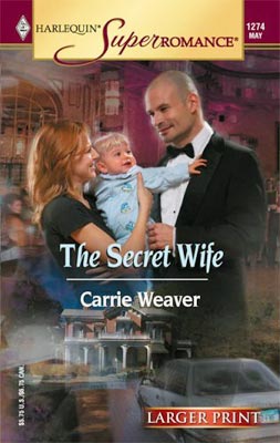
Candy: The Secret Wife hands the (no doubt) Even More Secret Baby to Gunther the bodyguard so he can exterminate the last of the evidence of her drunken Cabo weekend.
Sarah:
Dude. Isn’t that the bald guy from Night Court? You never know WHO is going to turn up as a cover model next!
And why is there a car driving into his crotch?
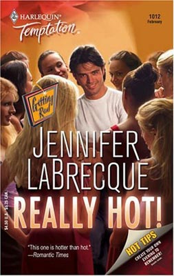
Candy: HAY GUYS! THIS BOOK IS LIKE OMGHOT LIKE REALLY FOR REALZ HOT! EVEN THOUGH THE GUY LOOKS LIKE A BLIND DATE REJECT BUT U NO HES HOT COZ LOOK AT ALL THOSE HOT CHICS STANDING AROUND HIM.
Sarah: Here at SBTB we present the following ironclad rule: “If you have to use an exclamation point to assert the hotness of your hero, there is no way said hero will be remotely hot on the cover of your novel. Instead, your hero will look like a meth-addled Joey Lawrence.”
Whoa.
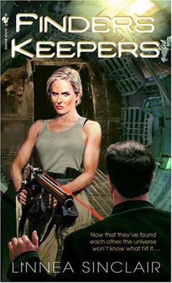
Candy: OK, I know the guy is supposed to be putting his hands up in surrender, but from this angle, it looks like he’s excited. “Ooooh, ooooh, Sharon Stone is shooting me with a red laser! How veddy, veddy exciting! I can’t wait to tell Mumsy about this, she will just die!”
Sarah: Either he’s running to Mumsy, or he’s gyrating his hips like those guys in the Nextel commercial and she’s so pissed about his poor dancing skills that she’s going to shoot off his schmeckie and see how well he dances now, huh, punk?!

Very nice picks for covers, Smart Bitches. And not a DeSalvo or Fabio to offend the eye.
And now for my takes on the covers:
1) Yes, the man on the cover does look like Richard Moll (the bald, stupid guy from Night Court who actually looks like Steve Martin with a shaved head). Why couldn’t it have been John Larroquette’s Dan Fielding? At least he was known for being a womanizer, although I don’t know how he would have handled the baby.
2) How can the second cover be romance if it’s pandering to the typical male fantasy of a guy having legions (or is it lesions) of girls swarming all over him and fighting for his affections? That’s revolting! I thought women read romances (and if a guy reads a romance, there’s the possibility that the man is either gay or trying to find out what women see in these things). And the guy on the cover doesn’t look like Joey Lawrence on a meth bender—more like a sleazy daytime soap star with a big ego and a small dick.
3) The woman is Sharon Stone on steroids, no question. And what’s that caption on the shot guy’s shirt mean (“Now that they’ve found each other, the universe won’t know what hit it…”)?
No, great romance does NOT equal great covers. I haven’t read the others snarked on here, but I just read FINDERS KEEPERS and loved it…but the cover model is definitely channeling her inner bitch…and not bitch as in this place, but bitch as in… well, you know what I mean.
Sorry to keep bothering you about this, but I found some covers (all real, all the time) that might be a little more screwed up than the ones submitted for the approval of other Smart Bitches:
Here are some links, fresh off the skillet:
1) http://store.eharlequin.com/t2_book_detail.jhtml?PRODID=11770
2) http://store.eharlequin.com/t2_book_detail.jhtml?PRODID=11738
3) http://store.eharlequin.com/t2_book_detail.jhtml?PRODID=11591
4)http://store.eharlequin.com/t2_book_detail.jhtml?PRODID=11731
5) http://store.eharlequin.com/t2_book_detail.jhtml?PRODID=11706
6) http://store.eharlequin.com/t2_book_detail.jhtml?PRODID=11044
“Ooooh, ooooh, Sharon Stone is shooting me with a red laser! How veddy, veddy exciting! I can’t wait to tell Mumsy about this, she will just die!â€
You killed me. Laughed so hard I choked on my own goddamned spit. I can see him prancing from side to side too as he expresses his joy.
*bows to the goddesses of snark*
Here’s another cover I stumbled upon. Hope I don’t give anyone nightmares: http://www.amazon.com/gp/product/images/0373691122/ref=dp_image_0/002-3308869-7184836?%5Fencoding=UTF8&n=283155&s=books
I quite like the Submission one, at least it has a bit of a sense of humour. But the others, ick!
REALLY HOT! is “hotter than hot”? (No, really?) Has the Romantic Times misplaced their thesaurus? Or did viewing the cover kill off another hundred of the poor reviewer’s brain cells?
Woo! Awesome snark without the Man Titty. Nice work, Angels!
REALLY HOT! OMG, ARE WE LIKE, 15?
But I’m disappointed. It says on the cover that there were hot tips on how to “create your own evening to remember” and you didn’t share.
My tips usually involve chain saws, molasses, and all night tattoo parlors, but no one likes old fashioned fun anymore.
I put the Submission one in there because to me, it didn’t say “romance novel”; it said “Girls Gone Wild”. Although, it is funny now that I think of it.
Here’s a truly awful one (this was number four on my list, but there was no link to it):
http://store.eharlequin.com/t2_book_detail.jhtml?PRODID=11731
I think that’s what Candy meant, but she didn’t use the not equal symbol (this symbol here: ≠), so it should read:
Here at SBTB we present the following ironclad rule: “If you have to use an exclamation point to assert the hotness of your hero….
The exclamation point is one of my pet peeves with romance. It’s either unnecessary or a cheap substitute for finding a more effective way to convey strong emotion. Whenever I see one I feel like I’m listening to a used car salesman:
You’ll love it! It’s really hot! It has wheels! And a cup holder!
I think that’s what Candy meant, but she didn’t use the not equal symbol (this symbol here: ≠), so it should read:
Actually, I did 🙂 . In Javascript, PHP, and a few other languages, != represents “does not equal to.” Computer languages vary in the way they represent this; in VBScript, for example, it’s represented as <> . I used != because I forgot that a) not everyone is a complete fucking dork like me, and b) I was too lazy to look up the symbol.
Well…..we have been complaining about the mullets. I am tempted to give a few snaps to the first cover simply because the hero is different, and some guys look really hot bald. Unfortunately, that guy ain’t one of ‘em. Definately Bull from Night Court. Not sexy.
The second one….I just want to stomp the shit out of that guy. The fact that he looks like he would cry like a little girl while I did it makes me want to do it even more. That is the first cover that has actually made me feel violent. It is like red kryptonite.
The third…I have nothing. It just sucks.
Well, I’m dorky enough to have gotten the != sign, so I guess I’m ‘complete fucking dork’ literate. 😛
Which is good, because a lot of the world seems to be coded in CFD.
It’s a sign of how much time I’ve spent reading Sarah that MY first response to the first cover, even before reading it, was “Holy cow! It’s Richard Moll!”
But, really, it looks more like Grant Morrison. Except he’d be wearing a white tux.
Lauri:
These covers are attrocious:
No 3 – looks like Will and Grace attempted to hook up again – even though he’s gay.
No 4 – was just painful
No 6 – what is up with the chicks neck, I know long slender necks as supposed to be sexy but she looks like she has dislocated something.
Mr. Hotstuff may be drawing a crowd, but not everyone there is standing slack-jawed, mesmerised by his floppy-haired charm. The toothy blonde on the left seems to be more interested in checking out the hussy in the red dress opposite.
Awesome snark without the Man Titty
‘tis so very true. And yet, Sarah & Candy have succeeded in their devious deSalvo-led experiment in Pavlovian response. But I am weak of will. And so I now seem to be subconsciously conditioned to expect freshly-greased man-titty on Tuesday morning. I may even be turning into someone who lobbies publishers for more! of these! covers! with 3-D holograms! and extra shiny bits!!!! and dresses like their favorite *le sigh* model on feast days. Where my mullet wig?
Oh the shame. I probably need aversion therapy. Maybe I should go look at Avon covers on Amazon while beating myself over the head with a freshly-caught river salmon, generously slicked with baby oil. Without the man-titty, I am just… lost and empty, like a tiny baby bird who has fallen from the nest. Cheep cheep.
Doesn’t the hot! author’s name look like Barbecue? Had to look at it twice. Maybe each author should change their last name on the cover to match the title too.
Did anyone notice that Finders Keepers has the lovely blurb in the corner: “Now that they’ve found each other, the universe won’t know what hit it…”? I for one hope that whatever hits us, blinds us. *Shudders*
Doesn’t the hot! author’s name look like Barbecue? Had to look at it twice. Maybe each author should change their last name on the cover to match the title too.
Shucks, I saw that too. It forces you to do a double-take on a cover that really doesn’t merit it.
actually, the guy on the cover of the Secret Wife looks more like ex-Toronto Maple Leaf Tie Domi. http://en.wikipedia.org/wiki/Tie_Domi