
Last week Candy burst forth with songs of Luuurve ® about covers she actually liked. This week, it’s my turn.
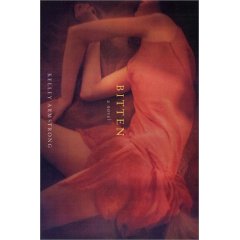
This is one of my favorite covers ever, which is good because I like the book a helluva lot, too. It’s both ethereal and creepy, attractive and horrifying – a diaphanous woman on the ground in an unnatural position, yet still arranged in a way that is alluring enough to make you take a second look. Amazing design, especially the physical position of the model – at first glance, she’s just reclining but then you see the bent arm and think, “Wait a minute….”
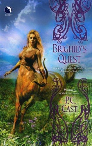
P.C. Cast shall henceforth be known as Seriously Lucky Bitch, because she won the cover lottery somehow. I’ll get to the “Goddess of” series in a minute, but check this out. It’s a centaur woman. She’s half a horse. And she’s still attractive and interesting and how the hell did they do that? She is HALF HORSE and yet she’s strong and feminine. Wow.
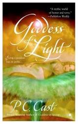
Proof #2 that PC Cast has the luck that dare not speak its name. Candy already talked about Goddess of Spring so I’m going to take a gander at this one – and there’s something very specific I like about it, too. Aside from being artistically gorgeous and visually exquisite, I love this cover for a particular reason. The woman in question, she has a BELLY. At least, it looks like she does. And wow, does that every make my pregnant self feel even more goddess-like.
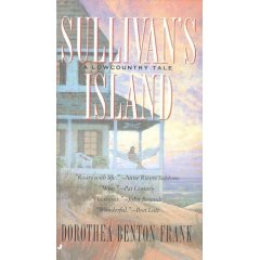
I love Dot Frank’s Lowcountry tales, and Sullivan’s Island is one of my favorites, and, like Bitten, I love it when a cover is attractive enough to match my enjoyment of the contents. It has enough color to avoid being one of those washed-out beach watercolors, and it looks like a still snapshot of a romance and a good story – which it is.
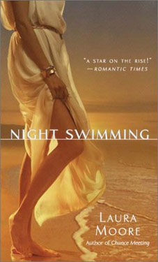
I love this cover for the same reasons as the Dot Frank cover. I personally love the beach, so it’s not hard for me to like any cover that’s ocean-related. But the classic attire, almost Greek or Roman-like, coupled with the gesture that the woman depicted is about to toss off her gown and go swimming is both a romantic and conquering image.

I have tried to read this book a bunch of times, and each time I didn’t enjoy it as much as I enjoyed the cover – so I suppose this is my “Kitchen Witch,” the book I keep coming back to even though I’ve tried to read it before. It’s a lush, evocative cover, and I wish my hair would do that thing that it’s doing on her head on that there cover. The smooth bun without the flying pieces every which way? I might have to try to read this book again, because it’s just too good-looking. My problem, though, is that the cover looks like a contemporary – her dress, that hairstyle – and then I crack it open and it’s…a Tudor?

Holy erotic cover, Batman. WOW. That is one evocative image, and while I’d have to cover that bad boy up on the bus in the morning, whooo damn. That is some erotic, sensual imagery right there. Love the dark hand against the bodice. I’m fanning myself, in fact.
And there you have it – covers I like. I’m a big fan of not seeing people’s faces, it seems, as I like covers that end at the collarbone – the headless cover model doesn’t bother me at all. I’m also a sucker for covers that show people from the back or side, or in masked profile, though I couldn’t recall any specifically that I’d marked mentally as a “love this cover” book.
But mostly, I love artistic, lush covers that aren’t about clinchy sensuality. I’m not a huge fan of the one color covers with a picture of an estate or manor in the distance, either, though, as they seem to be the antithesis of the clinch cover, staid and plain for the sake of being so. I’m always interested to see reissues of older books, like early Julia Quinns that go from wild-haired clinch cover to staid one-shade cover with small watercolor house in the distance around the middle like a belt.
I’m always happy, then, to find covers that are romantic without clinching all over the place, and yet are interesting to look at.
I have to agree with you about PC Cast’s covers- they’re all grrrreat! Sorry, gotta love Tony the Tiger. Actually that first one caught my eye the most. Have to say I think the DBF cover is ok, but I’m kinda meh about the books. Same for the JF.
Off topic- what is the prevailing opinion of Bitten? Haven’t read it yet & wonder if I need to rush out & buy it.
If you are asking me, I loved it loved it loved and loved it some more. Not only a great story but turned me on to paranormal romance in a big way. LOVED it.
Ok. Good enough for me.
I really need to rush out to the store anyway, you know. For,uh..bread. yeah that’s it.
‘Bye honey- TTFN!
I find it kinda’ interesting that both you and Candy chose (mostly) covers that feature people without complete faces. And I mostly agree with both of you when it comes to the covers you chose. I guess this is “interesting” because I thought, psychologically speaking, we humans were supposed to respond more positively to faces – eyes specifically – when it comes to a gut level reaction of positive or negative feelings or catching the attention. Or in other words, it seems our reaction should be negative when confronted with a faceless picture. However, I find I like these that are more evocative than specific.
Oh and also, loooove the Brighid’s Quest cover. As a Sagitarrius I’ve seen and noticed many a centaur over the years and that’s the first female version I can remember seeing. Yep, PC is very lucky with all of the covers I’ve seen thus far.
Oh, I love the BITTEN cover. It’s a lot nicer than the original UK cover. Hm. Let me see if I can track it down … UK Trade Cover
I find your selection interesting. It makes me think of Fleetwood Mac, circa 1970s, and fairy tales.
I think I’ll do a selection. It’ll definitely cheer me up. Cheers for the idea, S & C. 😀
Eeek! Is that the original cover for The Lady’s Tutor? Mine is plain, nothing like that at all. I love that cover!
Yes, indeed, I love that cover for “The Lady’s Tutor.” And I agree about the allure of pictures without faces. They let us do the casting of the characters involved. So that we can be wearing that corset on the Schone novel and the significant other of our choice owns the tanned hand. It lets us do a sort of the photoshopping, with our own imagination.
I must confess; I thought the original cover for The Lady’s Tutor was SOOOOO gorgeous, that I bought a used copy off Ebay.
For $8 US.
Plus shipping and handling.
I couldn’t help myself. I wear corsets occasionally. Nothing quite as erotic as a hansome man helping you with your laces…
I’m prety sure that the copy of Bitten that I have- a trade size copy- has an entirely different cover than that one or the one Maili linked to. And I too love, love, love the book. It purely rocked!
And I’m glad you posted Laura Moore’s cover. She’s another one that seems to get lucky in that department. Few people seem familiar with her books but I met her at Celebrate Romance and she was quite shy but soooo lovely. It’s too bad she doesn’t get more press because I enjoy her books.
Just got back from RWA Reno to this lovely post that included my FAB covers! Thanks Smart Bitches!! (Clearly I should be cleaning my carpet because my Scottie lost his mind when I left and peed all over my condo…but this is so much more fun.) About the Brighid cover – the background is from an actual photo of Oklahoma’s Tallgrass Prairie, taken by – ta da! – my mom! The Centaur Plains in my mythological world is patterned after our Tallgrass Prairie.
My Goddess Summoning covers…what can I say? I am one lucky bitch.
LOVE the Bitten cover. I have it in my TBR pile right now, but the cover doesn’t look like that. Unfortunately.
Hey – right now I’m deeply in the middle of another book with a kick ass cover, Kushiel’s Dart. The book is fabulous, too, by-the-by.
Sarah my love, you’ll be happy to hear that Goddess of Spring won the Prism in Reno. (Elphame’s Choice won Bookseller’s Best and the Daphne du Maurier!) No Rita, though, damnit…
Ms. Phreakishly Cool that is FANTASTIC!
Mazel tov and congratulations!
These covers are all lovely, although Brighid’s Quest is my least favorite. (Sorry, PC; I do love the goddess covers!)
I’m a big fan of the original cover for The Lady’s Tutor too.
All of the covers are great, except for the first one. It just doesn’t look right to me. Thanks to PhotoShop, I retitled the first one, “Mommy’s Drunken Weekend” because it looked as if the woman passed out on the floor from too many martinis.