
Some of our readers wondered if we’d create a special edition of Covers Gone Wild wherein instead of bitching long and hard about covers featuring Lord Mantitte, his immaculate wax-job and his patron saint, Our Lady of the Perpetual Wardrobe Malfunction, we’d discuss the cream of the crop, the best of the best, the covers that actually make us stop and say “Ooooh, pretty!” instead of making us want to claw our eyes out and pray for a swift, merciful death once we gaze upon them. In short: romance novel covers that DON’T suck unwashed, sweaty monkey ass.
We hear, and we obey. This week, I, Candy, will show you some of the covers I really, really like. You’ll notice that most of these don’t feature any men. It’s not that I’m a closet lesbian—not that there’s anything wrong with that—it’s just that most male romance cover models leave me cold. It’s more than their faces, because even the bare torso shots leave me going “meh,” and I like rock-hard abs just as much as anyone else. I think it’s very likely the cheesecake factor. Cheescake is tasty to eat, but not particularly tasty for mine eyes.
For instance, if the cover for Mr. Impossible hadn’t been such a hideous, iridescent pink, I would’ve included it in this list because it gets a lot of other things right: the half-smile, the pose, the period costume, and the miraculous fact that the model was actually allowed to keep his fucking shirt on instead of having it absent or, even worse, tucked neatly into his belt but completely unbuttoned. If the background had been desert sand, blue sky and a pyramid or two, this cover would’ve easily made the list.
Honestly, why aren’t I consulted when it comes to these sorts of things? My taste in cover art is impeccable. IMPECCABLE, I tell you. Don’t believe me? Check these out.
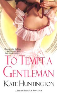
Zebra’s Regency line is putting out some truly lovely covers lately, and this is one of my favorites. It’s demure, it’s sexy, the look is very clean and elegant, and the font doesn’t make me want to weep and call the police to report curlicue abuse. Plus: I want that dress. This is a refrain you’ll probably hear very often in this entry, because damn, I love poofy, gauzy, girly dresses, and I love it when they’re used to good effect on a romance novel cover. Sigh.
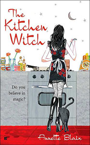
Every time I walk by this book, I pick it up. Every time, I remember it flunked the 15-page test, and put it back regretfully. That, folks, is good cover design. I like the scratchy, textured illustration, I love the heroine’s outfit, and the cover just screams “Buy me! I’m a fun book!” Too bad the 15-page test screams “Don’t buy me! I’m mediocre, with the potential to veer into extreme annoyance the more you read me!”
Ooops. So much for not bitching. Sorry.
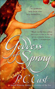
P.C. Cast is one lucky bitch. Most of the covers for her books are just gorgeous. I had a hard time picking the one I liked best for this entry, but I finally settled on this one because I love the colors, the textures, the expression on the woman’s face, and her kickass dress. I want that dress. Dammit.

OK, not romance, but chick lit, but man, a lot of chick lit books have covers that just kick. ass. The cover looks fun, the design is clean and uncluttered, and having the title and author on the boxes is a pretty nifty idea. And that pink herringbone skirt? Want it. Dammit.

Regulars to this site will have seen me mentioning this cover a bunch of times. That’s because I think it’s sexy done RIGHT. It’s kinky, it’s sexual, yet the cheescake is pretty discreet, and the models’ faces are shadowed so they don’t interfere with my concept of what the characters look like. Too bad the story itself was about as sexy and fun as watching Carnie Wilson getting her stomach stapled.
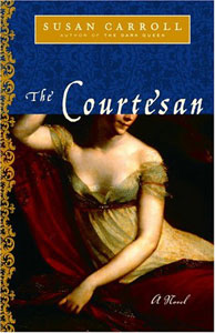
If I had to choose a favorite style of historical romance cover, I think covers based on old paintings would probably be it. This book, however, isn’t really a romance; from what I can tell, it’s a historical novel. But who cares? The cover is beyoootiful. I love the texture, the curlicued border on the left edge, the rich colors, the discreetly sexy painting, the fonts. Now why can’t more historical romances have more covers like these instead of pumped-up gym monkeys sporting scary eyeliner?
Stay tuned next week for Sarah’s whack at Romance Novel Covers that Don’t Suck!
So far, my taste is agreeing with yours.
As far as the reuse of old paintings, yes, yes, yes. One of the Mary Balogh’s “Mistress” books (Was it More Than, Less Than, Equal to …?) reused a portrait of Madame Recamier and it looked luscious, much better than the plain metallic covers on the “Slightly” series. Also, I like when they use PreRaphaelite paintings.
A sexy cover that stays with me is my older paperback edition of Robin Schone’s “The Lady’s Tutor.” Basically it’s just a tanned hand lying beneath a corseted bunch of cleavage. I prefer that to the more tasteful and sanitized reissue cover.
Allow me to borrow the Bitch toque and point out that the dress in example 1 is like nothing ever seen nor yet dreamed of in the Regency.
lol I agree with you on all except the Taboo cover. It just screams cheesy erotic romance wannabe to me.
And the chick lit one, it’s kinda hard to read the title and author…
Good point about Cast’s covers, I just bought Elphame’s Choice and I haven’t read it yet (had to get through Origin In Death first) but ever so often I pick up the book just to sigh at the cover. It doesn’t hurt that green is one of my favourite colours.
The Courtesan is a beyoot.
Allow me to borrow the Bitch toque and point out that the dress in example 1 is like nothing ever seen nor yet dreamed of in the Regency.
An excellent point. However, since I only have the vaguest idea of what constitutes authentic Regency-era dress (other than the fact that they usually sport empire waists), and since I wouldn’t even know the difference between, say, a morning dress, a walking dress and a riding habit if each of these approached me and bit me viciously in the ass, consider my ignorance delightfully blissful.
And the chick lit one, it’s kinda hard to read the title and author…
Keep in mind the following:
1. The image is 72 dpi, which is a fraction of the book cover’s actual resolution.
2. It’s been shrunk to about 30% its original size.
3. When shrinking something digitally, blurring inevitably occurs as details are squished and pixels are moved around. Using the Sharpen > Unsharp Mask filter in Photoshop helps take care of this issue, but I was lazy last night and only bothered to shrink it without sharpening it.
4. Likewise, shrinking also fucks with the color balance and contrast of a picture. And that’s not even considering that each monitor won’t render the colors the same way, since the color differences can be pretty radical depending on the video card, video driver, monitor settings, monitor manufacturer, type of monitor (LCD vs. CRT, for example). I could’ve upped the contrast and fixed the minor color shifting that occured when I shrank the image, but again, I was lazy and didn’t bother.
I’ve seen the cover in real life, and the text is legible—as long as I have the glasses on, anyway. (This isn’t saying much because I can’t see shit without my glasses.)
The Courtesan is a GORGEOUS cover. Gorgeous. And I’d want that dress if I would look like that in it.
Did the Kitchen Witch remind anyone else of Bewitched?
The cover that I attempted to put on my blog (Gramercy Place) was gorgeous too. The rich colors made me drool, and I don’t even particularly like pictures of buildings. Usually are meh.
I like all of these covers, especially the last two. The deep jewel tones always attract my eye.
I definitely have a preference for covers that take their cue from older paintings, especially the pre-Raphaelites. Anything by Waterhouse gets my immediate attention. And there isn’t a man boob in sight. ; )
Another Waterhouse fan here. I buy a Waterhouse calendar every year.
Of the covers shown here, I like To Tempt a Gentleman and Goddess of Spring.
Here are links to other covers I like:
Beyond the Pale
A Breath Away
Seduction of Sarah
Sorry the links are so long. I hope they work.
[Candy’s note: Edited links so they don’t break the CSS layout.]
Oooh! Thanks for mentioning my covers! (Goddess of Spring is my favorite, too.) My author friends are totally jealous – they say I have magic good cover chi.
Personally, I can’t stay away from the covers that look like old paintings, especially pre-Raphaelite. The Courtesan is beautiful. Remember The Red Tent? I admit to buying that book because of the cover.
And I love that you Smart Bitches are doing cool covers! Well done you!
One of the Mary Balogh’s “Mistress†books (Was it More Than, Less Than, Equal to …?) reused a portrait of Madame Recamier and it looked luscious, much better than the plain metallic covers on the “Slightly†series.
Ooooh, yes, I know exactly the book you’re talking about. It’s No Man’s Mistress, and I picked it up because the cover caught my eye. It’s on my keeper shelf, too—the plot is pretty cheesy and the heroine sort of annoying, but the hero is just deeeelish.
yes, yes, Candy! That’s exactly the Balogh cover that I had in mind. It’s doing something a lot like Prudhomme’s portrait of “Josephine” for “The Courtesan.” I think the Balogh cover is lovely, and I’m not usually a fan of that shade of orange. (Too many flashbacks to a 70s childhood surrounded by avocado green, rust orange and coppertone home appliances.) But this is far handsomer than usual.
Mmmmh. Beautiful covers. Eyes all happy now, fully recovered from Lord Mantitte.
Thanks, Candy. I can now go tranquilly about the rest of my day.
Give the Kitchen Witch another try… it does start slow.. but it gets better!
Hmmm, well done! Now how about some great covers with male models? (just for a bit of a challenge) My personal favorite is the USA cover of Alison Kent’s “The Sweetest Taboo” YUM. I also bought ” Out of Uniform” – Amy J Fetzer partly for the cover art. Love military heroes.
BTW, I so love this site. Great, great stuff – call it how you see it, and so damn funny.
cheers
Euri