…and yes – ack! There are changes afoot!
Change can be difficult, but in this case, the change is promising to bring with it some extra double servings of awesomesauce. Jump or scroll, it’s all good!
Jump to:
- Answer the Beta Question of the Week
- Wait, what does Beta even mean?
- Tell us about another problem you had
- Rant (or gush!) your little heart out
- Find out about our new Smart Bitch
The goal for our new design is… We want to make everything about the site better for you. We want it to be easier for you to involve yourself in the incredible SBTB community. We want our site to load quicker for you, and we want you to be able to view it on your phone, for goodness sake. And searching. Oh, yes, searching. Why?
We have a lot to talk about in the romance world, and with the new site, we have enhanced searchability and thus, find-ability (the bitchability comes standard and won’t change, of course). We want you to be able to find the things you’re looking for, while also maybe discovering some new books, discussions, and moments of mayhem and hilarity which you might have missed.
Our redesign is an evolving process which includes a lot of inspection, discovery, questions, and more questions. How can we do some parts better? How can we make the site faster and easier to navigate? Why have I run out of cookies? No, ACTUAL cookies, not web cookies. We’re never running out of those.
We want to hear from you, too. The point of all our efforts is to make the site and the community within it easier to use and easier to navigate. This page is for all of us to talk about what’s new, and why it’s new, what is particularly rocking your socks, and what you think we can do to make it even better. We invite you to get involved as much or as little as you wish.
No, it’s not a stupid question: here’s what we mean by Beta
Beta testing is the process of using real people in the real world to find bugs in a new site. Why’s it called beta, you ask? Because it follows alpha testing, the internal, pre-launch, error-slaying, bug-squishing process that happened before the new design went public. Alpha is the first letter in the Greek alphabet. Beta is the second. “Beta Testing” is just a fancy way to refer to the second testing process.
And yes, logically Gamma Testing would come next, but we just call it Ongoing Beta. The site will keep evolving. We’re going to keep testing. And sooner or later we’d run out of Greek letters. (Though, must say, I do like the sound of “Omicron Testing.”)
Beta Question of the Week:
SBTB has lots of different ways to subscribe to our content! Are they easy to find? How would you do it?
Ongoing Open Beta
FOR REPORTING ISSUES, BUGS, AND GENERAL WONKINESS
Tweet @TeamSBTB or fill out the form below.
This is the spot to report anything you want to tell us about the new site. We want the site to be easy to use and accessible to all, so if you notice a problem or something’s not quite right, we want to know. Basically, if anything feels odd to you, we want to know about it. (And if you think something is covered in coolness, we want to know that, too.)
Let’s Talk About It
Finally, use the comments section below for general venting… or to tell us about the changes you like! Comments are for discussing the redesign, while the form above will send fixes to the design team as quickly as possible.
Please consider adding a function to your review tab so that I can find what the Bitches think of a particular book. Search by title and/or author would be awesome!!
@Team SBTB: My apologies, have posted this in the beta section.
I so appreciate all the suggestions. I want this to suck as little as possible (I know, lofty goals!) for y’all. Thank you!
I also think we need to have a tournament of nested comments vs not nested comments. The prize can be Jello. (I like Jello.)
@Janet S (comment #41): Good news! Both search functions you cite are absolutely available. Click the hyperlinked author name at the top of any post. That will take you to all posts by that author in reverse-chron order. Cool, huh?
As for searching by title or author, again, super easy: Use the new&improved search field. For instance, I just typed Julia Quinn into the search field. This is the result: http://smartbitchestrashybooks.com/?s=Julia+Quinn — pretty comprehensive. Putting “Julia Quinn” in quotes (the way you might in Google) is even more on target.
Similarily, typing in “viscount who loved me” will give you this search: http://smartbitchestrashybooks.com/?s=%22viscount+who+loved+me%22 but without the quotation marks it will yield a less precise result list as it will also include posts that simply use the word “loved”.
But this is basic Search stuff. Down the road we intend to offer many more ways to get to desired content, not just through this search functionality. But we want to run with this new, more robust search functionality first before we start in on that.
@Karen (Comment #40): Thanks!
I loathe nesting comments. Loathe. Them.
I don’t know if it’s possible technically, but a sort feature for comments could solve the dilemma. Something whereby you can sort comments by oldest, newest or nested. Also adding the option of how many comments you want to view per page would help w/ the pagination issue. Basically I’m thinking of how online retailers let users customize their product search results. Don’t know how feasible that is for a blogging platform tho.
Anyways, thanks for listening.
Okay. I miss the pink. I like the narrow multi color bars under the banner/heading and above the posts. The far right, beneath the search lady’s eyeglasses, has an empty rectangular block. Those eyeglasses are a very clever way to initiate search. I don’t miss the rotating samples of current posts which formerly were at the top of the page. I never had the patience to wait for them when the same info was directly below. I miss the pink … oops, said that already. Ahem. I will miss one long page of comments tremendously. When I get to a “real” computer (desktop, not pad) I am going to see if I can search for Friday videos. It may have been less confusing if this post appeared on the home page…I’m not completely certain I am commenting in your preferred location.
Maybe (and I have no idea if it’s possible), but with the multiple comment pages, maybe there could be a way to search the comments of a post? especially things like HaBO which can get really long, and that would make it easier to see if someone has already suggested something without having to click thru multiple pages.
I don’t think I’d mind nested comments, if they look like the ones SB Sarah has above, maybe color coding them would help? Sometimes is can be difficult to see which comment someone is commenting on if there are various levels. For example Askamanager blog recently got nested comments, and while yes, it was nice at first, it just got really annoying which people would respond to each nested comment, then someone would respond to the original comment and you’d have to follow where the text starts on the page back up to the comment they were replying to…and that probably makes no sense whatsoever
Overall, I like it so far!
Love the colours and the general layout seems breezy to navigate. The one big negative: too little white space. In my laptop’s browser (IE 10) everything is crammed tightly together with barely there margins separating the table columns and table rows (if that’s what they are called). It’s a superbusy look that is tiring my eyes very fast.
Anyway, congratulations and good luck with the new site version!
I’m having a lot of trouble with the font. Ws & Ys seem faded out, and I really hate the gray text.
@CG (comment #45) and @Olivia (comment #47): Without going into a technical conversation about CMS structures and the differences between platforms, tools, and such, comparing blog-based comment presentation to database-driven, product-based viewing options is kinda-sorta apples to oranges. Both fruit, but really quite different. (Yes, I simplified this significantly. To the coders out there, yes, I know that this is a very, very broad statement.) Similarily, including comments in search changes the nature of the search, and would dilute the results significantly. Currently search applies to SBTB content. If we were to include comments in that pool, search wouldn’t be nearly as viable.
I appreciate the thought in terms of how you might want to view comments, though. I don’t mean to shoot down ideas — all input is helpful. Simply please know that for just about everything suggested/requested there was some valid reason why it wasn’t included at launch (and may never be included). This said, each of these considerations were already on the can-we-do-this-and-will-it-work list for future initiatives. For launch, we wanted to go with the cleanest, easiest-to-use structure while people got used to the changes.
@LML (comment #46): You are commenting in exactly the right spot, thanks. If you were reporting something you thought was wrong, then it would have been more helpful for you to have used the ONGOING OPEN BETA above.
I’m afraid I have to chime in re: the font. Just reading through these comments has given me a headache.
I actually read SBTB on my phone maybe 95% of the time, and FWIW, I’m struggling with the new font there, too. It’s a bit better on the small screen, but something about it is challenging — I find I’m happy with single-screen blurbs, but long articles are uncomfortable.
I am so torn about comments. I love nested commenting when the threads are really long (say, 25 or more?) because it can be really hard to track all the threads along the way. I dunno, I think the lack of nesting makes it feel like we are sitting around a living room having a conversation, while nested commenting feels like being at a party and drifting from one conversation to the next, if that makes sense? I’m sure we’ll all adapt and nesting will work just fine.
Oh, wow, the title bar *is* gray. When I sit way above my laptop and look down at it, I can see the dark gray and the crossing lines. When I look straight on at my screen, it’s all black to me. The hashing on the mauve (?) also almost entirely disappears.
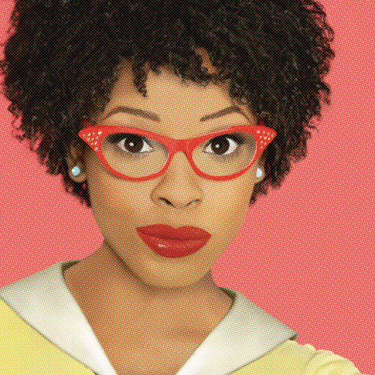
And, while I’m at it, I can see the iconic search symbol in the upper right, but without it I probably never would have noticed that the lady has the word “search” next to her. Any chance that could be in a different color (perhaps the mauve of the side bars)?
Hi all, while during testing the font was well-received, it’s clear that you all were not much liking it. Thanks to all the emailed input as well as the comments. We’ve changed the font. Better?
Re the downside of nesting (having to scroll back to find the original post in order to see if someone has added to the ongoing conversation)
Since we are able to subscribe to email notificatons for comments for a blogpost, I’m just curious, if the decision is made to go ahead with nesting replies to comments, would it be possible to provide a link in the email that would take me to the specific conversation?
The font is much easier to read….thank you!
You changed things. I do not like change. I will adjust, but I am one with my inner Sheldon Cooper at the moment.
I too miss the pink, and I don’t like how large the bespectacled ladies are. They scare me. They were cute when they were smaller, now they loom. And judge. And are probably going to tell me to be quiet…
@Jessica:
The Ladies would Never tell you to be quiet! They like you exactly as you are. 🙂
I like the limited use of pink. The pink was kind of overwhelming. I like the jump to add a comment & the new link for adding a book to goodreads.
The center column seem WAAAY narrower. I’m assuming the new font has something to do with that? Actually the whole site appears narrower. I read it on my iPad 2 in safari. I’m certain I’ll get used to it.
Anyway, nice job! Looking forward to more updates.
Luv luv luv the “Category” dropdown option on the left side. I can definitely see myself searching Reader Recommendations when I’m looking for something new to read or checking out some past Cover Snark when I need a giggle.
And how cool was it to see my name as a link under the “Your Comments” section hehehe!
@KellyS (comment #58) re: center column width. The center column is narrower on the ipad than on the desktop/laptop full window width. (I am guessing you don’t see the pink on the sides on your ipad.) The whole site is responsive to fit to viewpoint.
@58 Kelly S @ 60 Emily: I feel the same way about the columns. The center column with the principal content seems too narrow in proportion to the side columns. Because I have a fairly large landscape monitor, I don’t run my browser full screen. When I widen it, I get more pink on the sides, but the content doesn’t expand to fill the extra space.
In regards to the font, it looks a little on the light side, but it’s more that the line height is too tall.
And another vote against nested comments.
Thank you!
Thirty comments is better than twenty comments. And the text is much easier on the eyes now.
I *love* the new search. Previously trying to find something was just about impossible. Today I wanted to check why I’d put a particular book on my “to buy” list. I typed in the author’s name, and up came a list of *relevant* links, including the podcast transcript where this book was discussed. I doubt I’d have been able to find it on the old site. Thank you so much for the shiny new *useful* search!
I LOVE the new site – much more readable. The new fonts are great!
I do have some not-so-great things to comment:
The too-few comments per page make it hard to follow comments.
Threaded conversations would improve comment readability by a factor of 1 gillion
It would be perhaps a compromise to show comments and collapsed reply-threads, so people could see the comments and if they want to follow a conversation they’d just click on “expand”. Or maybe show initially the top 2 replies?
Maybe order the comments decreasing by date, instead if increasing?
If I follow a post and want to see what else has someone commented, I’d see the new comments first, instead of the old ones again, then I’d have to remember which page was the last comment I read, and click on that – saves a click or two.
I love it, I think it looks great. I liked the old pink but the darker one is lovely.
Comments… I don’t like pagination, makes it harder to follow. I don’t have a problem with nested comments, particularly if it means we can keep the comments on one page. I like Diana’s idea above re collapsing reply threads.
Thank you, thank you, thank you for changing the font. That was my only major gripe. Overall, I love the design of the new site, but the original font was painful. Also–*arms over ducked head*–I’m not missing the pink.
I love the new color scheme. It all looks great. I’ll be looking around a bit more to see what’s new.
LOVE LOVE LOVE the new functionality! My favorite is that Search is now better, AND that there is a way (via left sidebar) to find the “Good Shit vs. Shit To Avoid” category, which has always been the most useful posts for me as a reader.
I would love to be able to read reviews sorted by author or by genre.
Love the layout, and ps your text in the adblocked ad really convinced me to exclude the domain with my adblocking software. Very well played! 😉
Oh, the font you switched to after yesterday’s spidery one is now so much more readable. AND there seems to be more white space! Thank you from a happy camper 🙂
I admit to some bias in this suggestion, but could the transcripts be listed with the actual podcasts under the podcast heading? I think that would be handy for people who want to go back and read all the transcripts or check something on an old one.
I would never, ever have thought to click the lady on the top right to search the site. Way too clever for its own good. A simple blank bar with magnifying glass works just fine.
@Garlicknitter:
I’m not sure I understand what you mean?
Though, I forgot to mention – in the future podcast entries, the transcript will be part of the podcast entry. As in, it’ll expand/collapse one the transcript is in place, so all the comments and discussion are in one place.
I love the new design – especially the responsive design and the search option.
I like what I see tonight, I am especially pleased that moving thing that you put in at the top last time so that the last few blog posts fed across is gone. That was the worst part and I so wish DA had not adopted it (I know you can go directly to the blog)
Thing One: thank you SO much for the font fix. Like many of the others, I found the first version almost unreadable. The line weight of this one is much, much better (I read on a laptop with a privacy screen filter and I had to simply give up my SBTB for a couple of days! gasp)
Thing Two: while I don’t love the pagination of comments, I understand the reasoning. In future versions, would there be a way for readers to click something that gives the option to “show all comments”? I realize this might be too much but… it never hurts to ask!
Overall the redesign is lovely – clean and modern and still “yours”. Good work!
I love it! It looks organised and very new user friendly (you can quickly find categories of what you need to find). Loving the black and pink colours.
I’m a sucker for organising things under subheadings, folders, files etc (I’m kinda like Monika from friends or Malory Price from the Key Trilogy by Nora Roberts)… this new look is giving me an orgasm for organisation hahahaha
First thing is that I’m blind so my comments are aimed towards acceptability. I usually read the site on my iPhone. Before there was a lot of swiping I had to do to get to what I wanted to read. So, I stuck to the newsletter and my RSS reader. There are a lot more headings now, on the site and newsletter, which make it so much easier on my thumb. My only gripe is that the descriptive text for images has been replaced with “click” in the newsletter and a string of numbers /letters on the site. Used to be if a post about a pod cast has links to what is discussed. Those links used to have the name of the book or whatever, now I guess it is just a pic of the book cover? If you have an i device you can turn on voice over. For the computer the screen reader I use is NVDA and it is free and you can run a portable version on a USB drive so you don’t have to install it.
Basically it’s all good so far, especially the comments and except for the images that I was spoiled with and didn’t have to actually flick on to see wtf.
@Llaph:
Thank you for letting me know about the missing descriptions of the images – that’s definitely important for your use of the site. Let me see what I can do, k? Thank you – and please feel free to email me or comment again if you notice anything else? You can also use the Beta report feature above on this page to fill out and explain the problem.
This may sound weird, but I miss the original Ladies from the top of the page. I viewed them as the official logo (of sorts) for SBTB. (I was rather fond of the lady in front of the pyramid, because … pyramids.)
I like that there are different glasses-wearing ladies on the various pages, though. New ones, too. (The one wearing black leather gloves is SASSY. 🙂 )
Maybe its just the fact that I visit this site on my android phone, but I was extremely saddened to see in the book review lists there are little to no pictures of the book covers anymore 🙁 I love being able to view the book cover, sometimes it helps me find books faster because I know to stray away from books with gowns/gothyness on the cover! I definitely liked the format for reviews better before the update