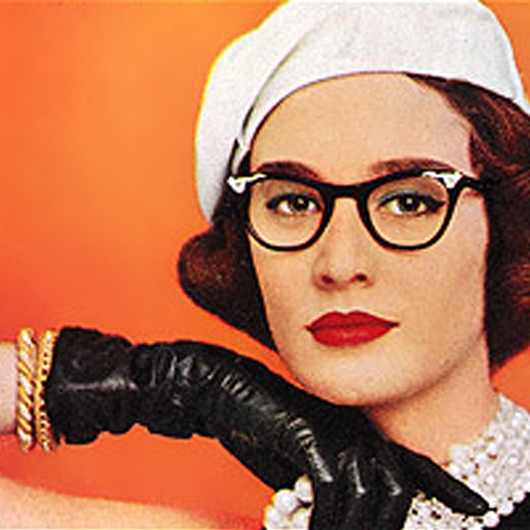
Kay and a few others have alerted me to this Carla Kelly cover, and it’s prompted me to ask for your opinion:

Not a bad looking cover – except that the hero has a hook for his left hand. He lost his hand in an accident at war and while it doesn’t bother the heroine in the least, it’s a part of the story in a big way. That there, as Kay pointed out, is his left hand. It’s not even a plot twist – it’s in the third paragraph of chapter one!
Bright stared at his rapidly cooling cup of tea, and began to chalk up his defects. He did not think of forty-five as old, particularly since he had all of his hair, close cut though it was; all of his teeth minus one lost on the Barbary cost; and most of his parts. He had compensated nicely for the loss of his left hand with a hook, and he knew he hadn’t waved it about overmuch during his recent interview with Miss Batchthorpe. He had worn the silver one, which Starkey had polished to a fare-thee-well before his excursion into Kent.
This inconsistency bothered Kay very much, while I can’t say I would have noticed – or even cared if I did. I’m so used to covers not really matching the story that I’m more apt to notice if they do in a particular way, like with Julie James’ Something About You.
Does that inconsistency bother you? I’m not even going to wonder about a hook appearing on a romance cover, though I’m sure Harlequin could pull it off. But does it bother you to see a hand on the cover when there’s not one in the story?

It does now that you’ve mentioned it. I probably wouldn’t have noticed, but would have looked at the cover again once I read he had a hook. While minor things aren’t really a bother, major ones are. For instance, on my cover the scarves are purple…the the book they are red. No big deal. If they had put a blonde supermodel on the cover though…when I stress the burnette with the not-so-perfect body in my book….I would have had kittens. Yes…kittens.
It wouldn’t have been pretty. Thankfully, I had a great cover artist!
I agree that it sends the wrong message to delete a major hook (yes…pun intended) of the story from the cover when it could have been done. That…or just flip the picture. Major things like limbs missing, hair color, skin color, tatoos, etc….that are wrong tell me that someone isn’t paying attention. It speaks of lack or pride in their work and unprofessionalism. Either the writer needs to fill out her cover art forms better or the cover artist needs to pay attention.
Yes, it bothers me a lot. As it happens, I’m on the Cover Cafe cover committee and this is the sort of thing I would nominate as a Worst cover, even though it’s otherwise attractive. Like other posters, if I see mention of an obvious physical characteristic, I go straight to the cover and look for it. If that part of the body is hidden, I’m okay, but if it’s visible and wrong, then I get really upset. Even though it’s probably a losing proposition (since it’s so common), I do not like covers, for instance, where the hero is described as a redhead, but he’s shown with black hair. It’s not that I particularly care for red hair but it’s such an easy thing to do correctly (as opposed to displaying a hook that might make people uncomfortable—I say show it anyway), that the error annoys me.
Related to this post on inaccurate covers, is the number of covers with couples who are dancing backwards, with his right hand up in the air instead of hers. I know the art department or someone switched the image to “improve” the look of the cover but it’s one of my pet peeves!
Dang it! I bought the ebook, but now that I know about it, it’ll niggle away at the part of my brain that always straightens anything hanging crookedly.
That said, the art department doesn’t have time to read the books. As the in-house client responsible for the end product, it seems logical that the editor would be establishing do’s and don’t’s for the art department to follow. Maybe Harlequin has someone else in charge of signing off on cover proofs, but in any case, someone with knowledge of the book should have caught this.
Yes, if had I bought this in print, I absolutely would have noticed it, and it absolutely would bother me.
Natalie L. said.
Yes, this exactly. Inaccurate cover art annoys me, because it feels disrespectful to the reader/product, but things like this are worse – like whitewashing a cover model. Even where it’s not intentional, it’s still a big deal.
Bad cover art now – well, that’s subjective so I can give that a pass.
This seems to fall in with another trend I’ve noticed, which is that there’s an inverse relationship between how heavy a heroine is mentioned as being and how thin she’s depicted on the cover. Major overcompensation. How hard would it have been to not show the hook without rubbing it in people’s noses that you’re ignoring it by depicting his left hand?
Yes, it bugs the crap out of me when the cover has nothing to do with the story. You see that so often, and it makes me wonder why, after so much time working on the book, there can’t be a little more effort to make the book cover represent the story accurately.
One recent occurrence was the TAKEN BY THE OTHERS cover (by Jess Haines). Great story, but the heroine looked A) like a stripper; B) unrealistic. Shia is neither, and it made a lot of fans annoyed.
I think you have to be pretty far up in a Publisher’s’ sales chain before they let you have approval for things like cover art. Dream: they like it so much they even let me pick the paper and font. Meawhile, if it bothers you, pretend they are looking in a mirror. Lots of people stand in front of mirrors when they start making out. And her soft focus eyes and his mouth say that’s maybe where they’re at. And, geez, guys, don’t go getting all political again over this, huh?
Yes, it bothers me. Aside from erasing the hero’s characteristics, there seems to be a disconnect on this one between the title (Admiral’s Penniless Bride) and the fact that the model is wearing a lovely, expensive-looking dress and a pearl necklace.
There’s a wonderful Mary Stewart novel (Nine Coaches Waiting) in which the heroine is a governess at a French chateau. One of the paperback editions has a typical Gothic castle illustration on the cover. But in the book the author explicitly says that the chateau does not look at all like a Gothic castle, but is rather an elegant square mansion …
Here’s my two cents. Publishers are responsible for producing a book based on the hard work of the authors. Therefore, I think that they should at least TRY to make the cover reflect the contents of the book. Things like the main female is suppose to be Amazonian but the cover model is a waif? The main male character has long black hair that hangs past his shoulder (and this hair is repeatedly mentioned). The cover model has short hair that is clearly not black. And don’t even get me started on settings and objects from the story! I don’t focus on the cover art but honestly how hard can it be to produce a cover that reflects the story?
Yes, the wrong cover bothers me. Even skipping the fact that they could have angled the art so the missing hand is under her arm/behind her back/otherwise concealed, the author decided to make the hero a character with a very distinctive physical trait—and the cover has a generic romance novel cover guy. Give the author’s characters some credit!
It’s great that books are starting to have more diverse characters, but we need covers to do the same. The problem with covers that alter things like body size, ethnicity, or the presence of a disability is that these covers influence (or try to influence) what people perceive as desirable. If making disabilities (or varied body shapes, or varied ethnicities) invisible isn’t political, what is?
Yup. It bugs me in a big, big way.
I can’t say I would necessarily notice without someone pointing it out (historical romance covers, while I can find them very beautiful, all tend to blur in my mind so very few stick out), but if someone did/if I noticed it does bother me. Maybe a little less egregious than the racefail of certain covers, but a disability covered over sends another bad message: only able-bodied men and women deserve romance.
Plus, from a marketing standpoint a hook is more likely to get me to pick up the book because its “different” than the usual fare.
This.
Does it bother me? Yes. Do I think crabbing about it on sites like this will make publishers get a clue? No. And this particular cover could’ve been easily addressed by mirroring the image. Viola, intact right hand. Lazy, lazy, lazy. More to the point, I think they’re afraid we won’t read something with an imperfect man in it.
If I HAD noticed it, I would have assumed a) stock image, they don’t care if it matches or b) they flipped it and that’s really his right showing.
Doesn’t faze me one bit. I own it, though it’s still on Mt. TBR, and doubt I ever would’ve noticed the discrepancy.
And to answer the charges of hiding his disability, I think emphasizing said disability and selling it on the novelty of it only focuses on his status as “other.” This cover forces people to see him as a person first and foremost.
I say this as a cripple myself. I’m sorta glad his hook isn’t on the cover. Romance is dreadfully guilty of fetishizing the other.
The cover is so generic, it makes me think that they didn’t care. Hell, they could have flipped it in Photoshop and had no problem.
I can’t find the Jennifer Crusie post on the dog insertion, I am suspecting maybe she deleted it?
It always annoys me when they have a couple on the cover that clearly doesn’t match the descriptions. How hard is it to get/photshop models to match? This cover could easily been fixed with a horizontal flip. The left hand becomes the right hand, no one knows what the hook is getting up to behind her back, and everyone is happy.
Yes, such a glaring and easily remedied inconsistency between cover and book does bother me. Is the publisher just not paying attention to their author’s work? If not, why should readers?
It definitely bothers me, on more than one level. The inconsistency between the story and the cover is one issue; erasing his disability is another. Other commenters have said it more clearly than I am, but yes, it’s a problem for me as a reader.
I don’t usually pay attention to the cover art beyond seeing it on the shelf in the store; I recognize that its purpose is to catch my attention by fair means or foul and that it has little or nothing to do with the book itself, unfortunate as that fact may be. It’s branding and marketing and nothing more. I do agree that it SHOULD be, that as packaging it should more accurately describe the contents, but I also recognize that the industry doesn’t always work that way.
In this case, I agree that the discrepancy could have been solved by simply flipping the image, and in fact the image may have originally been created with that in mind. But to me this was clearly a marketing decision. Not as a matter of needing to have a “perfect, unblemished” hero but because he would appear too threatening. Somebody in marketing obviously said “OMG sex with this man would be incredibly painful, just think of the damage he could do with that hook, it will scare readers off, get rid of it.” In a genre that expects the toughest, meanest alphas to soften up around their ladylove and give her gentle and considerate sex, personal hardware like that can be construed as too threatening, no matter how considerate the character may be depicted as being in the course of the story.
Jennifer:
I found the entry, but either she seemed to delete the part about changing it or delete most of the comments section that had that whole discussion. Or they went somewhere I can’t follow. It was supposed to be a dachshund, not a German Shepard. I did scan through the comments section to find anything left where she talks about it and found all these quotes, but nothing on where the discussion originated:
Then as the commenters get more incensed about the fact that she rewrote it for the cover:
and then “It’ll be a Yorkie in the book now. They’ll change it.”
Sorry, I know it’s not exactly on topic, and I can see where everyone is coming from with the kind of message erasing a disability sends to the public. I just don’t care. I’m with whoever above said that they just use the covers as a code to tell you what kind of story – subgenre, level of eroticism, etc. After the initial impression, I don’t think about the cover again.
Ordinarily I’m inclined to roll my eyes when the covers don’t match the books, when the heroine is shown as blonde instead of dark-haired or modelesque instead of proudly plump. But in this particular case it would have taken a few seconds to mirror the image! It’d even be sweet that she was holding his hook in an affectionate gesture. But no.
And this was said early on but I’ll reiterate it: Lois McMaster Bujold had a hero with a hook for a hand in The Sharing Knife and he was unabashedly portrayed as such on the cover. Granted, she’s the Lois McMaster Bujold and might have more clout with the marketing department, but still.
Since his other hand isn’t visible, and it’s a pretty cover, I could convince myself that the cover image has been mirrored and it’s his RIGHT hand showing on the cover…
I sadly would probably not have noticed, once I’m reading, I’m usually in the zone.
Lisa
This does bug me—as it does whenever a cover is totally inconsistent with the author’s physical description of the characters. It’s a lovely cover and I wouldn’t have stopped reading the book once I realized the er, lack of hook, but I wish they could have found an image where the hero had only his right hand showing.
And yes, I know that’s often easier said than done. I’m sure “live” cover shoots are a different kettle of fish, but I can talk about stock photo images. I requested changes to the covers of both my latest release and my upcoming one. And when the cover artists had difficulty providing new images, I spent hours upon hours trolling royalty-free stock photo sites and coming up with alternative images for the cover artist to use that better fit my character descriptions.
Was it worth the bleeding eye-balls and the thumping headaches after squinting at thousands of tiny thumbnails? Heck yes.
I know I’m very very lucky to have a publisher willing to accommodate my requests, but I feel that it’s worth at least asking for a change so that readers don’t feel disappointed by a cover that apparently totally ignores the author’s descriptions of the characters.
Bugs me for sure.
I’ve said it before and I’ll say it again – if I was that oblivious to details in my work, I would be fired.
Yeah, I don’t know if I would have noticed—certainly, not on an ebook, but probably on a paperback.
But I just wanna say that the details you mentioned in this blog post made me buy the ebook immediately and read it TODAY on my Nook.
And, by the way, it’s an unbelievably lovely romance novel.
Ignore the cover. The contents are so worth it.
I do mind sometimes—especially if it makes me wonder “Did anyone tell the artist the first thing about this book?” Like the German editions of the Psy-Changling books by Nalini Singh—they’re up on her website, and a whole barrel of WTF for those who have read the books, especially the third book (Caressed by Ice), which has a man with tiger stripes (I think) on the cover. The number of tiger changelings in the books? Zero. The hero of that novel? Psy.
I’d like to think that the publishers cared enough not to have this kind of inconsistencies but we know all they care about is a pretty cover to catch the eye of the buyer. While I’d never buy a book based on the cover, face it, apparently a lot of people do. I never realized it until I started reading so many blogs but half the bloggers I read go on about the cover as much as they do the content. And the ebooks on my Kindle don’t show a cover once downloaded so apparently once they get our money the cover is no longer important either.
I didn’t notice but I was too busy being blown away by the sheer awesomeness of the book itself. I’ve been reading long enough to know that the cover images are a combination of advertising and branding, more than a true reflection of the story, alas.
It bothers me in the same way it bothers me to see the person of color kept in shadow on cover. I know in this case it’s most likely a mistake and not markeing. But it’s a possibility somebody wanted to hide a handicap to keep readers from being put off.
I read almost all of my books on the Kindle. I glance at the covers in the bookstore or when I order and all I notice is whether they’re aesthetically pleasing (and the Carla Kelly cover is definitely beautiful) or whether they’re over done. The same with the titles. The Kindle lets me forget about them after that – and that’s fine with me. If the covers or the titles are too dramatic or sappy, then I’m grateful for my Kindle so that I don’t have to look at them again.
Yes, it really bothers me when the physical descriptions of the characters are not consistent with the covers. Especially hair color & scars. The missing hook would bother me as well. It’s so common though. I guess that’s marketing for you.
I feel like, if you’re going to go to the trouble of adding an eccentric quirk like a hook, your publishers shouldn’t do you the disservice of leaving that out of the cover. I would love to see a hook in this picture!
I’ve already read the book, and I did notice, but I’ve resigned myself to wrong and horrible covers. This one is not unattractive, but that necklace was not in the book either, and although there is a yellow dress, that one seems wrong-too youthful for the character. And where’s her wedding ring? They get married right a the beginning of the book.
It does bother me when physical characteristics on the cover don’t match descriptions in the book.
Especially when it’s a glaring discrepancy, I start to wonder what the publishers process is for choosing covers – do they have a pile of “cover art” and use a random generator to plop a cover on a book? I feel like it undervalues the author, and I would be pretty upset if my “curvaceous” brunette showed up as a slim blonde on the cover.
This book was fabulous!! Heroes rarely take my breath away in the first scene, but wow, he sure did!
The missing hook on the cover doesn’t bother me as much as the missing hook in the author’s writing! At one point the hero “rubbed his hands together” in anticipation. What? That’s just lazy writing and editing. And I actually enjoyed this book and want to read more of her backlist. I feel disappointed mostly that this slipped through the whole process.
Yes, it bugged me when I read the book—as someone said already, as soon as I read about the hook, I went back to the cover image and checked. It’s central to the story, and it would have been easy to use an image where his left hand wasn’t showing. It’s like “whitewashing,” which I also hate. Not that I think there was any deliberate thought process of “let’s pretend he has two hands for the cover,” just publisher thoughtlessness. I don’t think they need to depict the hook on the cover, but I think depicting him with a left hand is stupid.