Tuesday 7 April, I flew up to Toronto to hunt for the sheikh billionaire tycoon surgeon duke cowboy, who I’m told is named Don. Don Mills. Alas, even though I searched through several different floors of Harlequin Headquarters, Don hid from me, and I didn’t capture him on film.
I did, however, have a ripping good time wandering all over the offices of HQN HQ.
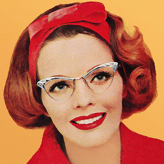
Yup, I’ve arrived at the right place.
Free books! As part of the 60th Anniversary, Harlequin is giving away a whole suite of romances. All the more reason to stop by HQN HQ – you can grab yourself a specially-bound copy. Or, download them all.
The Oracle of eBook, Malle Vallik, better known as Director of Digital Content and Interactivity.
Deputy eBook Oracle Jayne, who is so incredibly wise she has to wear a knee brace from carrying around all the awesome inside her head.
The entire HQN office suite is decorated with vintage cover art celebrating the 60th anniversary. It’s like working inside a museum of visual history. Not nearly enough people appreciate the social and anthropological history present in the romance genre, and Harlequin alone is worth in-depth (hur) investigation.
There’s a big display of any and all press that HQN has received that mentions the 60th Anniversary. Right there? Bitches, man, Bitches!
And right there, above the sultry eyebrows? Dear Author. Woo hoo!
A LOT of thought and examination goes into the cover art and layout of the Harlequin books, particularly the visual themes within a specific line. I had a good old time checking out the “Book Title” “Author Name” mockups. There was a whole rack of them, and they cracked me up.
Bitchery fan Natasha had some of the best desk decor, including Ms. Harley Quinn. How has there not been a romance heroine named Harley Quinn?!? Natasha also has a cool job. She is part of the team that makes sure the artist’s rendering on the computer matches the actual product from the printer, including foil, gloss, and ink color. Even with the digital advances at Harlequin, how the product looks on paper, literally ON the PAPER, is crucial.
I’m told these are the backs of Don Mills’ business cards proclaiming him the Sheikh Surgeon Tycoon Billionaire Cowboy Duke. Note the art that celebrates the 60th Anniversary. Reason #466 to work at HQN HQ, after Don Mills, socialized medicine, the unstoppable opportunity to recycle something every 5 feet within the city of Toronto, and now on my list: really fine business cards. I’m partial to the lighthouse myself.
Found him! Look! It’s Don Mills! And lucky me, I visited HQN HQ on Wear Your Best Cravat Day. How fortunate I was wearing the perfect dress!
In all seriousness, I was probably dork of the year touring the offices. All these nice people came to work, and I showed up and squeed all over the place. I visited the digital headquarters, where they are carefully tracking how many downloads of the Free Harlequins – with a goal, I believe, of reaching 1 million. Want some? Head on over and download them all!
I also visited the art department, where I saw mockups of future covers and stills from a photo shoot to create the cover for Jillian Hart’s Gingham Bride, coming in November 2009. The models, the costuming, the poses, and the lighting were all part of the decision process, along with the massive amount of detailed input from the author – which helps a lot. If they use one of the images I saw, Ms. Hart is going to get a beautiful cover.
I also learned that sometimes Harlequin has trouble finding male models for the cover photo shoots, because the standard of attractiveness and sensual beauty in the modeling industry is very different from the goals and images preferred within romance. Consider the difference between the very young, almost asexual looking models in a lot of fashion spreads and the virile, shapely, and muscular – sometimes, yes, too muscular – models you see on many romances. So Harlequin, frustrated with local agencies sending models that they couldn’t use – or with having to spend hours altering the images to achieve the look they wanted – put out an open casting call for ordinary guys to become cover models. They now have a huge list of attractive everyday dudes, some of whom are firefighters, EMTs, police officers or physical fitness buffs, who model for Harlequin covers. I saw one photo shoot of a model posing in Roman gladiator costume, and thought that he was a perfect balance of “very attractive” and “very real looking.” Turns out he was one of the models chosen from their last casting call, and he’s really quite good at the modeling thing. Totally at ease in his own skin, it seemed from the pictures. Putting aside the varied opinion on the male standard of beauty within romance cover models, I find it fascinating that local dudes from the surrounding area are working as cover models because the modeling-models didn’t quite fit. But regular guys from down the road, they totally fit.
Thanks again to Malle Vallik, Oracle of eBooks, and the Harlequin Digital team, including Jayne and Aideen for being such wonderful hosts and being so very welcoming.
