
I haven’t done a Cover Makeover in a good long time, and I figured you guys are long past due for another eye-searing collection of past and present cover hilarity. This current set’s victims are the novels of Loretta Chase. In case you didn’t know already, I love Loretta Chase novels like whoa and like burning. She writes intelligent, elegantly-constructed stories that tweak romance novel conventions in exactly the right ways, all narrated in a delightfully wry voice.
You wouldn’t know it looking at the covers. You look at the covers, and you can hear the soft porn sax begin to flow, and girls with names like Tami or Koral exclaiming their pleasure in breathy voices even as they attempt to writhe around the bed in a way that won’t rub the fake tanner off on the sheets.
So given that these books are actually GOOD, when Berkley re-released her two earliest Avon historicals, I was all YES! AWESOME! Finally, she can get the covers she deserves!
Nope. No such luck. I don’t know how or why Chase has pissed off the God of Good covers so severely, but almost every cover she’s had has been beaten severely with the ugly stick before being run over—twice—by the ugly truck.
In a way, I guess I should thank this absolutely hideous cover. I had never heard of Loretta Chase, but I was hungry for more romance novels after glomming everything by Judith McNaught and Lisa Kleypas I could find. It was so ugly, it caught my eye at the book rental store in Malaysia, and I picked it up on the whim. The guy’s glistening curls were hypnotic, I tells ye. And then I started reading the book.
I think I might’ve paused to eat or pee or interact with people, but honestly, I might not have. When I was done, I ran back to the store for more, and wailed and gnashed my teeth when I found only two more books by her.
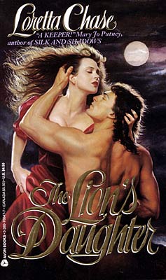
But enough about my ridiculous love for Loretta Chase novels. That cover. THAT COVER. Y’all. What in the everloving name of fuck were they thinking of when they came up with it? I mean, what is the guy DOING? Is he rearing up from the grave to drag the weirdly pale chippy in with him? Or is she the reanimated corpse, attempting bash him on the forehead with her chin before shoving him down to spend eternity with her in the cold, damp earth? And why are they both hurtling around with their eyes closed? To hide their UNDEAD ZOMBIE EYES?

And here comes the make-over. No more curly mullets, but there’s a thoroughly insipid guy in a thoroughly insipid romance novel pose: shirt unbuttoned (but still tucked in! We have to have standards, people, or the world is going to fall apart), hands on hips, manly, determined gaze into the distance. The cover isn’t even hilariously bad, the way the original cover was; it’s just boring. And bad. At least the original cover made me stop in my tracks and go “hot donkeys that cover is hilarious.” This cover inspires mild distaste, followed by boredom.

This sequel to The Lion’s Daughter was the first romance novel I’d read in which the villain of the previous book was made into a hero. Loved it, though I still liked The Lion’s Daughter better. And the cover was a worthy successor of The Lion’s Daughter in every way. What’s not to love about two sweaty jaundiced people getting fresh with each other on top of what look like theater curtains? Delicious! I can see the tagline now: Two things bound these star-crossed lovers together: a love for musical theater . . . and class C liver cirrhosis. HOT.

OK, so Berkley ditched the cirrhosis and the girl, but kept the curtain theme, and instead of getting someone with hepatitis, they chose a Jensen Ackles knock-off with a weird flat-top haircut and an aversion to shaving. OK, fine. He’s not the greatest, but at least he looks healthy, and he’s pretty cute, if you unfocus your eyes a little. But dude: that dead look on his face. That expression, combined with him coming around the curtains, makes me think of this strip from A Softer World. Stalkeriffic!

Y’know, I have to admit a fondness for this cover. It’s clinchy and kind of embarrassing, and the pink and orange tones are pretty lurid, but this is one of the very few covers in which the models actually look a lot like the characters. The woman, in particular, looks like Jessica: beautiful, dark-haired, just a touch exotic. The guy…he’s not quite as big and imposing and Italian as I picture Sebastian, whom I picture as a more rough-hewn member of Dieux du Stade, but you know, he’s still kinda hot.

And the revision? Meh. It’s not horrible, but what’s with the watered-down pastels? Jessica and Sebastian are probably one of the most vivid, well-matched pairs in all of Romance. They’re bright jewel tones and fire, not big soft flowers and a woman looking vaguely down at some stain she has on her sleeve. This cover is downright soporific, and part of it’s due to the soft, sleepy woman. This does not look like a woman who’d shoot a man who’s wronged her. This looks like a woman who’d think about maybe shooting him, then go take a nap instead.
And that’s it for this round. Next time: Jude Deveraux and the special trainwrecks that were the covers for her early releases.