
I haven’t done a Cover Makeover in a good long time, and I figured you guys are long past due for another eye-searing collection of past and present cover hilarity. This current set’s victims are the novels of Loretta Chase. In case you didn’t know already, I love Loretta Chase novels like whoa and like burning. She writes intelligent, elegantly-constructed stories that tweak romance novel conventions in exactly the right ways, all narrated in a delightfully wry voice.
You wouldn’t know it looking at the covers. You look at the covers, and you can hear the soft porn sax begin to flow, and girls with names like Tami or Koral exclaiming their pleasure in breathy voices even as they attempt to writhe around the bed in a way that won’t rub the fake tanner off on the sheets.
So given that these books are actually GOOD, when Berkley re-released her two earliest Avon historicals, I was all YES! AWESOME! Finally, she can get the covers she deserves!
Nope. No such luck. I don’t know how or why Chase has pissed off the God of Good covers so severely, but almost every cover she’s had has been beaten severely with the ugly stick before being run over—twice—by the ugly truck.
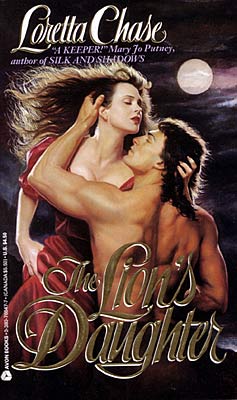
In a way, I guess I should thank this absolutely hideous cover. I had never heard of Loretta Chase, but I was hungry for more romance novels after glomming everything by Judith McNaught and Lisa Kleypas I could find. It was so ugly, it caught my eye at the book rental store in Malaysia, and I picked it up on the whim. The guy’s glistening curls were hypnotic, I tells ye. And then I started reading the book.
I think I might’ve paused to eat or pee or interact with people, but honestly, I might not have. When I was done, I ran back to the store for more, and wailed and gnashed my teeth when I found only two more books by her.
But enough about my ridiculous love for Loretta Chase novels. That cover. THAT COVER. Y’all. What in the everloving name of fuck were they thinking of when they came up with it? I mean, what is the guy DOING? Is he rearing up from the grave to drag the weirdly pale chippy in with him? Or is she the reanimated corpse, attempting bash him on the forehead with her chin before shoving him down to spend eternity with her in the cold, damp earth? And why are they both hurtling around with their eyes closed? To hide their UNDEAD ZOMBIE EYES?

And here comes the make-over. No more curly mullets, but there’s a thoroughly insipid guy in a thoroughly insipid romance novel pose: shirt unbuttoned (but still tucked in! We have to have standards, people, or the world is going to fall apart), hands on hips, manly, determined gaze into the distance. The cover isn’t even hilariously bad, the way the original cover was; it’s just boring. And bad. At least the original cover made me stop in my tracks and go “hot donkeys that cover is hilarious.” This cover inspires mild distaste, followed by boredom.

This sequel to The Lion’s Daughter was the first romance novel I’d read in which the villain of the previous book was made into a hero. Loved it, though I still liked The Lion’s Daughter better. And the cover was a worthy successor of The Lion’s Daughter in every way. What’s not to love about two sweaty jaundiced people getting fresh with each other on top of what look like theater curtains? Delicious! I can see the tagline now: Two things bound these star-crossed lovers together: a love for musical theater . . . and class C liver cirrhosis. HOT.

OK, so Berkley ditched the cirrhosis and the girl, but kept the curtain theme, and instead of getting someone with hepatitis, they chose a Jensen Ackles knock-off with a weird flat-top haircut and an aversion to shaving. OK, fine. He’s not the greatest, but at least he looks healthy, and he’s pretty cute, if you unfocus your eyes a little. But dude: that dead look on his face. That expression, combined with him coming around the curtains, makes me think of this strip from A Softer World. Stalkeriffic!

Y’know, I have to admit a fondness for this cover. It’s clinchy and kind of embarrassing, and the pink and orange tones are pretty lurid, but this is one of the very few covers in which the models actually look a lot like the characters. The woman, in particular, looks like Jessica: beautiful, dark-haired, just a touch exotic. The guy…he’s not quite as big and imposing and Italian as I picture Sebastian, whom I picture as a more rough-hewn member of Dieux du Stade, but you know, he’s still kinda hot.

And the revision? Meh. It’s not horrible, but what’s with the watered-down pastels? Jessica and Sebastian are probably one of the most vivid, well-matched pairs in all of Romance. They’re bright jewel tones and fire, not big soft flowers and a woman looking vaguely down at some stain she has on her sleeve. This cover is downright soporific, and part of it’s due to the soft, sleepy woman. This does not look like a woman who’d shoot a man who’s wronged her. This looks like a woman who’d think about maybe shooting him, then go take a nap instead.
And that’s it for this round. Next time: Jude Deveraux and the special trainwrecks that were the covers for her early releases.

No comments on the covers, but having never read Lorette Chase and hearing your gushing, I’m going to get me some! By whatever means necessary:)
I also have a special place in my heart for that florid cover on Lord of Scoundrels. When I bought the book recently I went out of my way to get the old cover instead of the new. And, yeah, I also pictured Dain to be bigger and more Italian than the cover model. Maybe it’s because of all the comments Dain made about looking like Lucifer and how monster big he was, but the word minotaur pops in my head now and then. Kind of like Asterius from P.C. Cast’s Goddess of the Rose. I love me some Dain.
And I’ve loved everything I’ve ever read by Loretta Chase. I think the other covers are a great improvement over the old covers. Especially the couple suffering from impaired liver function. My brain insists they’re into some kinky sex trip involving cheetos and hot, sweaty ass.
I just recently discovered the goodness that is Loretta Chase. I have the new pastel version of Lord of Scoundrels, which I kind of like better than the old clinch cover. I really prefer not having any people on the cover, or at least not people where I can see their faces. I like my imagination to fill in the blanks.
Never read Loretta Chase, will have to check her out once I actually find a bookstore in this town.
Is it sad that I have copies of both the old and new covers? On purpose, not by accident.
And you are totally responsible for the torture I’m going to go through until I can get my hands on the new Loretta Chase. I avoid, avoid, avoid checking if she has a book on the way because she is one of the few authors that sends me into obsessively checking availabilty, haunting release date ignorers like Wallyworld (though buying early makes me feel slightly bad, I make up for it with my “just in case the first book gets eaten by my psychotic cat” purchase after the release date) and generally questioning the status of my mental health. She is one of two authors I actually keep in order, all together, on the shelf by my bed (duplicate copies carefully sealed away out of kitty reach).
OMG the insanity is creeping up. I had to stop and check if it was available at my local Borders before finishing this comment.
Eli, you have a book-eating cat? I have a book-eating dog. Maybe they should get together (on an island. Far, far away).
Why do the shoot-you-‘cos-you-wronged-me heroines always end up looking insipid? Or whorish. Or both. Insipid whores. Yep, just the sort of heroines romance needs.
I’m trying to figure out how to get a decent cover the book I’m writing with just such a heroine. Maybe just sending in a cover req that says “She fights tigers for fun” might do it. Maybe not.
Well, I have definitely seen worse covers…Dara Joy anyone, anyone? Just wanted to comment that I have FINALLY gotten to read a Loretta Chase book – found it at Borders, B&N;never had it! Anyway, I read Lord of Scoundrels and have to say, I appreciated Jessica – what a terrific heroine! She wasn’t wishy-washy, she knew what she wanted AND how to get it – LOVE HER!
Speaking of when bad covers happen to good authors, have you seen the cover for Julia Quinn’s new book?
http://search.barnesandnoble.com/The-Lost-Duke-of-Wyndham/Julia-Quinn/e/9780060876104/?itm=1
Eeek! The woman looks like a bobblehead doll.
I totally agree with you about the old Lord of Scoundrels cover – the colours are on the garish side, but models are good. The woman looks like she could coolly comment on a pocketwatch with a picture of a man performing an intimate service. He doesn’t look like Dain should (he’s all around too civilized looking), but he has a nice back, and backs are underrepresented on covers, imo.
*sigh* Loretta Chase was my conversion over into Romance. Good times.
I too have the first Lord of Scoundrels cover and prefer it, but that could be sentimentality speaking.
What I want to know is why does the guy in the second title look like he’s escaped from a Brockmann “seal” novel? And what is it with peoples sudden fixation with Seals, Delta Force, hot cops,…
OK, off topic and probably fodder for another column.
Speaking of insipid, the male model in the redo of The Lion’s Daughter looks like Ian Ziering from Beverly Hills 90210. Definitely *not* my idea of a hot stud!
The new Lion’s Daughter cover—yep, that’s her after the operation.
And shouldn’t that be The Captive of the night, singular?
And the new LOS—from that distance he doesn’t look lordy or scoundrelly.
As far as Julia Quinn’s new cover, from where I sit, he’s about to say, “Sorry, darling, but one of your breakfast Cheerios fell into your bra.”
She, of course, rides tra-la above it all with that Splenda vacant stare…
Lord of Scoundrels was one of the earliest books I worked on in my publishing career. Although I eventually became utterly jaded to romance covers, this one stuck with me. I always assumed it was the memory of the original art (yay for being in Production! we see the original art!). It’s good to know that the magic the artist had on this one translated into the printed cover.
The only romance cover I’ve found to be rather hawt since then is from Thrill of the Knight by Julia Latham. That thing is smoking. When the proofs hit the office, we were all fanning ourselves.
Okay, this was worth reading just for the laughter, let alone the dead-on commentary.
I adore Loretta Chase, and you could put Beaver Cleaver on the cover of one of her books and I’d still read it.
Holy doodle, that cover IS hawt. I’m all a-twitter!
Second version of Captive s of the NIght looks more like George Michael to me. I hear the sultry strains of “Faith” and “Father Figure” every time I look at it.
You should compare Chases’s Carsington brothers series US covers with the UK covers. The US covers are all shots of half dressed men and the UK covers are cameos (male or female) on wallpaper background. Interesting…
Yes, or maybe Sherrilyn Kenyon’s US and UK covers. The US ones were all shiny naked men, and the publisher in the UK thought that was a little tacky, so she put classier images of extreme close-ups on the UK covers. Very plain backgrounds and fonts. At first I preferred them, but now…well, I can’t remember which is which. At least I could look at my US copies and go, “Oh yes, scary wolf-man inviting you to enjoy his waxed mantitty, that’s Vane’s book,” or “OMG hawt guy who looks like Mohinder from Heroes, that’s Valerius’s book.”
Of course, a lot of them have been re-issued since. I just had a look for wolf-man on Amazon and couldn’t find him. Shame.
The newer Lord Perfect cover is the most cringe worthy (Unbuttoned but tucked in shirt? Check. Supposed-to-be-come-hither-but-really-deadened-eyes? Check. Inexplicably oily chest? Check.) but since its LORETTA CHASE, I would read it if the covers were made of compressed cat vomit.
Indeed! There is a slightly odd current trend in British publishing to “Austenise” the cover of historical romance novels. So Loretta Chase gets regency style wallpaper and tasteful monochrome cameos and Mary Balogh reproductions of 19th century portraits.
Mary Balogh
Loretta Chase
Conversely, the book covers of Austen herself receive a sort of sub-Sophie Kinsella treatment:
Jane Austen
I find it odd (and depressing) that, in re-issuing one of the most popular and beloved of all romance novels, Avon picked the blandest, least memorable cover in the history of the genre. I mean, it’s The Lord of Scoundrels! Vibrant, spicy, funny, vivid, unforgettable – almost always tops the AAR poll for best romance.
You’d think a new cover for this one would pay homage to that.
What were they thinking?!
To quote Mark Kermode, everyone involved should be thoroughly ashamed of themselves!
The worst thing about Chase getting saddled with all of these horrible covers is that she wouldn’t be on my radar at all were it not for the rapturous reviews I’ve read of her work here; I’m a relatively new romance reader, so I have no history with her books. And lemme tell ya, these covers would make me run away from her like the wind through Zombie Heroine’s hair in Cover #1. Surely there’s a middle ground between Irredeemably Tacky and Irredeemably Boring—can’t anyone find it?
Well, now I have to go read Loretta Chase. I agree with you point by point on all the covers, so have nothing witty to say. You said it all.
Once again, I have to ask: Why do publishers do this? Seriously. Is there any focus-grouping, any feedback they solicit or accept about covers?
What does it say about our industry that prospective readers are factoring “carrying this book in public would just be too embarrassing for words” into their purchase decisions?
I don’t know about covers, but Harlequin’s research into which titles sell best is responsible for all the Sheikh’s Secret Tycoon Baby Mistress Wife For The Taking titles. Srsly.
Cat, you gotta be kidding. The Secret Baby Harlequin titles come from actual research? Where I come from, they’re mostly good for a laugh.
Once a friend and I (she also writes inspirational romances) did a panel called “The Christian Virgin Cowboy’s Secret Baby and Other Titles You Won’t See From Us.” Our audience was charmed.
I love Loretta Chase like she gave birth to me (note: she did not). I picked up all three of those books based on authorship, not covers. The covers are terrrrrrrrrrrible. I agree LOS is a boring cover- I might have picked it up anyway, but I agree that it is nothing like Jessica, who is awesome.
Thank you once again for making me laugh so hard I woke Mistah Midnight, sleeping down the hall (from Smut Central, not from my bedroom!).
I agree wholeheartedly with your adulation of Loretta Chase. Lord of Scoundrels is one of my top five ever romance novels. The rest of the list includes books by Pat Gaffney, Mary Jo Putney, and Anne Stuart. I concur with your wonderfully colorful observations about her covers.
Love the bobble-head analogy for the herione on Julia Quinn’s latest. She’s the perfect match for this guy.
Now I am impelled to research the proper rites for propitiation of the Goddess Of Good Cover Art.
Hugs,
Liddy
I find an even more interesting concept in cover art is the fad to show only half the head of the hero/heroine. Sometimes it is the top half, sometimes it is the bottom half. I actually like it because it is mysterious. At least you don’t have to wonder why the artists and the editor don’t seem to get together and discuss the proper hair/eye color and physical attributes of the hero/heroine of the story. Nothing ticks me off more than reading a book and wondering what story the person pictured on the cover migrated from? Seems to me at least the editor should have read the book to know when the cover is all wrong.
What intrigues me about cover art is the fad that only shows a portion of the hero/heroines head. I rather like it since it does add an aura of mystery. At least it doesn’t cheese me off when the person pictured seems to have migrated onto the cover from a different story! Nothing makes me madder than wrong hair/eye color or incorrect physical attributes – false advertising I’d say. Although the reality is probably that the artist and editor have probably not read, or remembered the book well enough to accurately portray the people involved.
In case you are wondering about my weird double-entry, something went wrong in cyber land – a real snafu!
I think I like the originals better than the newer ones. They might be clinch, but I’d rather that than downplayed pastels and dead-faced men.
There’s a fun visual echo on the new “Captives of the Night” cover – his boob is peeking out from behind his shirt in just the same coy way as he’s posing with the curtain.
With those raves, I may have to pick me up some Loretta Chase.
Captives of the Night original cover: King Midas perhaps?
I recently picked me up some Loretta Chase books on the strength of the reviews here and I have to say, I am thoroughly enjoying them. My fave so far is Lord of Scoundrels (what can I say, I’m a sucker for damaged neurotic heroes) but Mr Impossible was fun too (kinda like early Elizabeth Peters) and I just started Your Scandalous Ways, which is basically James Bond in the 1800’s—did anyone notice the connection between James Cordier/James Bond and Quentin/Q? LOL! Many thanks to the Bitches for pointing me in the way of some fun summer reading!